/* */ Beulah Bee: January 2018

January 25, 2018

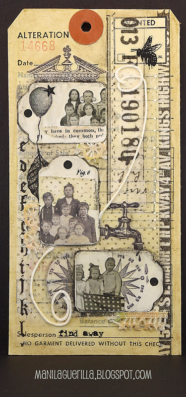
Find Away

I like challenge blogs and my favorite is the Simon Says Stamp's Monday Challenge Blog. And I really, really like challenge blogs when the theme is to create a tag or something with a tag attached.

As I am rather fond of the format :) for this week's Tag It challenge, I used both suggestions and made a tag with tags.


Tim's tiny stamps, washi, tissue wrap, remnant rubs, found relatives and fabric bits were used to create my, dare I say? unconventional masterpiece. No matter what you might think of this tag--you gotta love that faucet (so much detail in such a tiny stamp)!

January 24, 2018

Creativation 2018 - Idea-ology Show Samples

CHA 2018
Photo by Paula Cheney

The best Christmas present I got this year? An invitation to make samples for the masculine side of the Tim Holtz Idea-ology booth at this year's CHA convention. Thank you, Tim and Paula!

Now called "Creativation," this annual gathering is sponsored by the Association for Creative Industries and gives designers like Tim an opportunity to introduce and demonstrate new products.

Photo by Paula Cheney

I expect Tim's booths are the highlight for many that attend and this year's fare is every bit as exciting as in years past. I'm sharing the pieces I made for this event so you can learn more about his products and how they can be used.

Click on the photos below for a link to the

construction details and additional views.

CHA 2018
Trilogy featuring Collage Paper

CHA 2018
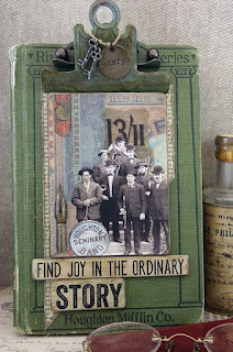
Ordinary Story

January 21, 2018

Never Change


I used the back page from some vintage sheet music for this tag's background--MCMXIX (or 1919) means the song is 99 years old and I suspect that the paper is nearly the same age.

I didn't encase it (coat with clear medium to protect) so I had to be really careful as I worked with it but I wanted to preserve the softness of the paper and it's natural vintage tone. I didn't have to rub very hard to apply the Distress inks I used to tint it which was a good thing!

The birds were stamped then cut from more vintage paper (a book page) and that's some Small Talk (Idea-ology) text.

I'm linking to the Birds of a Feather theme at Simon's Monday Challenge Blog. I won the $50 gift card last week which proves the old saying, if you don't play you can't win. Thanks Simon!!

Now I'm off to buy a lottery ticket.

January 14, 2018

According to Value


Value is defined as the relative lightness or darkness of a color. It is an important tool for the designer/artist, in the way that it defines form and creates spatial illusions. Contrast of value separates objects in space, while gradation of value suggests mass and contour of a contiguous surface. (Read more, here.)

Of all the things I learned in art classes, the concept of value has been the most significant and perhaps the most challenging to fully understand and implement. I work at it constantly and it can make a big difference when you get it right.

I thought I'd use this tag (my first for 2018), to explain some steps I took to adjust the values which you might find interesting or useful.
  1. The lady's dress was bright orange and this warm, strong color was too dominant. To adjust the value, I tinted it with transparent blue (Tumbled Glass Distress Marker). Blue is the complimentary color to orange and when you mix compliments, they cancel each other out. So the bright orange now has a more muted value and settles better into the background.
  2. The flowers were very neutral. I wanted them to stand-out more and appear closer (plus they needed some detail) so I tinted them with lines of pink, orange and turquoise gel pens (Gelly Roll Soufflé). Warm colors appear closer, cool colors recede.
  3. The lady was grounded by using a dark tint under her feet (otherwise, she would appear to be floating). It's subtle, but you may also notice that the grey background is lighter near her feet than higher up. This is a way to create a sense of depth. Distance (like on the horizon of a landscape) is imitated with lighter, cooler colors.
  4. And finally, most compositions are best when there is a mix of bright, dark and medium values. Here, it's the dark greys and black text combined with the bright white dots (extra-fine DecoColor paint pen). The remaining elements fall into the medium range.
If this information was helpful or interesting and you'd like to see similar posts in the future, let me know by leaving a comment.

January 11, 2018

Raised by Wolves

Photo is by Bernd Heyden

Collage is an interesting art form. Disparate images pieced together that hopefully, speak to the viewer in some way. Sometimes, the hardest part for me is knowing when to quit so I just go with my gut. I guess that's what everyone does.

A lot of my collages are dependent on what I have lying around at the moment that I grab and decide to include. It is a game of sorts and play has a lot to do with it. "I wonder what this will look like if I put it here?" is the ongoing conversation I have with myself.

So today, may I share another journal page/collage that started from a photo by Bernd Heyden that I was compelled to use. Raised by wolves? You may guess what band I was listening to while making it.

I'm linking to Simon's Monday Challenge Blog, this week's theme is "Winter Blues."

January 06, 2018

Oddly Aggressive


Hello friends and welcome to my first post of the new year--I hope everyone had a good holiday!

At the beginning of the year, I can't help thinking about what I'd like to do different, in my personal life and in my creative life, and that was on my mind as I created this journal page today.

I have a large Dyan Reaveley Dylusions Journal (the pages are 8.25" x 11.5") and instead of filling up the page or doing a two-page spread as per my usual, I tried something new.  I drew a smaller rectangle on just one page to make the format more manageable.


A page of Tim Holtz paper (Memoranda) and some of his tissue wrap (Melange) were used along with a print-out of a vintage photo. The flower garland was made with a stencil and paste medium and tinted with a bit of Black Soot Distress ink.

It was a frivolous and fun way to spend a Saturday afternoon and I'm linking it to Simon's Monday Challenge Blog, this week's theme is Something New.