/* */ Beulah Bee: design tape
Showing posts with label design tape. Show all posts

January 15, 2022

Fashion Backward

Let us resolve, in this new year, to push back against the fashionable narrative. Reality is messy, and it always exceeds our grasp. That is not a counsel of despair; on the contrary. It is rather a call to guerrilla warfare against endlessly repeated banalities and untruths. - John Wilson

 -------------------------------------

To make this tag, I applied a reproduction of a vintage luggage tag (Cavallini & Co.) on a tag cut from a recycled box and used various inks to distress it. The ladies were cut from an image found on the net and they're standing on a strip of Design Tape (Holtz) and a scrap of sewing pattern tissue. The text was typed in Photoshop, reverse printed and applied using my image transfer technique.

As always, I hope this post finds you well and happy and I appreciate your visit.

Until next time, take care.

March 04, 2021

Hallmark

 Journal Page

It's been ages since I made a journal page and thanks to a prompt from Simon's Monday challenge this week, another page in my large Dylusions Journal is complete.

I used a ruler like this one to place my lettering with a black permanent marker.


Then I applied an image transfer which was a challenge due to its large size. It's hard to get them perfect but the imperfections are embraced for the vintage-quality they impart.

I used colored pencils to tint the background, craft paint and Design Tape (Tim Holtz) for the border.

As always, I hope this post finds you well and happy and I appreciate your visit.

Until next time, take care.

February 28, 2021

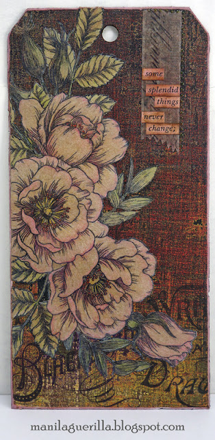
Splendid Things


I'm posting this just in time to link up with Simon's Monday challenge. This week's theme is to make anything but a card so it was a fine time to make a tag.

I've noticed a new greeting card format that's long and skinny and happens to be the same size as a #8 manila tag (obviously without cut corners and a hole on top ☺). I've sent tags through the mail before (I make a custom envelope) but I've never used this format to make a card and plan to try it.

The background for this tag is a scrap from the Abandoned paper stash (Tim Holtz) and the flowers (Simon's Beautiful Flowers) were stamped on kraft paper and tinted with colored pencils before fussy-cutting. The kraft paper gave the flowers a nice vintage vibe.

I used a strip of Design Tape (Tim Holtz), some text cut from a book and there's a tiny bit of Nuvo Crystal Drops along one side of the tape.

As always, I hope this post finds you well and happy and I appreciate your visit.

Until next time, take care.

April 17, 2020

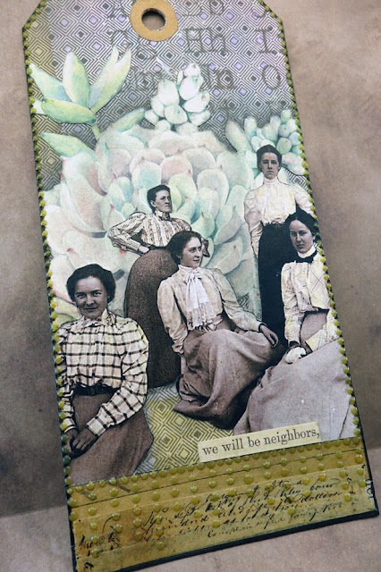
Neighbors


Fortunately, during this pandemic and the stay at home orders, the weather here is suitable for walking outdoors and my neighbors are taking advantage of it.

As I gaze out my window, I am seeing many of them for the very first time!

The "neighborly" text sticker (Tim Holtz) seemed right for this tag made with a printed vintage photo that was cut-out and pasted over succulent plants cut from scrapbook paper (Kaisercraft).


I'm linking this up with Simon's Monday challenge blog because many succulent plants start with the name Echeveria and this week's theme is the letter E.

As always, I hope this post finds you well and happy and I appreciate your visit.

Until next time, take care.

January 30, 2020

Love Everything


Hello friends, today I'm sharing a greeting card crafted for Valentine's Day. It was made using an image altered in Photoshop before printing, trimming and pasting to my card.

If you're curious what I mean, here's the before/after using a filter called "poster edges."


I cut a paper heart and tinted it with Distress Oxides (Candied Apple and Worn Lipstick), the background was stamped with script and gesso applied to knock it back, washi tape was used to visually anchor the image and a border was cut from striped paper.

I'll mention a very useful (non-digital) technique for altering the color and texture of any image which is scratching the surface with the point of a knife to create lighter areas which can be tinted with color. Here's a close-up to illustrate:


The sentiment stamp seemed perfect for this image and it's one of Simon's from a set called Delicate Flowers. I'm linking this post to their Monday challenge blog because this week's theme is "All Loved Up."

I hope this post finds you well and happy and I appreciate your visit.

Until next time, take care. 
May 22, 2019

Miss Trudy


I'd sure like to know the story behind this lovely little girl but for now, I'm calling her Miss Trudy. She's a Tim Holtz Paper Doll and I stained her clothing with the ink from gel pens (scratching the darker areas a bit to lighten and texturize).

The background was stenciled (Tim Holtz Dot Fade) and I stamp embossed the border using a vintage rubber stamp (1996) by Hero Arts called Violet Border. I am featuring this stamp as part of the company's 45th anniversary Show & Tell celebration for a chance to win their monthly kits.


I am so glad I dusted it off and set about putting it to work as I'd forgotten just how useful this stamp can be!

My tag was colored with Distress Oxides, some gel pen ink and a bit of colored pencil. The bench was made out of washi tape.

I had a lot of fun with it so it's no coincidence that I chose this particular Remnant Rub for the text!


I'm linking up to the Hero Arts Show & Tell Celebration and also to Simon's Monday challenge because this week's theme is Use Stencils.

August 11, 2018

It's Tape


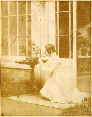
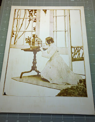
This is made with tape--washi/design tape, whatever you want to call it, placed in strips or torn into pieces and, where there were windows, covered over with tissue paper.

What could possibly have inspired me to do this?! It started with a photo found on the net (thanks, Vintage Everyday).


After printing, I began to cut away sections and then set it away for awhile, not sure where to go with it but I knew collage would be a part of it.


Then along came a prompt from Simon's Monday Challenge Blog where this week's theme was to add some tape to whatever you make.

Okay, so I went a bit overboard but it was an interesting personal challenge and if I ever use this technique again in a more serious way, I did learn how to best manage the properties of the tape (slick surfaces, sealing, etc.).

I won't share them with you as I doubt anyone would ever do something as crazy as this.

July 04, 2018

February 13, 2018

Heartfelt Friendship


A Valentine's Day tag? Sure! Why not? I'll be sending this to my dear friend, Thelma, who got me started in paper crafting and always makes her Valentine's Day cards special with a commemorative postmark from Loveland.


I'm linking this to a special Simon Says Stamp blog post, Send a Card to a Friend Day (for a chance to win a $100 gift card--whoo-hoo!).

Supplies used: Authentique Classique "Pretty" paper, tinted paper doilies, washi tape, Scribbles, a white Gelly Roll pen and Idea-ology design tape (Chatter).

January 14, 2018

According to Value


Value is defined as the relative lightness or darkness of a color. It is an important tool for the designer/artist, in the way that it defines form and creates spatial illusions. Contrast of value separates objects in space, while gradation of value suggests mass and contour of a contiguous surface. (Read more, here.)

Of all the things I learned in art classes, the concept of value has been the most significant and perhaps the most challenging to fully understand and implement. I work at it constantly and it can make a big difference when you get it right.

I thought I'd use this tag (my first for 2018), to explain some steps I took to adjust the values which you might find interesting or useful.
  1. The lady's dress was bright orange and this warm, strong color was too dominant. To adjust the value, I tinted it with transparent blue (Tumbled Glass Distress Marker). Blue is the complimentary color to orange and when you mix compliments, they cancel each other out. So the bright orange now has a more muted value and settles better into the background.
  2. The flowers were very neutral. I wanted them to stand-out more and appear closer (plus they needed some detail) so I tinted them with lines of pink, orange and turquoise gel pens (Gelly Roll Soufflé). Warm colors appear closer, cool colors recede.
  3. The lady was grounded by using a dark tint under her feet (otherwise, she would appear to be floating). It's subtle, but you may also notice that the grey background is lighter near her feet than higher up. This is a way to create a sense of depth. Distance (like on the horizon of a landscape) is imitated with lighter, cooler colors.
  4. And finally, most compositions are best when there is a mix of bright, dark and medium values. Here, it's the dark greys and black text combined with the bright white dots (extra-fine DecoColor paint pen). The remaining elements fall into the medium range.
If this information was helpful or interesting and you'd like to see similar posts in the future, let me know by leaving a comment.

January 11, 2018

Raised by Wolves

Photo is by Bernd Heyden

Collage is an interesting art form. Disparate images pieced together that hopefully, speak to the viewer in some way. Sometimes, the hardest part for me is knowing when to quit so I just go with my gut. I guess that's what everyone does.

A lot of my collages are dependent on what I have lying around at the moment that I grab and decide to include. It is a game of sorts and play has a lot to do with it. "I wonder what this will look like if I put it here?" is the ongoing conversation I have with myself.

So today, may I share another journal page/collage that started from a photo by Bernd Heyden that I was compelled to use. Raised by wolves? You may guess what band I was listening to while making it.

I'm linking to Simon's Monday Challenge Blog, this week's theme is "Winter Blues."