/* */ Beulah Bee

April 11, 2016

No Trouble


I'm a Guest Designer for April at the Simon Says Stamp Monday Challenge Blog and if this is your first visit here--hello and welcome!


This week's challenge is Rain and/or Flowers and I'm super excited to feature one of the new Tim Holtz stamps for 2016 called Sideshow. 

According to Tim's blog (CHA 2016 Stampers Anonymous Sneak Peak), he discovered some mixed-media art, fell in love with the designs and purchased them to turn into stamps.

I too, fell in love and knew this set was a "must-have." This is my first time using them and since the man with umbrella/raindrops is perfect for this challenge, I had no trouble completing it!

I stamped the image on a dark blue page from Tim's new paper stash called Dapper using ColorBox Frost White pigment ink and Ranger's super-fine white embossing powder.

I used Ranger's Red Geranium archival ink to stamp text in different directions along the left hand side to fill-in the background.

I pasted on vintage postage stamps using Perfect Paper Adhesive (great product), stamped some numbers (which also came with the set) using Ranger's Cobalt archival ink and used Gelly Roll Souffle pens to emphasize and add color to the lines and text on the paper.

The pens work well for adding accents because they write on most surfaces (even acrylic paint/mediums) and provide a nice, dimensional quality.

I felt the man was a little too bright so I dimmed down the white embossing by applying a transparent layer of color using Old Paper ink from a Distress marker mixed with PPA which can also be used as a medium.

The ink helped with my values and also brought out an interesting texture in the embossing that was a side-benefit I hadn't planned on.

I look forward to using this stamp set for other projects--the design and style just invite creativity and I think they will prove to be very versatile. And I'm happy to have a stamp that's a little different from the standard fare!

----------------------------------------------------------------------------------

I really hope you'll join us for this week's challenge.

I want to see what inspires you!

And when you upload your creation to the Simon Says Stamp Monday Challenge Blog you'll have a chance to win a $50 voucher at the Simon Says Stamp store!


Here is a list of the products I used this week which can be purchased at Simon Says Stamp:


April 04, 2016

Today


I've been invited to be a Guest Designer for April at the Simon Says Stamp Monday Challenge Blog and if this is your first visit here--hello and welcome!


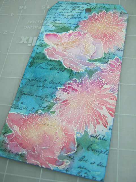
Our challenge this week is to use a resist technique and I chose embossing powder which works great with watercolor but I also wanted to alter the fine lines of my stamping. So here's the twist...

I cut a tag shape from Arches watercolor paper then stamped my flower shapes (Tim's Flower Garden Stamp Set) with ColorBox white pigment ink and sprinkled on Ranger's Ultra-Thick Embossing Powder.

Since this powder has chunky bits, I embraced this feature and encouraged some to fall off with extra tapping before it was heat-set to create a distressed appearance.


For a quick way to make a mask, I used wax paper and a graphite pencil to make a rubbing of the embossed surface.


I trimmed the mask along the edge outline and it was used to cover the flowers so I could stamp some background text (Tim's Ledger Script) with Ranger archival ink.


I applied water over the entire tag surface and let it soak in a bit before adding paint. This way, the colors run together creating natural blends and it prevents hard edges. The embossed lines make it easy to control and contain the paint.


It's optional, but I prefer to iron-off the embossing as a final step to even-out the surface and get rid of the shine. I use an old iron (dedicated to crafting) to re-melt the embossing while it is covered with newsprint (it has the best absorption). Pull the paper off immediately after applying heat because once it's cool the paper might stick.


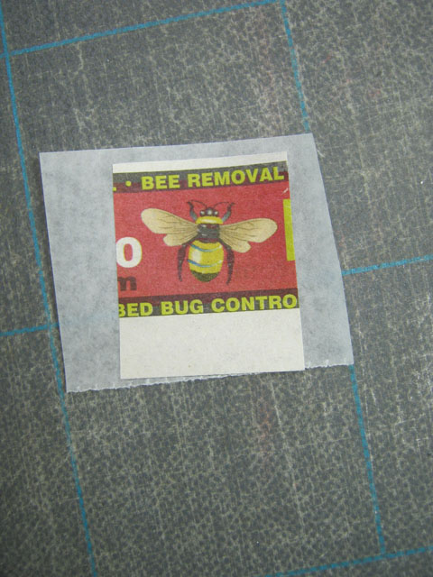
My stash of bee stamps is limited (what?) so I clipped an image from a newspaper advertisement and since the paper is flimsy I pasted it to some strong tissue, encased it with acrylic medium then cut it out.


I made some adjustments to the paint colors (added some stems and a bit more green), stitched tinted Lace Trimming along the side, added dots of dimensional paint and a Small Talk sticker.

The tag edges were darkened and I splattered watered-down white paint over the surface with finger flicks.

I'm happy with the mottled appearance and would recommend this resist technique if you want to give your stamped images a new vibe--distressed or otherwise.

----------------------------------------------------------------------------------

I really hope you'll join us for this week's challenge.

There are many resist techniques and I want to see what inspires you!

And when you upload your creation to the Simon Says Stamp Monday Challenge Blog you'll have a chance to win a $50 voucher at the Simon Says Stamp store!
https://www.simonsaysstamp.com/

Here's a list of the products I used for this challenge which can be ordered from Simon:


March 23, 2016

La Cucina


(Per Schiassi e Scarpelli)

My cooking skills have improved with practice over the years but in the early days of my marriage I felt like a child in the kitchen. My husband is Italian and no one cooks like his Mama!

The stamp used for this tag was found at a garage sale and seems very old (I think it may date back to the 1970's) and while I wasn't sure I'd ever use it, I was drawn to the image (perhaps because of my history?) and the price was right so I bought it.

With this week's theme of Food and/or Drink at Simon's Monday blog challenge I thought now would be a great time to use it.


I began with a page from an old cookbook which is now hard to see due to the many layers of distressing I used to make the walls look like old plaster. The floor, window and sign were hand-drawn, the bird was stamped and I placed a bit of washi along the sides of the window for trim.

Buon appetito!