/* */ Beulah Bee: June 2018

June 24, 2018

Penny Farthing


A journal page to share with you today made for Simon's Monday challenge--this week's theme is "Transport It." It was a chance to embrace my passion for collage and to try out a new addition to my craft stash--Idea-ology Plain Collage Paper (Tim Holtz).


Over the years, I have amassed a sizeable collection of images taken from old picture books (no worries--they were destined for the trash) and it was a pleasure to find the material I used for the background.

I also used an image from the net that was fussy cut and pasted over the top. The foreground paper is from Tim's French Industrial paper stash. The text is a Tim Holtz Clippings Sticker.

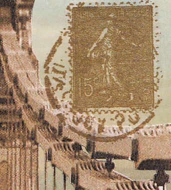
The Plain Collage Paper was used to stamp the typewriter keys (Tim Holtz Documented) and also the postage stamp (Hampton Art 2010).


Here's a close-up view and you can see how transparent this collage paper can be. I find it superior to other tissue papers I have used in the past and know I will get a lot of use out of it. There are also printed versions with flowers, birds, and script.

In case you are wondering, a penny farthing is a high-wheeled bike and I suspect the driver of the motorcycle with sidecar may have been the photographer.

That's the Hammersmith Bridge, London in 1900. The city skyline is Florence, Italy, and the postage stamp and the stamped script (Inkadinkado) are French. Now that's traveling!

June 22, 2018

Lina Cavalieri

Click on photo for larger, lightbox view

Someday I should start saving all my tag experiments gone bad so that you can see how this format is really meant to be my chance to try new things and to learn from my mistakes.

Occasionally, I get it right (in my mind, anyway) and those are the tags I blog about. This one, in particular, is a good example of what I'm talking about.


I wanted to try a variation of this Tim Holtz technique using a new stamp called Beautiful Flowers by Simon Says Stamp. It's a process of embossing, painting in the areas with acrylics, and then wiping the lines clean.

The paint I used was initially transparent so variations in flower color are due to the background (an image transfer over a book page) showing through. I applied another layer of a more opaque color on the flowers near the top to achieve more uniformity.

It was easy to lift paint off the embossed areas even after the paint was dry and I'll definitely try this technique again.


I thought the play of text and page margin under the face would be interesting but it was too severe so I applied a strip of Tim Holtz Tissue Wrap along the edge to soften the contrast.

To balance out the bottom I added text with texture paste and a homemade stencil. The paste was white. I've learned from experience that it's almost impossible to tint the paste black before you apply it because the best you can expect is maybe a dark gray.


So I took a teeny-tiny paintbrush dipped in black ink and painted the texture paste after it had dried. I've never tried tinting the paste with ink instead of paint so maybe I'll give that a go on a future tag. I also wonder if there's a black texture medium that you can buy?

June 13, 2018

Precious Things


What to do, what to do...

I can't bring myself to use the papers included in this month's Simon card kit because they are just too pretty! Seriously.

And I couldn't bear to cover up the background of a tag made with a new embossing folder (Tim Holtz 3D Botanical) because it was just too pretty, too!

So I tried to think of a design where I could leave most of it showing and here's what I came up with.


I really played around with distressing the background. I embossed a rather thin piece of pink paper (after slightly damping it first) and then I gave it a coat of Krylon clear matt finish to seal and protect it.

Then I went crazy with gesso, inks, and paints--brushing on, wiping off (and even a little bit of sanding), just to see what worked the best to bring out those glorious embossed details.


Who could blame me for not wanting to cover this beauty up?!

The girls are Paper Dolls (Tim Holtz) and the butterflies came from the Graphics Fairy which I printed in miniature on vellum and then cut out.


Some tiny jewels (tinted with alcohol ink), a scrap of vintage sheet music, a Remnant Rub (text) and a border made with dots of Liquid Pearls were also used.


I tinted the Paper Dolls with transparent acrylic paint and the white of the pearls and lace were made with a Gelly Roll pen. I had a tiny butterfly that was just the right size for sitting atop the little girl's hair bow.

I'm linking this up to Simon's Monday Challenge Blog, this week's theme is Anything But A Card.

Now, what to do about those pretty papers...

June 07, 2018

Bright & Beautiful


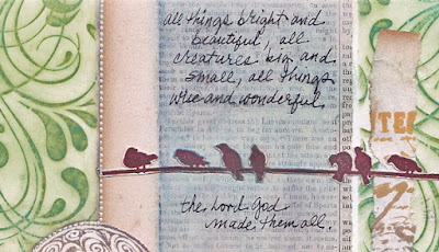
This week I learned that "all things bright and beautiful" is the first line of a poem/hymn written in 1848 by Mrs. Cecil Alexander whose published work was called Hymns for Little Children.

I've also spent the week converting wood stamps to cling mount and testing them (a project not for the faint of heart).

So to take a break and to link up with Simon's Monday challenge, I used various stamped "test" remnants along with an old book page, a vintage photo and some washi tape to create a collaged journal page.


I also had to try a technique I discovered this week where you stamp with Distress Oxide ink and then smear it just a bit with a blending tool. The page border was created this way and I have Stacy Hutchinson (via Tim Holtz) to thank for sharing this tip.


Stamp credits: Inkadinkado, Tim Holtz, Penny Black