/* */ Beulah Bee: vellum
Showing posts with label vellum. Show all posts

May 04, 2015

Devil or Angel?


My entry for Tim's May tag features a snapshot from the Idea-ology Photobooth strips along with pieces from the vellum Expedition ephemera pack, a metal number brad and the School House stencil.

I thought I'd share a few tidbits regarding my distress techniques rather than provide a step-out since Tim's got that covered.

Click to Enlarge

I distressed the photo by peeling off the back so it would be thin enough to scrunch then flattened it out, pasted the backing back on and inked the edges.

A liberal amount of water was used with red brick and iced spruce to tint the texture paste and background. Naturally, the tag warped a bit so I flattened it out with some heavy books overnight.

There's adhesive-backed metallic mesh behind the photo and I used text rub-on's for the question marks. I also wanted the hole reinforcement on the tag to show so I cut my background papers around it.


I used a typewriter for the text on the shield. To insert it into the machine, I used washi tape to temporarily fix it to a larger piece of paper.

I distressed the shield with sand paper and tinted the edges with colored pencils.

I removed the tabs from the number brad then flattened it out with a rubber mallet. I darkened the numbers a bit with a fine permanent marker.


To tone down the color of the arrow which was originally a very bright orange-red, I used a colored pencil in a complementary color, blue-green (which is opposite orange on the color wheel).

This is a good trick to become familiar with when going for a distressed look because adding a color's complement is a proven way to tone down the original hue by reducing it's intensity.

To paste the arrow, I marked off where it would be then scraped away the stenciled letters underneath so it would lay flat on the background.


Well, I think that's everything and once again, I enjoyed the challenge of this month's tag.  Tim sure did pull out all the stops this month and I hope you are inspired to create something too!

February 09, 2015

Best Day Ever


All the paper bits for this tag came from Tim's Crowded Attic paper stash. His February tag features a collage theme so I cut and distressed the background like he demonstrated.

For embellishments, I used Crackle Accents on the frame edge, an Ephemera Pack label, Remant Rubs, a small Arrow Adornment, a Number Brad, washi tape and some gingham ribbon.

Here's a tip about the Ephemera Pack label: They are made with vellum and are semi-transparent but I painted the backside with white acrylic to alter its appearance.

I also used a touch of gold paint on the arrow and brad and filled in the number with red.

Best day ever? For me it's this Saturday when my husband and I will celebrate our 34th wedding anniversary.

Happy Valentine's Day!

December 18, 2014

Believe


Tim introduced a new product this month called "Frosted" during his December tag tutorial.  It looks interesting and I hope he demonstrates other uses for it in future posts.

I substituted old-fashioned drafting vellum for my background and text by using the Falling Snow stencil (Simon Says Stamp) and a section from Tim's Christmas Words stamp along with some embossing ink and powder to create a similar effect.

The reindeer was embellished with Perfect Pearls and you may recognize the leaves from Tim's Wallflower paper stash. The number 25 is an Idea-ology Plaquette.

I'd like to share an embossing technique seen on the leaves as it comes in handy when you want fine details and better control.

Click to Enlarge
I used a gel pen to draw in the areas I wanted to emboss. In this case, it was the veins on the leaves.

The ink stays wet long enough to apply embossing powder. I used various pen colors and clear powder in this example.

December 13, 2013

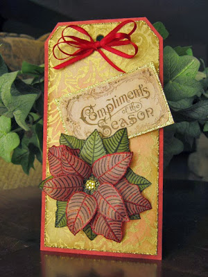
Compliments of the Season


tag, Christmas

The best part of making cards and tags at Christmas--you can never have too much glitter!

This tag was made by pasting gold-printed mulberry paper (Black Ink brand) on a manila tag, color was added with Distress inks, it was mounted on pinkish-red card stock and glitter was placed around the border.

The poinsettia was made by printing a page of leaves on vellum which were cut out after painting the back side. The leaf edges were embellished with glitter and diamond bling was used for the center.

The greeting (an image from Graphics Fairy) was pasted on card stock and it also received some glitter. A simple red bow became the topper.

I think the best feature of this tag is the gold-printed mulberry paper. I never tried using it with Distress inks but I applied it gently (the paper is soft and thin) and it helped break up all that gold and gave it an antique-like quality.

My inspiration came from the Tim Holtz December tag and Simon Says Stamp Monday blog challenge, which was tissue paper.