/* */ Beulah Bee: watercolor
Showing posts with label watercolor. Show all posts

October 15, 2019

This Happy Life


Thanks to Columbus, I had the day off yesterday and an opportunity to make something for Simon's Monday challenge (this week's theme is "Pink").

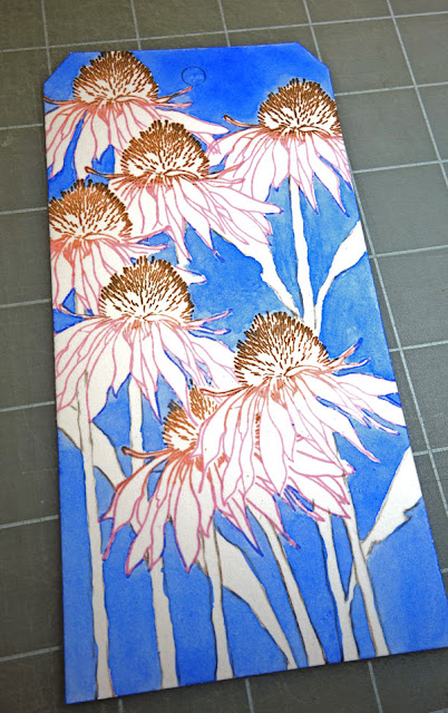
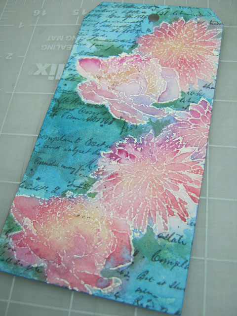
Nothing says pink like a coneflower so I made this tag by stamping on watercolor paper (Tim Holtz Flower Garden), the text is an old Remnant Rub, and the border was machine-stitched and dotted with Nuvo Crystal Drops.

Just a few things, technique-wise, that you might appreciate:


I'm sure you've seen the "no-line" technique when it comes to stamping an image that you plan to watercolor using a light shade of dye (water-based) ink so the lines disappear. But I like the lines! So for this tag, I stamped with archival inks using a pink, a tea stain, and a dark brown shade. The lines darkened somewhat after the watercoloring was applied.


Obviously, I had to do some masking to stamp this arrangement. But I didn't use the stems that come with the set and drew them on instead.

The photo above shows how I painted the background first using a juicy puddle of cobalt blue.


The bee was an after-thought. It was stamped onto a piece of tissue paper, cut-out, pasted on and then I dabbed a tiny bit of yellow paint on to its body.

It's also worth mentioning that I prefer to use a "hot-press" version of watercolor paper when I plan to stamp on it. Cold-press has bumps that I think make it harder to get a crisp image.

If you haven't tried watercoloring with rubber stamps, I can tell you it really is a lot of fun and very rewarding. Go for it!

August 02, 2018

Colibri de Costa


Wild thing, you make my heart sing...

I have a hummingbird feeder right outside my window that I keep filled year-round. The most frequent visitors are Costas. They are very small (less than 3 inches) and I am amazed how they can survive the extreme temperatures and monsoon storms during this time of year.

So this is the "wild thing" I chose for this week's theme at Simon's Monday Challenge Blog.


I traced the outline from a photograph and used watercolors on a blank watercolor postcard.

The male hummingbird has an iridescent purple gorget (throat patch) that flares out along the sides of the neck like a mustache. I wish I'd had iridescent paint but I could go over it with some Perfect Pearls if I wanted to duplicate this effect.

If you are shy about watercolors, you might be more comfortable working with a small format as I find it easier to manage. All you need is a tiny brush.

May 27, 2018

Thanks ...


After working on this card, I now have new respect for the challenges that this art form presents and for the artisans who make it look so effortless.

Mixed-media? No problem--you can just paint over a part you don't like. Card making requires more planning and if you make a mistake sometimes you just have to start over.

But practice makes perfect, right? So I plan to do just that and purchased the June Card Kit from Simon Says Stamp. It features a lovely stamp set called Beautiful Flowers and I have used it for this card.

The kit came with three dots (red, yellow, blue) of an artist-grade watercolor paint from Daniel Smith and this was the only paint I used to tint this stamping.

Using the science of complimentary colors becomes critical in this scenario because you must tone down the primary pigments for the colors to look more natural.


The border was made with kraft paper using the new Tim Holtz 3D embossing folder called Botanical (also included in the kit) and machine-stitching provided some accent.

Otherwise, it's a bit of a plain jane but I didn't think it needed anything else since the flower image is such a show stopper. Thanks to this new stamp set, I now have some sentiment stamps that I was sorely lacking which will help me with my new quest in card-making.

March 14, 2018

Limited Edition


Inspired by a mood board for Simon's Monday challenge this week, I have created a tag that is a very literal translation. But I just couldn't help myself as something about a cracked egg as a vase for flowers resting inside a tea cup really spoke to me.

I didn't have a tea cup stamp so I printed an image of one and the flowers were cut from the Wallflower paper stash. The background stamp is by Heidi Swapp, the tinting is Walnut Stain Distress Oxide and regular Distress Bundled Sage (on watercolor paper) and the text is a Remnant Rub.

December 03, 2017

12 Tags for Christmas 2017 - Season's Greetings


Tag three of my 12 for this year's Christmas was an experiment using a hand-made stencil patterned after the original rubber stamp. I like to use Yupo for my stencil material because it is strong, waterproof and cuts like butter.


After pasting on a background of old book paper, I used thin white acrylic paint and the stencil to make a random pattern then stamped over the stenciled areas once the paint was dry.

I didn't worry too much about accuracy and you'll see places where the two (stencil and stamp) don't meet. But that's okay because the variations added interest in color and line.

My tints mainly came from Distress Oxides (lipstick and pistachio). I also used a light wash of white acrylic and a few watercolors, where needed, to adjust some values.

Platinum Stickles and Tim's Tissue Tape created a border that was darkened next to the inside edges with a bit of charcoal pencil.


Stamp credits: Penny Black Christmas Star, Echo Park Christmas Sentiments

April 05, 2017

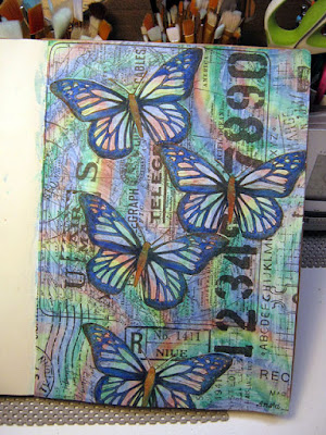
Blue Butterflies


Ready?


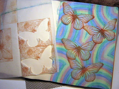
Rainbow stripes drawn with watercolor brushes (Dollar Store)
then covered with light gesso wash.


Butterflies stamped on deli paper with sepia archival ink and cut out.


Butterflies pasted to page using glue stick.


Butterfly wings filled-in with blue watercolor brush
and outlined with black gelly roll pen.

Butterfly outlines traced onto Postale tissue wrap and cut out.


Tissue wrap pasted around butterflies using fluid medium.


Blossom stencil and white paint used to fill-in around the page.


Blossoms tinted in random areas with Distress ink.

I'm linking this journal page to Simon's Monday challenge blog.

Who knew rainbows could be so inspiring?! 

December 21, 2016

12 Tags for Christmas - November

Click for Larger View

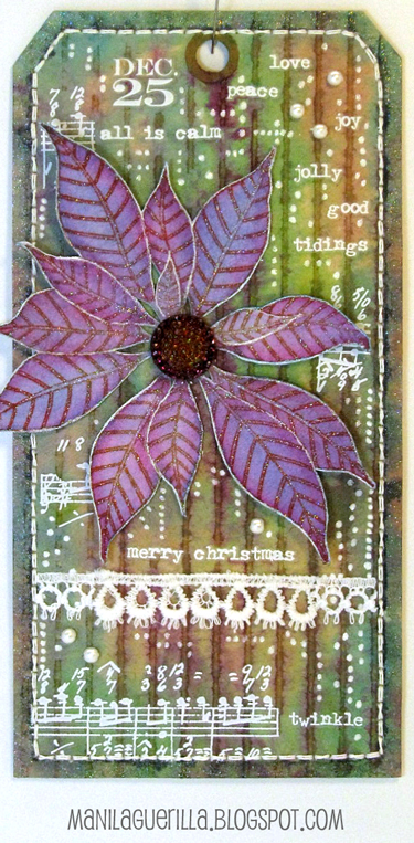
Tim's November tag was a lesson in using Remnant Rubs as a resist and dimensional coloring. As with my original tag and again for this one, my rubs didn't resist in the same way Tim's did. I'm not sure why but think it may have something to do with how absorbent the background paper is.

My background is a little out-of-the-box in that I used a piece of delaminated cardboard (made by soaking it with water then peeling apart the layers). I like how it took the various stains I applied and puddled around the cardboard lines.


I used the white version of Tim's Christmastime Remnant Rubs, filled-in the background with random dots made with a Gelly Roll pen and added some vintage lace and a few seed pearls. The tag borders were hand-stitched with thick white thread after punching the holes on my machine.

I stamped my poinsettia (Penny Black, Christmas Star) on watercolor paper using red archival ink then tinted it and filled in the lines with some glitter paint. To make the flower coordinate more with the rubs I outlined the petal edges in white. The center is a Gumdrop tinted with Butterscotch and Wild Plum alcohol inks.

I have one more tag to go but don't expect to complete it before Christmas Day so with this post, I'm sending you my very best wishes for a safe and peaceful holiday that's full of good cheer!

December 09, 2016

12 Tags for Christmas - August


Gosh, I'm having a hard time sticking to Tim's monthly techniques--it seems unfair to even call this one "August." You may recall that I'm making Christmas versions of his monthly tags and I'm resolved to the fact that I just don't have the stash to pull it off.

Still, it's the inspiration that gets me started and narrows down my choice of materials and I'm always happy for the nudge in a direction I might not have considered before.

This one started with a brayered stain background that didn't work with the stamps I wanted to use so I turned it solid using Seedless Preserves (such a strong color--it will cover up almost anything).

The stamping (Inkadinkado Evergreen Holiday) was done on watercolor paper using Sepia archival ink then tinted with watercolors and Gelly Roll pens.


I cut out the negative spaces so the background would show through then embellished with machine and hand stitching, some Liquid Pearls, Rock Candy Stickles and Lace Trimmings. I felt the lettering needed more contrast so I outlined them with a fine-line marker.

November 24, 2016

Platinum Blondes


Kismet: When you're browsing through web feeds and come across a photo that inspires you to create and it just so happens the theme at Simon's Monday blog challenge is using three of anything!

I haven't watercolored in awhile and thought I'd give an ink and tempera resist technique another try, this time using a tag, hoping the smaller format might be more manageable. It was.

September 26, 2016

Toxique

Everything about this creation is unconventional and you may not care for it. However, my experimentation here illustrates some unusual techniques that may be of interest so I've decided to share it.


I began by using watercolor on watercolor paper. I stamped on some Plain Tissue Wrap (the hand and face with circle/lines). I cut out some gear images from some Tissue Tape. I used a home-made circle stamp and filled one of them in with some dot-stamped tissue wrap.

I wondered what it would look like to draw white lines with a Gelly Roll pen throughout the background. Then I sharpened the circle edges and added some dots with my black and white pens.

But it wasn't big enough to be a tag so I mounted it on some grey cardstock with stitching.

Now what to do with the empty space on top? I stamped and then embossed some black dots and added the white ones with a gelly roll.

I brought out the whites of the lady's eyes with a Picket Fence Distress Marker.

I think it's interesting that you can't really tell what's tissue wrap or tape when you compare the look with the stamped circles (where the watercolor paper is completely exposed).

For collage work, the tissue wrap is really useful and I have a tip: There is a subtle difference between the front and back surfaces--one side is slightly smoother and stamping on that side seems to give me the best results.

I really don't know what to make of my subject matter except to say that maybe it reminds me to wash my hands to avoid germs? I think I'll link it to Simon's Monday challenge blog (this week's theme is embossing "powder power") just to remind them too :)

April 04, 2016

Today


I've been invited to be a Guest Designer for April at the Simon Says Stamp Monday Challenge Blog and if this is your first visit here--hello and welcome!


Our challenge this week is to use a resist technique and I chose embossing powder which works great with watercolor but I also wanted to alter the fine lines of my stamping. So here's the twist...

I cut a tag shape from Arches watercolor paper then stamped my flower shapes (Tim's Flower Garden Stamp Set) with ColorBox white pigment ink and sprinkled on Ranger's Ultra-Thick Embossing Powder.

Since this powder has chunky bits, I embraced this feature and encouraged some to fall off with extra tapping before it was heat-set to create a distressed appearance.


For a quick way to make a mask, I used wax paper and a graphite pencil to make a rubbing of the embossed surface.


I trimmed the mask along the edge outline and it was used to cover the flowers so I could stamp some background text (Tim's Ledger Script) with Ranger archival ink.


I applied water over the entire tag surface and let it soak in a bit before adding paint. This way, the colors run together creating natural blends and it prevents hard edges. The embossed lines make it easy to control and contain the paint.


It's optional, but I prefer to iron-off the embossing as a final step to even-out the surface and get rid of the shine. I use an old iron (dedicated to crafting) to re-melt the embossing while it is covered with newsprint (it has the best absorption). Pull the paper off immediately after applying heat because once it's cool the paper might stick.


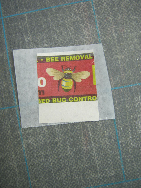
My stash of bee stamps is limited (what?) so I clipped an image from a newspaper advertisement and since the paper is flimsy I pasted it to some strong tissue, encased it with acrylic medium then cut it out.


I made some adjustments to the paint colors (added some stems and a bit more green), stitched tinted Lace Trimming along the side, added dots of dimensional paint and a Small Talk sticker.

The tag edges were darkened and I splattered watered-down white paint over the surface with finger flicks.

I'm happy with the mottled appearance and would recommend this resist technique if you want to give your stamped images a new vibe--distressed or otherwise.

----------------------------------------------------------------------------------

I really hope you'll join us for this week's challenge.

There are many resist techniques and I want to see what inspires you!

And when you upload your creation to the Simon Says Stamp Monday Challenge Blog you'll have a chance to win a $50 voucher at the Simon Says Stamp store!
https://www.simonsaysstamp.com/

Here's a list of the products I used for this challenge which can be ordered from Simon:


December 06, 2015

12 Tags for Christmas - July


I can't pick a favorite from my 12 Tags for Christmas series (inspired by Tim's monthly tags for 2015) since I haven't made a December version yet but this tag, for the month of July, is a top contender.

Why? I would never in a million years have combined Santa images from three of his Christmas collage stamps in this way but did so to mimic the theme from July which featured three watercolored blueprint stamps. And I think the result is pretty awesome (if I do say so myself ☺).

Using a page from his Merriment paper for a background, the stamped images were embossed and tinted. The number 25 is a cut-out from that same paper line and the cents symbol was covered up with an Ideaology star tinted with alcohol ink (click to see a close-up). 
When it comes to creating flesh tones, I find that a combination of red, yellow and violet works pretty well. And since my watercolor paper is a bit on the heavy side, stitching the images to the tag is a good way to secure them and adds another level of interest.

I can't wait to attach it to a package for my great-nephew who happens to be the biggest Santa fan in the family this year.

December 01, 2015

12 Tags for Christmas - April


The emphasis for Tim's April tag this year was on using a watercolor technique along with a clever way to assemble a word band insert using kraft paper.

My holiday version features a poinsettia stamp by Penny Black and I didn't use a die-cut for the text-- it was stamped and embossed instead (Tim's Christmas Words).

And it just wouldn't be as Christmas-y without some bling so I applied gold Stickles on the border and used black 3-D Scribbles for accent.

I really like this one--it's easy to see why using watercolor with stamps has become so popular and starting with a spritzed background really elevates the technique.

In case you don't know about my 12 Tags for Christmas series, this post will fill you in on the why and what for's.