February 04, 2016
Orbital
Simon said "stamp," so I did. Same style/technique as the tag in my last post only this time I added my hand-carved owl stamp.
The drawing was copied from another, similar British Library image--this one came out of a Boston school atlas published in 1831.
Mine is decidedly more colorful.
I will again link to the Monday blog challenge where this week's theme is a ray of sunshine.
February 02, 2016
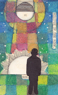
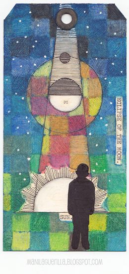
Eclipse
An eclipse cannot exist without a ray of sunshine.
 |
| Click to Enlarge |
Sorry, Simon. While inspired to make this tag from the Monday blog challenge prompt which is ray of sunshine, I didn't use a single stamp in the process.
Instead I drew a diagram I stumbled upon at the British Library Flicker photostream (a favorite place to look for inspiration) and tried out a technique using oil pastels that's been on my to-do list for awhile.
Here's a link to the tutorial, the artist's name is Loretta Grayson.
Oil pastels are fun but messy which is the main reason I don't use them too often. That, and the fact that they resist water-based paints so are less desirable in mixed-media projects. Still, their resist quality can be useful and Loretta's tutorial helps to illustrate that fact.
They have two qualities I really like--they are smooth as butter and the pigments are strong. Here in the US, you can purchase a student-grade box for a reasonable price (I used Cray-Pas). If you've never tried them and like to experiment, then perhaps I've tickled your interest.
January 28, 2016
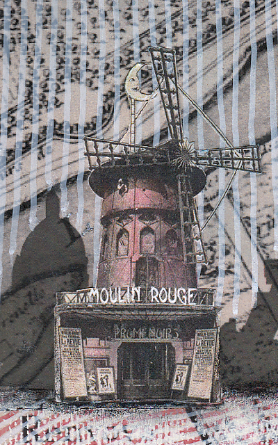
Moulin Rouge
 |
| Click to Enlarge |
The challenge at Simon was simple: "Love is in the air" + red. So ... Paris is known as the city of love and the ladies of the Moulin Rouge (that's French for red mill) are doing did their best to promote it.
I began with an image of a medieval map of Paris and a silhouette of the skyline. And I couldn't resist the Can-Can girls so I looked for an image of the Moulin Rouge to accompany them.
As far as technique goes, I thought I'd explain the background. The map was busy and most often, artists will use a wash of gesso or white paint to blend back an image creating subtlety. But I wanted to try something different.
So I used white and red paint pens to draw lines over the surface of the map and I rather like the effect.
I always try to create the illusion of depth and the vertical and horizontal lines help to achieve this along with using lighter brighter colors in the foreground and darker colors in the back.
The scale of the objects also helps create some perspective since the ladies are larger than the buildings.
In case you are wondering, this is a two-page spread in my large Dylusions journal which is 9" x 11".
Subscribe to:
Posts (Atom)


