/* */ Beulah Bee

December 02, 2017

12 Tags for Christmas 2017 - 'Tis the Season


A page from a Tim Holtz Kraft Resist paper stash was a key ingredient for this, my second tag for Christmas, 2017.

A light wash of white acrylic was used to bring out the resist design. It was embellished with stamped elements (the deer, pine bough, and cut-out holly leaves) along with some burlap ribbon and numbers from a vintage Tim Holtz grunge board collection.

And it wouldn't be a Christmas tag without adding lots of glitter (Gold, Rock Candy Stickles) and that is absolutely my favorite part about making these tags and I can really get carried away with it!

The text that wraps around the arch was made by cutting a strip from a pad of fairly thin paper. It was dampened lightly so I could round the shape before pasting. I used a slow-drying glue that allowed more time/wiggle-room and gently manipulated it to follow the curve.

December 01, 2017

12 Tags for Christmas 2017 - Joy to the World


♪♫ ♪ "On the first day of Christmas, my true love sent to me ..." ♪♫♫♪

Ten years ago today, Tim Holtz began the tradition of blogging about techniques for creating 12 Tags for Christmas and I've continued to make them every year since then to decorate my presents.

This year, I decided to post them in 12 consecutive days beginning December 1st just like he used to do and my first tag features a simple, understated design with an early American or Georgian vibe.

The background is pearly paper with clear-embossed snowflakes (Kaisercraft Frosted) that was tinted with Faded Jeans Distress Oxide.

I coated the book paper die-cuts (Carta Bella Joy Wreath) with Glossy Accents and created additional contrast by using a blue gel pen and a water brush (which soaked in underneath).

I gave the entire surface a wash of dilute white acrylic paint and took advantage of the resist properties of the Glossy Accents by wiping the paint away from the die-cuts where there was overage.


I used a Remnant Rub to complete the phrase and made a frame border with 1/8" silver metallic ribbon (Offray) tinted with off-white acrylic paint.

To age the appearance a bit more, I rubbed on Frayed Burlap Distress Ink here and there and added some Liquid Pearls along the bottom for a touch of Christmas bling.

November 21, 2017

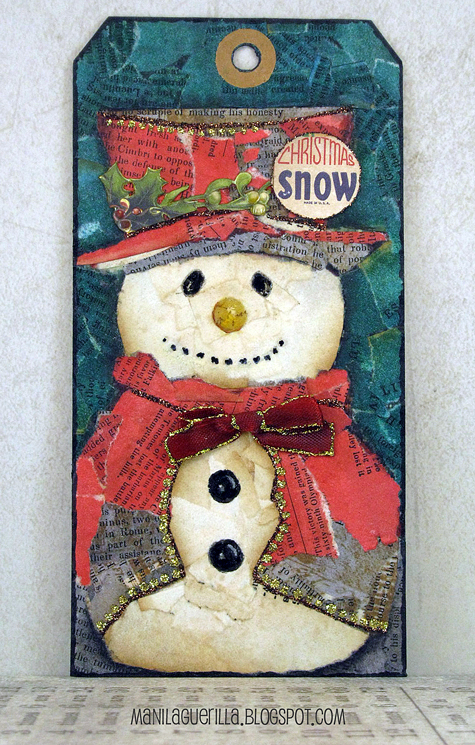
Christmas Snow


I love this tag. And it was EASY to make. Perhaps this post will inspire you to give the technique a try?

Prompted by Simon's Monday Challenge Blog, where this week's theme is torn paper, I began to search for inspiration on the web and kept seeing cupcakes like this one by artist Nancy Standlee.

Her post made me realize that an easy way to start a torn collage is by using an underpainting as a pattern you can follow for matching shapes and colors.

So, using this image as my guide, I tinted several pieces of vintage book paper with red, dark blue-greens, and brownish grays and set out tearing and pasting my pieces down.


The paper on the snowman's face and body is untinted--it is the actual color of this really old paper and the darker areas are the page edges where most of the discoloration occurs.

His hat accoutrements were cut from Tim Holtz ephemera and of course there's lots of Stickles. I also covered the eyes, nose and buttons with Glossy Accents and I'm glad I did.

Making this tag put me in the spirit and now I'm now ready to tackle the job of setting up the Christmas tree!

October 26, 2017

Monochrome


A manila tag, a Halloween stamp set from last year (Tim Holtz), a vintage photo (reduced), Distress Oxide Walnut Stain and Versafine Onyx Black inks were used to create a monochromatic scheme as prompted by Simon's Monday Challenge Blog this week.

I found this to be quite challenging to make. First, I'm still getting used to the oxide ink used for the background's first layer. Then it took several stamping attempts to manage an arrangement of the single house stamp into the fortress you see before you. The Versafine ink is the best for bringing out the details of this really terrific stamp.

A poison label stamp (also from the set) was used for the base of the tag and I varied the degree of shading with a light wash of transparent black and even some diagonal scratching to create more depth and delineation between the two foreground planes.


The ladies came from a terrific vintage photo (source: Vintage Everyday) that I reduced in size before printing. Granted, the scale isn't accurate but I didn't want to lose too many details by making them super small.

I have to say working with a monochrome theme wasn't easy and creating a balance of light and darks in the same color meant thinking outside the box. But, I always appreciate the Monday Challenge prompts as I end up trying things I wouldn't have otherwise--so thank you, Simon!

October 22, 2017

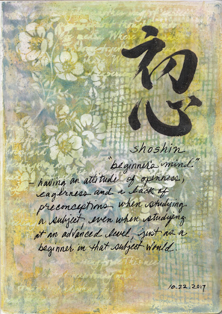
Shoshin


A journal page to share today made with a technique that I'll definitely try again--a combination of Distress Oxide inks using a Gelli Plate, stencils with white paint and creating negative space with colored pencils.

I embellished my background with an image transfer of a shodo (Japanese calligraphy) for the word shoshin which means "beginner's mind" along with my own handwriting to further explain the concept.

The oxides provide a worthwhile alternative to acrylics when working with the Gelli because of the slow dry time.

Using white paint with stencils while the ink was still wet provided variegations and more subtle shades than just pure white.

I carved out some negative shapes here and there and darkened a few areas with colored pencils for further variety.