/* */ Beulah Bee: embossing
Showing posts with label embossing. Show all posts

April 04, 2016

Today


I've been invited to be a Guest Designer for April at the Simon Says Stamp Monday Challenge Blog and if this is your first visit here--hello and welcome!


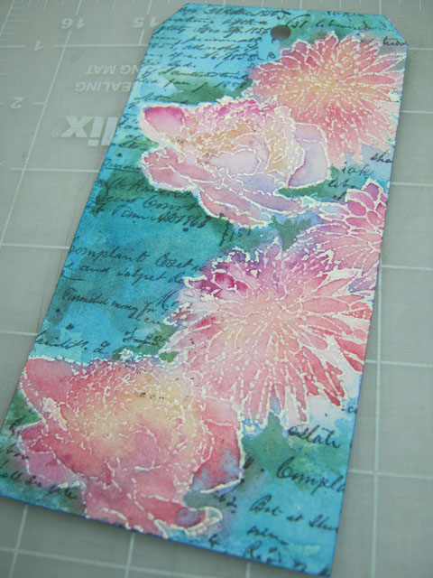
Our challenge this week is to use a resist technique and I chose embossing powder which works great with watercolor but I also wanted to alter the fine lines of my stamping. So here's the twist...

I cut a tag shape from Arches watercolor paper then stamped my flower shapes (Tim's Flower Garden Stamp Set) with ColorBox white pigment ink and sprinkled on Ranger's Ultra-Thick Embossing Powder.

Since this powder has chunky bits, I embraced this feature and encouraged some to fall off with extra tapping before it was heat-set to create a distressed appearance.


For a quick way to make a mask, I used wax paper and a graphite pencil to make a rubbing of the embossed surface.


I trimmed the mask along the edge outline and it was used to cover the flowers so I could stamp some background text (Tim's Ledger Script) with Ranger archival ink.


I applied water over the entire tag surface and let it soak in a bit before adding paint. This way, the colors run together creating natural blends and it prevents hard edges. The embossed lines make it easy to control and contain the paint.


It's optional, but I prefer to iron-off the embossing as a final step to even-out the surface and get rid of the shine. I use an old iron (dedicated to crafting) to re-melt the embossing while it is covered with newsprint (it has the best absorption). Pull the paper off immediately after applying heat because once it's cool the paper might stick.


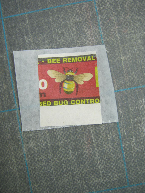
My stash of bee stamps is limited (what?) so I clipped an image from a newspaper advertisement and since the paper is flimsy I pasted it to some strong tissue, encased it with acrylic medium then cut it out.


I made some adjustments to the paint colors (added some stems and a bit more green), stitched tinted Lace Trimming along the side, added dots of dimensional paint and a Small Talk sticker.

The tag edges were darkened and I splattered watered-down white paint over the surface with finger flicks.

I'm happy with the mottled appearance and would recommend this resist technique if you want to give your stamped images a new vibe--distressed or otherwise.

----------------------------------------------------------------------------------

I really hope you'll join us for this week's challenge.

There are many resist techniques and I want to see what inspires you!

And when you upload your creation to the Simon Says Stamp Monday Challenge Blog you'll have a chance to win a $50 voucher at the Simon Says Stamp store!
https://www.simonsaysstamp.com/

Here's a list of the products I used for this challenge which can be ordered from Simon:


January 13, 2016

Remix


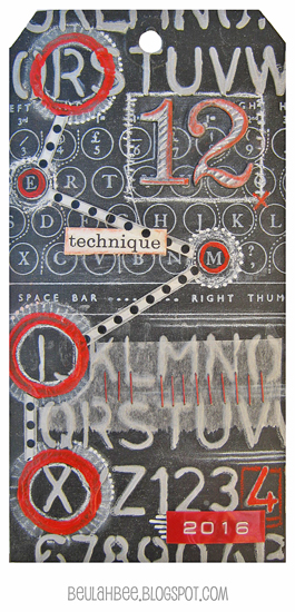
Tim's doing a "Technique Remix" for the 12 Tags of 2016 and this month he features metal embossing and chalkboard stamping. What a combination!

So even though I really tried to use more metal (three tags are in the trash as I write this), the best I could do was pull off the chalkboard look. In spite of my failures it was great fun just to try.

I thought I'd share my discovery for making your own chalkboard paper. Either start with black paper or make your own with paint or black gesso then coat it with what's known as clear gesso.

It's meant to be used mostly for pastel artists who need "tooth" on their surface for the powdery pastels to cling to. It's basically clear acrylic medium with a bit of fine sand mixed in.


First I used Tim's Schoolhouse stencil on a black tag to apply texture paste that was tinted with gray paint. I let it dry, stamped with Tim's Type Keyboard using white pigment ink and clear embossed it.

Then I applied the clear gesso over everything so I could use a white charcoal pencil to give it that chalkboard look.

Remember the grungeboard die-cuts from Tim's early days? That's what I used for the big number 12. Painted with black and clear gesso, they were easy to tint with a red pastel pencil and more white charcoal to keep the chalkboard theme going.

Some circles stamped with red paint, a bit of washi (polka dots), tissue paper and two more design features from Tim's early beginnings--mini staples and Dymo tape (the red 2016) provided the final embellishments.


I may have drifted from this month's remix but embraced what I've learned from following Tim's tag tutorials for such a long time and am excited about this year's new twist. I think it will be great fun to revisit these oldies but goodies.

December 06, 2015

12 Tags for Christmas - July


I can't pick a favorite from my 12 Tags for Christmas series (inspired by Tim's monthly tags for 2015) since I haven't made a December version yet but this tag, for the month of July, is a top contender.

Why? I would never in a million years have combined Santa images from three of his Christmas collage stamps in this way but did so to mimic the theme from July which featured three watercolored blueprint stamps. And I think the result is pretty awesome (if I do say so myself ☺).

Using a page from his Merriment paper for a background, the stamped images were embossed and tinted. The number 25 is a cut-out from that same paper line and the cents symbol was covered up with an Ideaology star tinted with alcohol ink (click to see a close-up). 
When it comes to creating flesh tones, I find that a combination of red, yellow and violet works pretty well. And since my watercolor paper is a bit on the heavy side, stitching the images to the tag is a good way to secure them and adds another level of interest.

I can't wait to attach it to a package for my great-nephew who happens to be the biggest Santa fan in the family this year.

December 01, 2015

12 Tags for Christmas - April


The emphasis for Tim's April tag this year was on using a watercolor technique along with a clever way to assemble a word band insert using kraft paper.

My holiday version features a poinsettia stamp by Penny Black and I didn't use a die-cut for the text-- it was stamped and embossed instead (Tim's Christmas Words).

And it just wouldn't be as Christmas-y without some bling so I applied gold Stickles on the border and used black 3-D Scribbles for accent.

I really like this one--it's easy to see why using watercolor with stamps has become so popular and starting with a spritzed background really elevates the technique.

In case you don't know about my 12 Tags for Christmas series, this post will fill you in on the why and what for's.

November 30, 2015

12 Tags for Christmas - March


This is my holiday version of the March tag from the Tim Holtz 12 Tags of 2015 series where he demonstrated an excellent technique for using gold embossing powder over wet texture paste (and is the only common element here).

Limited in my Christmas stamp choices (remember process versus product), I tried to mask this Tim Holtz collage stamp on a scrapbook paper background which was tinted with Worn Lipstick Distress ink and an aqua Gelly Roll pen.

Can you tell I missed? The outline on the top and left edges of the stamp were filled in with black lines to remedy my poor masking skills.

If you wonder about my color choices I wanted to try using less traditional holiday colors. In hindsight, silver versus gold embossing might have looked better with this scheme.

Just a reminder, you can preview all my 12 Tags for Christmas by using the link on the sidebar.

August 03, 2015

Mariposa


Mexico Moods is the summer challenge at Our Creative Corner and their prompt inspired me to create this tag.

Like my last several blog posts, this one features Souffle Gelly Roll pens. It seems I can't get enough of them and really went overboard this time! They are a bit like paint pens with a fine point and they're very opaque and waterproof.

I began with a black gesso background and stamped/embossed the butterflies and the lettering onto the tag. Next, I traced on a few designs with a pencil and some hand-made stencils.

Then the gelly rolls came out and were used to cover the entire surface with colorful mark making. To modify the values, I did use a glaze of thalo-blue in a few areas (particularly behind the butterflies).

The tag almost has an enameled appearance and makes me think I'd like to try this technique on a copper or gold background to see the result. Since they can be applied on any surface the sky's the limit!

June 09, 2015

Happy Day

I never realized how much I love
(and miss) plants until I moved
to the desert.

I know I've said it before
but I'll say it again.

I miss green.
I miss my garden, I miss grass.
I miss Spring and Fall.

Living where it never gets cold
was not a good trade and,
if I could, I would move
in a heartbeat.


But for now, I will embrace my cactus (avoiding the thorns) and make art to channel my passion for all things green. Since Simon's Monday blog challenge this week is for the love of plants, I've created this tag to celebrate.


It was an opportunity to use a stamp set I just found at a local rummage sale (without its packaging so I can't credit the maker) and an unusual technique which you may want to try.

I began by stamping and clear embossing the images on a plain manila tag then staining it (liberally) with Distress.

After removing the embossing with an iron and some newsprint (see resist technique step-out and links to tutorials here), I colored the designs with gel pens and a water brush.

I've posted about this painterly process before, here's the link.

I think the stamp design worked well with this technique and it has a kind of batik-like appearance. It was fun to try and I did end up having a happy day making it. My inner-crank about all things desert has disappeared (for now). Thanks Simon!

May 28, 2015

Thanks


For Simon's Monday blog challenge, where this week's theme is thanks, I thought I'd share a design I've used on many occasions. It's quick to put together (especially when I need more than one) and eliminates any excuse for putting off a thank-you that's due.

I stamped (and embossed) the PaperArtsy bottles (tinted with Distress inks), an assortment of tiny flowers (tinted with colored pencils) and the sentiment. The stems and the border were made with a fine line permanent marker. That's it--done! No cutting or pasting either, since I stamped directly onto the card front.

I really like the details in the bottle stamp and it's fun to try and mimic the old glass effect. I use this stamp quite often. Did I mention I collect old bottles? Perhaps that has something to do with it. ☺

April 13, 2015

Blue Butterfly


I still have one more Flower Garden stamp to go but, after making five in a row, I needed a break!

So I played around with another new toy instead. It's an adhesive silkscreen from Martha Stewart and it's pretty awesome. It's like a stencil but with way more detail.

I began the tag by using acrylic paint to apply the fern design right smack-dab in the middle. Then I envisioned adding figures on either side, found a photo that would work and did an image transfer. Since image transfers are transparent, I went over the darkest areas of the ferns with some additional green paint to make it more opaque and stand-out better.

I painted in a blue background and added some black lines with a gel pen. I stamped a butterfly with white, then embossed it and painted the insides blue to match the background.

Martha probably didn't expect her stencil to be used this way but, nevertheless, it was good practice and great fun. If anyone's interested in seeing how these work, up-close and personal, let me know in the comments and I'll put together a demo for a future post.

It's pure coincidence, but I'm linking to the Monday blog challenge at Simon Says Stamp because this week's theme is in the middle and that is exactly where my fern ended up!

March 20, 2015

Collection

Animals.

That's this week's Monday blog challenge at SSS.

So I took an inventory of my stamps.

While I did have a few that would work, they were all a bit on the tiny side.

No matter.

So I pasted.
And stamped.

Embossed.

Stained.

Painted.

Drew.

Fiddled.

Rubbed.


Erased.

Licked.

Cut.

And pasted some more.


I was going for a Cabinet of Curiosities look.

I ended up with something rather silly instead.


But I should get high marks for my enthusiasm, don't you think?


Maybe I should have started out using something other than a tag....

March 14, 2015

Apidae

Click to Enlarge
This large bee has always been a challenge to work with so I seldom use it. But, on this tag, I've finally produced a result I'm satisfied with.

I stamped and embossed the images on watercolor paper then covered them with masking fluid.

Using a variety of Distress Stains, I tinted the background and spritzed on some watered-down white acrylic paint.

Then I removed the mask and applied watercolor paints over the images.


I did some additional stamping at the base using Archival Ink and made a stab at lettering with fine-tip pens and paint. I felt it needed the heart to help with balance and keep it from looking so serious.

I'm linking to the Monday blog challenge at SSS where this week's theme is the letter B. There's no way I would have missed this one! ☺

On a side note, the geek in me wants to wish everyone a very special Happy Pi Day (a-pi-dae, my blog post title, get it?). This year's celebration is extra special due to the date representing the first five digits of Pi (Ï€), 3-14-15, a confluence that won't happen again for a hundred years. To celebrate I'll be eating pie.

Apidae is the scientific naming classification for many types of bees.

Stamp credit: Violets Floral Fantasy by Stampworkz

March 08, 2015

Explore Life


Tim's March tag for 2015 is a lesson in masking and using embossing powders with texture paste. I have three tags in the trash that just didn't pan out but believe me, I tried. My failures may be related to not having the right mediums so I just had to do things differently.

I don't usually step-out my techniques but, in this case, I thought it would be useful to demonstrate my process (click on the images for a larger view).

I began by pasting a paper from Tim's Crowded Attic paper stash onto a manila tag. They are images of vintage stamp pads and one of my all time favorites.

Sometimes it's hard to visualize where best to place a stamp so I made an imprint on some acetate that I used to try out different arrangements.

I stamped the image using Perfect Medium and clear embossing powder because I wanted to create a resist.


Then I applied a coat of Seedless Grapes Distress Stain and let it dry followed by a second coat of Vintage Photo stain.

As you can see, the embossed image resisted the stains perfectly!


To remove the embossing, I used a hot craft iron and absorbent paper (newsprint is best). The iron re-melts the embossing and the paper absorbs it. Make sure to pull the paper off immediately after you heat the image otherwise it will cool and the paper will stick.


Tim calls this next technique "stamp-to-stamp." I wanted to fill-in the bird so I stamped a library stamp onto the bird stamp then re-stamped the bird onto my tag (whew!).

Hopefully, the photo will help to explain what I mean.


No rocket science for the next step which was simply a matter of sponging paint through Tim's Burlap stencil.

I went over some of the stenciled areas with Black Soot Distress Ink to provide a variation of color.


Tim always says, "it's in the details" so my final touches include a Remant Rub over homemade tape, a touch of Peacock Feathers on the raven's body, a gel pen for the black dots, a black colored pencil to outline one edge of the bird and a white gel pen to bring out a few highlights.

I admit I didn't follow along very well this month but I really like Tim's composition and the idea of using a large bold stamp along with the stencils. I think part of the appeal of his tag is the strong contrast of lights and darks which I tried to aim for.

The monthly tags always make me push my boundaries and try new things which must be the reason I enjoy it so much.


Here's a link to more information on the emboss resist technique from one of Tim's tutorials that explains it perfectly.

And here's a video from Tim that demonstrates the stamp-to-stamp technique (skip to the 6:45 minute mark to by-pass the embossing folder info). I kind of wish I had watched this demo before starting my tag. I would have done things differently but will definitely try this technique again.

Stamp credits: Stamper's Anonymous Scratched Raven and Library

February 12, 2015

Dear Thelma


My dear friend Thelma (I'm Louise), introduced me to rubber stamping a few years ago and, without sounding overly dramatic, my life (and my storage requirements) have never been the same since.

This is the card she will receive from me this year which began as an image transfer on watercolor paper, then resist embossing, layers of distress ink and lacey ribbons added to embellish.

The shiny border dots are Liquid Pearls, a 3-D paint by Ranger that's a bit tricky to apply but creates a great effect when you want some old-fashioned glam.

I'm linking to the Monday blog challenge at SSS where this week's theme is Red and Pink.

January 18, 2015

For Joseph

Click to Enlarge

Joseph Cornell was a brilliant artist and a pioneer of assemblage. If you are not familiar with his work, it's well worth your time to look him up.

Prompted by a challenge at Art Journal Journey to create something "inspired by the Masters," I collaged a page that mimics his Medici Princess box creation.

I used a frame from a magazine advertisement for a background filled with more magazine scraps, some rub-on letters and numbers, paint, gel pens, colored pencils, and embossed stamping.

I wish I could use symbolism more effectively in my art to give it a strong voice and invoke introspection. This is a skill Joseph Cornell mastered in a subtle, understated way and is what I appreciate most about his work.

Update:  I modified the original journal page posted here. Something was missing! The black vertical and horizontal lines in the original work were left out unintentionally. This simple addition made a difference and now I'm happier with it. (1/21/2015)