/* */ Beulah Bee: stencil
Showing posts with label stencil. Show all posts

September 04, 2018

The Beekeeper's Daughter


I've made a Vignette Tray assemblage/collage to share with you today. I chose the smaller tray size and used whiting (a wood stain) and some light sanding to alter the surface. This technique is known as "pickling."

I used this finish on a CHA 2017 project and here's the link if you'd like to see another example.


A Found Relative was cut-out and placed between a sandwich of two Baseboard Frames and vintage book paper of a blue sky was attached to the back.

The background consists of the stained wood of the tray along with vintage book paper text.

The large white script was made using a home-made stencil and white paint on Plain Collage Paper.

By using the collage paper, I have lots more control over where it's placed and after pasting down it becomes almost invisible.


The tiny bee on top is an image transfer on the backside of a vintage button (I filled in the holes with paste medium).

The sunburst is also a transfer and the image came from a Trader Joe's flyer.

The gentlemen were cut from French Industrial paper stash and there's also a vintage postage stamp.


The flowers were cut from the Wallflower paper stash and that's an Idea-ology key dabbed with white paint and dark ink to distress it.

The honeycomb was made with a Tim Holtz Mixed Media thinlet.

This piece was a long-time in the making and there were several versions before I finalized it.

Funny thing, though--I ended up returning to my original idea. I guess I needed to try out all the possibilities before I could fully embrace the design.

May 17, 2018

Choose Joy


After playing with numerous stencils to create this journal page, it became apparent that I must get them better organized. I've ordered some clear vinyl sleeves and plan to place them all in a 3-ring binder.

This way, I'll know what I've got and use them more often as they really are a "joy" to work with.

Stencil It is this week's theme at Simon's Monday Challenge Blog and except for the red stamped script, washi tape and minor line work, everything you see on the page was made with a stencil (some store-bought, some hand made).


After applying the stencils, I gave the page a light coat of gesso then began to bring out the lines in the large lotus flower with a Pitt pen.


The next view shows additional line work and the beginning of value adjustments to put back some color. The nice thing about stencils is you can line them up with the original printing to finesse them as needed.


I added additional stencils of tiny leaves and the large text, some washi tape and a bit more line work to balance out the page.

Here are some close-ups you might enjoy--the last one shows how I used a stencil to mask the original printing and went over it with a text stamp.


January 06, 2018

Oddly Aggressive


Hello friends and welcome to my first post of the new year--I hope everyone had a good holiday!

At the beginning of the year, I can't help thinking about what I'd like to do different, in my personal life and in my creative life, and that was on my mind as I created this journal page today.

I have a large Dyan Reaveley Dylusions Journal (the pages are 8.25" x 11.5") and instead of filling up the page or doing a two-page spread as per my usual, I tried something new.  I drew a smaller rectangle on just one page to make the format more manageable.


A page of Tim Holtz paper (Memoranda) and some of his tissue wrap (Melange) were used along with a print-out of a vintage photo. The flower garland was made with a stencil and paste medium and tinted with a bit of Black Soot Distress ink.

It was a frivolous and fun way to spend a Saturday afternoon and I'm linking it to Simon's Monday Challenge Blog, this week's theme is Something New.

December 09, 2017

12 Tags for Christmas 2017 - Noel


I drifted away from the conventional with tag number nine and I kinda like where I ended up.

The ingredients are Tim Holtz Tidings paper stash, a Christmas Collage stamp (on tissue paper), Ephemera, Distress Inks, black Stickles and a white gel pen.

The tree was made from a stencil (Clear Scraps). I traced the outline onto paper and then cut it out by hand. Some might think that's a lot of work but for me, it's relaxing and therapeutic.

October 22, 2017

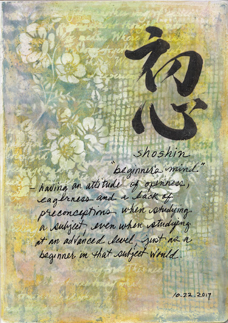
Shoshin


A journal page to share today made with a technique that I'll definitely try again--a combination of Distress Oxide inks using a Gelli Plate, stencils with white paint and creating negative space with colored pencils.

I embellished my background with an image transfer of a shodo (Japanese calligraphy) for the word shoshin which means "beginner's mind" along with my own handwriting to further explain the concept.

The oxides provide a worthwhile alternative to acrylics when working with the Gelli because of the slow dry time.

Using white paint with stencils while the ink was still wet provided variegations and more subtle shades than just pure white.

I carved out some negative shapes here and there and darkened a few areas with colored pencils for further variety.

October 15, 2017

Kept Her Word


I've been experimenting lately with image transfers over stenciled texture paste using large, solid designs so I thought it was time to try the technique over a more intricate stencil (Tim Holtz Floral).

I used one side of a page from Tim's Memoranda Paper Stash to cover the stencil and another page from the same collection was used for the tag's background.

The little miss is also an image transfer, Remnant Rubs were used to cover the red-bordered labels and a Clippings Sticker became the sentiment.

I consider my experiment a success although it was a little harder and more time-consuming but doable just the same.

And, because this is Not a Card, I'm linking it to Simon's Monday Challenge Blog where the theme this week is to make anything but. Two entries in one week will double my chances of winning and I'm itching to buy some Christmas goodies. Wish me luck!

May 04, 2017

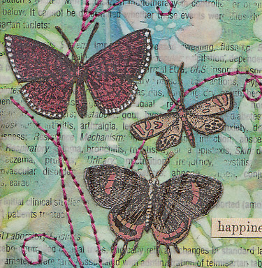
Happiness


Ah, the merry, merry month of May...

The high temp today in my neck of the woods was 104°F.  A bit warmer than normal, to be sure, but pleasant just the same as May means the crowds are thinning out and the pace is beginning to slow--a precursor of the quiet peace that comes with the heat.

My tag was made to celebrate the great outdoors which is the theme this week for the Monday challenge blog at Simon Says Stamp.

It was an opportunity to use a new Tim Holtz stencil called Floral which I fell in love with after seeing Paula Cheney's Instagram post and was the inspiration for the colors I used.

Rather than use a monoprint technique as she did, I opted to use texture medium over a text background then sanded it down before tinting with Distress inks. The medium helped to resist the ink and retain the stencil pattern.


The moths were cut from a discontinued Tim Holtz paper stash called Kraft Resist which I tinted with Distress markers and a white gel pen. The text is from the new Idea-ology Clippings stickers.

I didn't use machine stitching for the accents because the texture medium just didn't want to feed through smoothly. So, I opted for my backup method which is a good technique for those who don't have a machine.


I use a piece of cardboard placed under the tag and punch holes for my hand stitching with a "pin tool." It's a leftover from my days making pottery but I think it would be easy enough to find a substitute to punch the tiny holes needed. Pre-punching makes the stitching so much easier and it's a curiously pleasant task!

It's also a great method when accuracy is a must as I have more control punching than I do keeping my foot steady on the sewing machine pedal. A simple backstitch is all it takes to complete it.

April 05, 2017

Blue Butterflies


Ready?


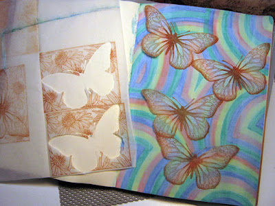
Rainbow stripes drawn with watercolor brushes (Dollar Store)
then covered with light gesso wash.


Butterflies stamped on deli paper with sepia archival ink and cut out.


Butterflies pasted to page using glue stick.


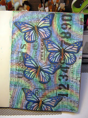
Butterfly wings filled-in with blue watercolor brush
and outlined with black gelly roll pen.

Butterfly outlines traced onto Postale tissue wrap and cut out.


Tissue wrap pasted around butterflies using fluid medium.


Blossom stencil and white paint used to fill-in around the page.


Blossoms tinted in random areas with Distress ink.

I'm linking this journal page to Simon's Monday challenge blog.

Who knew rainbows could be so inspiring?! 

December 31, 2016

12 Tags for Christmas - December


I didn't mean to wait so long to complete my final tag of this series and link it to Tim's December post but it's been a busy month.

Each day I would pass by the bulletin board in my bedroom/studio and see the blank spot meant for this month's tag. I considered skipping it but that just wouldn't sit right with me--my track record for completing the monthly tags will not be broken!

So on the last day of the month, last day of the year and at the very last minute, here's number 12.


Happy New Year!

December 13, 2016

12 Tags for Christmas - September


Paint patina and an alcohol ink resist technique was the recipe for Tim's September tag. My intentions were honorable for attempting a Christmas version but when I tried the ink resist technique using glossy paper instead of Yupo it just didn't work.

So my background of various alcohol ink drippings was stenciled over with white paint then a stamped image (Deep Red, December Tree) was pasted in the center and tinted with ink.

I cut numbers from Tim's Christmas Words stamp, outlined them in black and applied tint and glitter. A remnant rub (Christmastime) was used to balance the top along with a Mirrored Star (tinted with alcohol ink).  More bling came from dots of purple Stickles around the borders.


The multicolored background reminds me of those big old-fashioned Christmas light bulbs and how any and all colors can work for this holiday!

November 30, 2016

12 Tags for Christmas - May


Tim's remix for May was a Tissue Tape resist and Tattered Florals--here's how I spun a Christmas version.

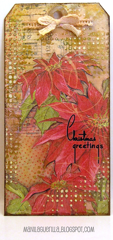
Since the florals die-cut is on my wish list (are you listening, Santa?), I modified this element by using a scrapbook paper cut-out of poinsettias instead.

There's plenty of tissue tape, though, and also Plain Tissue Wrap stamped with red archival ink using the Dots and Florals stamp.


I used the Dot Fade stencil which, out of the package, has a modern, high-tech appearance but by applying texture paste randomly and then using gold paint for highlights, I was able to create a vintage look that coincides with the Christmastime remnant rub.

October 10, 2016

Science Guy


Made to link-up with Tim's 12 Tags for 2016, this is the 41st tag I've made for the year not counting all the boo-boo's that ended up in the trash (Halloween pun intended).

It's a little plain Jane, especially for Halloween, but I lean towards "less is more" (perhaps just an excuse for not knowing what to do next). However this time, I did summon the courage to add some tiny black splatters and for me that's a step in the right direction.


Tim's technique started with a collage background of paper bits then a covering of crackle medium. I discovered first-hand that a thin application yields tiny cracks (background) and laying it down thick on the frame/tag borders (I used a fine-tip squeeze bottle) changed the look completely.

(Click on photos for a larger view.)


Obviously, my "Science Guy" isn't one of Tim's metallic monster masks but you have to admit this photo is just as bizarre. We can only assume this gent may have been a little impoverished (note the clever way he's buttoned his jacket) and I have no idea what he's cooking but it looks a bit suspect to me.


I used the skull from Tim's Mini Halloween Set #5 and also one of his Vellum Ephemera pieces painted off-white on the back and then distressed by sanding, wrinkling and inking.

To fill in the empty spaces, I mixed some texture medium with paint to match the shade of the medicine label and applied it through Tim's Dot Fade stencil before splattering the tag with watered-down black paint.

September 19, 2016

Common Denominator


Images that caught my eye were printed and pasted, then Tissue Wrap, stamping, stenciling and bits of Dapper paper stash combined with Distress ink/paint and many dots from a Gelly Roll pen became this journal page assembled over the weekend.

For me, the fun of "journaling" is I don't have a plan, I just take what interests me and begin. I never know where it will lead me and along the way I always learn more about what works and what doesn't.

Here are some close-ups (click for the larger, lightbox view):


The papers designed by Tim Holtz are ideal for collages but can be a little too thick for some applications. But no worries, as I have found they are easy to modify into a thinner version perfect for pasting.


I just use my fingernail to separate the front from the back then use a tiny amount of water to soften the paper so I can gently rub more paper bits off the back. In the image above, the paper on the left is the original, thicker version, the right one is how it looks after my delamination process.

I really, really enjoy the challenge of trying to create a sense of depth in my work and with this page, using warm reds at the bottom, cool blues and blacks at the top and the lightest values in the center along with modifying the size of the people helped to accomplish my goal.

And, if anyone is curious, the guys in the white uniforms--they were Coca-Cola salesmen from the 1930's. Perhaps the common denominator here is the love of a good cola?

Stamp credits: Tim Holtz Dots & Florals, Inkadinkado Newsprint
Stencil credit: Crafters Workshop Art Is

July 23, 2016

By the Sea


I enjoy painting scenes using vintage photos. But as you can see by the original (below), I didn't stray too far with this one.

After making an image transfer (using this technique), I used a Prima stencil for the stone wall and the birds are from a Tim Holtz stamp. Mostly, I used craft paint, a bit of ink and a Pitt brush pen.


I'm linking to this week's Monday challenge blog at Simon Says Stamp where the theme is Nautical/By The Sea in a mixed media style.

July 11, 2016

Ten Degrees


Here's a journal page to share with you today. I've been working in a large Dylusions journal creating two-page spreads--it's almost one-third full and getting much too thick to manage.

So I removed the completed pages and made a separate binding for them. Now my journal is nice and flat again and this time, I will work on just one side of the page and see if I like it better.

Today's page was inspired by this photo from a blog I've recently started following. It began with a background made from the corners of envelopes clipped by my great Aunt for her postage stamp collection (when I removed the stamps, I kept the corners to use for collage projects).

I applied the photo via an image transfer and used Postale tissue paper (Tim Holtz) in the foreground. The top of the collage was stenciled with texture paste (Tim's Dot Fade).


To enhance the areas the girls are standing on, I added additional lines with a permanent marker and used a bit of white paint to lighten the squares.

I wanted to retain the vintage colors so very little additional tint was applied except for some minor shadows made with a black colored pencil.

I am really grateful to this unknown photographer who captured such an inspirational image (and to the website for sharing it). Working on this page was really a pleasure. I wish I knew what a fisherman's store is but think it may be a warehouse. Can anyone enlighten me? Then I wonder what in the world these girls were doing there!

July 02, 2016

Condo


I've had trouble creating lately. I've shown up for the work but the results just weren't satisfactory. Hopefully, I've learned from my mistakes and the worst is over. It really has thrown me for a loop and even the purchase of a few new supplies didn't help!

So a thank-you is due to Maura Hibbits, who developed a tic-tac-toe board for this week's Monday challenge blog at Simon Says Stamp. Her clever idea allowed me to finally complete something and I opted to go all-in, using every element.


My tag is a layer of washi tape, corrugated cardboard stenciled with paste, birds stamped on fabric, sprayed and stained with blue and green distress inks and a light wash of gesso, some sequins, gold threaded ribbon and gel pen doodled dots.

I imagine it looks like an abstract bird condominium, hence the title of my blog post.

May 04, 2016

May Remix


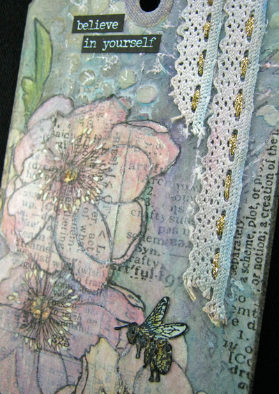
Let me introduce a tag made with all "Tim" products as inspired by this month's 12 Tags of 2016 (minus the tattered florals) where his remix features a Tissue Tape resist technique.

In the end, mine is more about enhancing the flower blossoms that are so much fun to paint. To quote Tim, "...stay true to your style throughout the creative process."  So I did and the sentiment was chosen to reinforce his statement.


The stamp is from the Flower Garden set, the bee is from Tiny Things. The Bubble stencil, Lace Trimmings (sewn on with gold metallic ribbon) and Small Talk stickers helped to embellish and I used the same tissue tape as Tim which is called Symphony.


And I used watercolor paper cut into the shape of a tag instead of one made with traditional manila cardstock.

Tim's tape is, without a doubt, my favorite kind because it's translucent, tough, and stays stuck! Just a little piece of it here and there in a composition can add just the right effect.

This month's tag made me appreciate it that much more.