/* */ Beulah Bee: tips
Showing posts with label tips. Show all posts

April 23, 2018

Marigold


I've made a greeting card to thank the hostess for a party my husband and I were invited to over the weekend.

It's nothing out of the ordinary but I used a few less common techniques that I thought would be fun to share.

The main ingredients are the Flower Garden stamp set, a page from the Etcetera paper stash, some Tissue Tape, and a Dot Fade stencil (Tim Holtz).


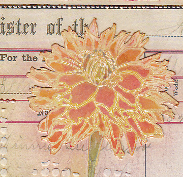
I stamped then embossed the flower, tinted it with Distress inks then used super-cheap kid's construction paper as blotting paper and a hot craft iron to remove the embossing. Newsprint also works great for this technique. To learn more about this process, see this post.


I know there are a set of die-cuts available for this stamp set but mine was cut-out by hand using an Exacto knife and self-healing cutting mat.


Here's a tip you might find useful: Cut as close to the image as you can but don't worry about the irregular edges. Then go back and make the tiny cuts later and you'll find it a lot less intimidating.


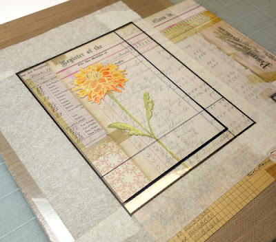
And finally I'll share a tip I've blogged about in the past (see this post) that helps you decide where to crop your scrapbook paper when designing a layout.

This template is nothing more than a sheet of transparency that I made lines on with a permanent marker. I put masking tape around the edges to mask the background. I lay this template over my paper and move it around until I find a spot that I like and mark the corners with a pencil dot to guide my cutting lines.

This week's theme at Simon's Monday Challenge Blog is "Flower Power" so I'm linking up. I haven't made a card in ever so long and it was such a pleasure that I plan to make some more for this week's challenge (I have lots of flower stamps 😉).

March 11, 2018

Cool in the Shade

My favorite teachers? The passing of time, experience, practice, experimentation, mistakes. Case in point this tag (made for Simon's Monday theme "Whatever the Weather"):


  1. Learning how to use Photoshop's recompose tool to crop this photo without losing the photograph's border frame.
  2. Experimenting with Tim Holtz Distress Oxide Ink technique on glossy paper with mixed results (too much water, not enough ink?).
  3. Applying crackle medium to paper, the product I use has to be applied really thick--it was too thin this time to show up.
  4. The benefit of delaminating some Idea-ology paper stash to reduce bulk when collaging (text piece is full thickness, report card area was made thinner). Each time I try this, I get better at it. The trick is to gently rub off the back with a little water after peeling away as much as you can.
  5. The flowers (Idea-ology ephemera) were also delaminated because they are easier to refine with cutting when the paper's not so thick.
  6. Proved again that for me, the best way to tint a photo is still using a dab of ink from a gel pen with a little water (the turquoise in the wallpaper behind the teacher, for example).
  7. Appreciating that without adding a little whimsy to the piece an observer might think it too serious and wonder about my mental state. (Perhaps you should anyway.)
The weather connection is in the Idea-ology text from the Memorandum paper stash. I do believe this teacher is cool in her shades. Also note the Red Precipitate Ointment which is a nice touch--don't you think?


By the way, my favorite human teacher was Mrs. Jennings who had the patience to work with me in the 5th grade when I refused to learn multiplication tables and provided comfort from bullies.

February 07, 2018

Feeling Noteworthy


The bird's crown is a Remnant Rub. Many of the older rubs have been discontinued. I am unhappy about that because I find them so useful. So I have no other choice but to hoard them.

Anyway, today my intention was to make a valentine-themed tag but I veered off-course (a good excuse to try again later) and made this tag instead.


The botanical bits came from an older 7 Gypsies paper collection called Conservatory. A vintage Germania postage stamp, scraps from a book page and yes, more Remnant Rubs (don't get me started) were also used.

I thought I'd speak a bit about my dotted border. As I use this decorative element quite often, I have a few tips in case you want to give it a go. I prefer Scribbles which is a dimensional fabric paint but also use Liquid Pearls.

When applying, don't touch the applicator tip to the paper as you will get a splotch instead of a dot. Rather, gently squeeze some out from the tip and delicately touch only the drop/paint to the paper then pull it away. Don't worry if it peaks a little, it will settle as it dries.

If you goof-up (and you will, it's inevitable)--fear not. Just keep a toothpick handy and scrap off the mistake as best you can. Then move on. Keep dotting ahead. Afterwards, you can go back to the boo-boo and use a knife to scrape away the dried bits that might still be there. Then put your new dots back in. I had two areas on this tag that I had to re-do and no one (except you) will ever know.

January 14, 2018

According to Value


Value is defined as the relative lightness or darkness of a color. It is an important tool for the designer/artist, in the way that it defines form and creates spatial illusions. Contrast of value separates objects in space, while gradation of value suggests mass and contour of a contiguous surface. (Read more, here.)

Of all the things I learned in art classes, the concept of value has been the most significant and perhaps the most challenging to fully understand and implement. I work at it constantly and it can make a big difference when you get it right.

I thought I'd use this tag (my first for 2018), to explain some steps I took to adjust the values which you might find interesting or useful.
  1. The lady's dress was bright orange and this warm, strong color was too dominant. To adjust the value, I tinted it with transparent blue (Tumbled Glass Distress Marker). Blue is the complimentary color to orange and when you mix compliments, they cancel each other out. So the bright orange now has a more muted value and settles better into the background.
  2. The flowers were very neutral. I wanted them to stand-out more and appear closer (plus they needed some detail) so I tinted them with lines of pink, orange and turquoise gel pens (Gelly Roll Soufflé). Warm colors appear closer, cool colors recede.
  3. The lady was grounded by using a dark tint under her feet (otherwise, she would appear to be floating). It's subtle, but you may also notice that the grey background is lighter near her feet than higher up. This is a way to create a sense of depth. Distance (like on the horizon of a landscape) is imitated with lighter, cooler colors.
  4. And finally, most compositions are best when there is a mix of bright, dark and medium values. Here, it's the dark greys and black text combined with the bright white dots (extra-fine DecoColor paint pen). The remaining elements fall into the medium range.
If this information was helpful or interesting and you'd like to see similar posts in the future, let me know by leaving a comment.

May 04, 2017

Happiness


Ah, the merry, merry month of May...

The high temp today in my neck of the woods was 104°F.  A bit warmer than normal, to be sure, but pleasant just the same as May means the crowds are thinning out and the pace is beginning to slow--a precursor of the quiet peace that comes with the heat.

My tag was made to celebrate the great outdoors which is the theme this week for the Monday challenge blog at Simon Says Stamp.

It was an opportunity to use a new Tim Holtz stencil called Floral which I fell in love with after seeing Paula Cheney's Instagram post and was the inspiration for the colors I used.

Rather than use a monoprint technique as she did, I opted to use texture medium over a text background then sanded it down before tinting with Distress inks. The medium helped to resist the ink and retain the stencil pattern.


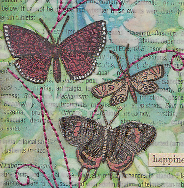
The moths were cut from a discontinued Tim Holtz paper stash called Kraft Resist which I tinted with Distress markers and a white gel pen. The text is from the new Idea-ology Clippings stickers.

I didn't use machine stitching for the accents because the texture medium just didn't want to feed through smoothly. So, I opted for my backup method which is a good technique for those who don't have a machine.


I use a piece of cardboard placed under the tag and punch holes for my hand stitching with a "pin tool." It's a leftover from my days making pottery but I think it would be easy enough to find a substitute to punch the tiny holes needed. Pre-punching makes the stitching so much easier and it's a curiously pleasant task!

It's also a great method when accuracy is a must as I have more control punching than I do keeping my foot steady on the sewing machine pedal. A simple backstitch is all it takes to complete it.

June 20, 2016

Be Still


My cat knows how to be mindful. He can sit for hours, just being present, calmly watching the world go by (in between frequent naps, of course). The sentiment used on this tag is a tribute to his pensive mood.

I began by pasting paper scraps to the background, covered them with a light gesso wash, then applied tint with inks and stains. I laid down a layer of fine crackle medium and used more ink to emphasize the crackling.

The cat is a tiny image transfer, the leaves and birds are Botanical Remnant Rubs. My confidence in using the rubs has greatly improved since I discovered they always stick better when applied to an acrylic-coated surface.

April 25, 2016

Creativity


This is my last week as a guest designer for the Simon Says Stamp Monday Challenge Blog and it has been a wonderful experience.

This is such a great blogging community full of inspiration and information--I'm happy to be a part of it and grateful for the feedback I've received!


This week's challenge is to use a metallic element so I made an assemblage that would definitely set-off a metal detector!

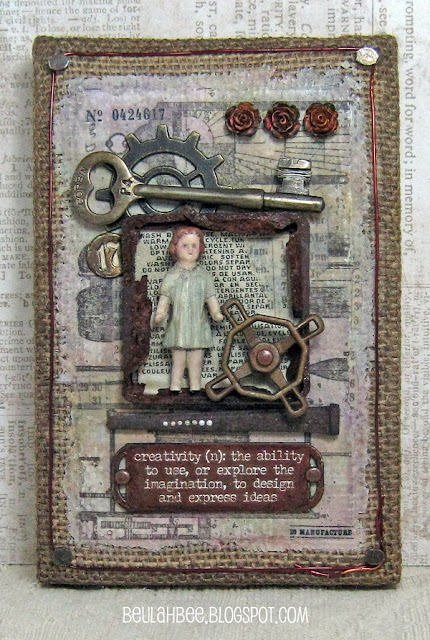
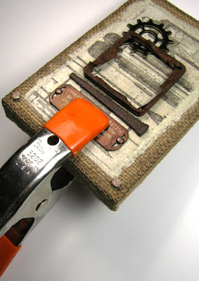
I used found bits of really rusty metal (the square frame and large nail), a vintage key and lots of Idea-ology including a Quote BandNumber BradGadget Gear, and Faucet Knob.


A border for the Burlap Panel was made using tacks and copper wire (credit to Paula Cheney at oneluckyday.net for this idea).

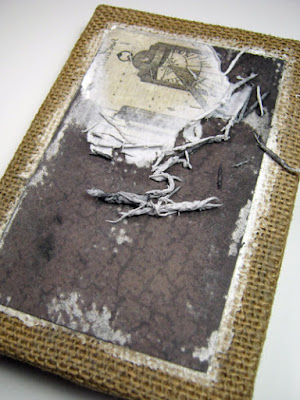
The background technique is rather unconventional. After prepping the burlap with paste medium (to fill in and even out the surface), I transferred an image cut from the Destinations Paper Stash using polymer medium. The overage of paste medium around the edges was tinted to match the paper.


I've done image transfers with lots of Paper Stash and I suspect it would work with other brands as well. Here's a link to a recent tutorial which describes my technique in more detail.


I included a doll and roses because of the Quote Band. The Salvaged Doll is the artist, the faucet knob represents effort, the number stands for time, the key unlocks the idea, the gear stands for the process and the result is beauty represented by the three Heirloom Roses.


It's fun and easy to transform the doll from its original, stark-white appearance. I just covered her with off-white paint, used blue for the dress, brown for the hair and mixed-up a flesh tone for the face, arms and legs. Everything was coated with fine crackle medium and after it dried, I dropped in some Tea Dye Distress Stain to emphasize the cracks. A tiny drop of red ink went on her cheeks and a fine-tip black marker helped define the eyes and mouth (my photo doesn't do her justice).

I wanted to match the roses to the other pieces but didn't have rust-colored alcohol ink. Since mixing colors opposite each other on the color wheel makes mud, I thought to drop an assortment of colors I did have on top of the roses until I got the look I was after. Then I took the shine away with some fluid matt medium.


The Quote Band was also given a rusty look. I filled in the letters with white paint, wiped the background with a rust-colored ink (like StazOn) and used black paint to distress the edges. I used an antique gold metal paint on the Faucet Knob and glued on a few brads with Glossy Accents.

Speaking of glues, if you'd like to try making an assemblage but you're not sure how to anchor the elements I have some advice. Use nails, screws or wires when you can (no problem with the Burlap Panel since the backing is made of wood). When you can't, a good urethane-based glue (like Duncan's Liquid Fusion) and some clamping will secure just about anything. You can see my other assemblages here.


There are other details about this piece that I could mention but if you've already read through what just may be the longest post in the history of craft blogging, then I may have said too much already!

---------------------------------------------------------------------------------


Please join us for this week's challenge and when you upload your creation to the Simon Says Stamp Monday Challenge Blog you'll have a chance to win a $50 voucher at the Simon Says Stamp store!


Here's a list of the products I used for this challenge which can be ordered from Simon:


February 16, 2016

Oliver


Recycle/upcycle is this week's Monday blog challenge at Simon Says Stamp. So, I used a paper bag Valentine's Day luminary that was marked down after the holiday for the background of this tag.

(You can click on the photos for a larger, lightbox view.)


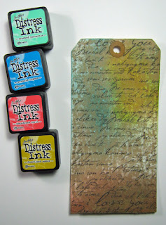
This was a chance to use my very first mini-Distress inks--I purchased Group #13 and think it is a great color combo. The darker brown at the bottom was made by combining the two complimentary colors, Abandoned Coral and Cracked Pistachio.

The flowers are from the Wallflower paper stash and the sun face was cut from an image of a Tarot Card.

You might notice in the pre-paste photo above that there are white strips attached to various flower parts. These are intentionally cut to hold the delicate parts of the flower together and I remove them immediately after I paste it down (before the glue fully dries).

The best glue to use when pasting something this intricate is an aerosol spray adhesive and I never, ever, ever use it indoors!

The portrait is of my grandfather who passed away several years before I was born.

January 28, 2016

Moulin Rouge

Click to Enlarge

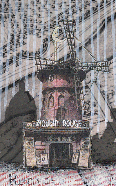
The challenge at Simon was simple: "Love is in the air" + red. So ... Paris is known as the city of love and the ladies of the Moulin Rouge (that's French for red mill) are doing did their best to promote it.

 
 I began with an image of a medieval map of Paris and a silhouette of the skyline. And I couldn't resist the Can-Can girls so I looked for an image of the Moulin Rouge to accompany them.
 
As far as technique goes, I thought I'd explain the background. The map was busy and most often, artists will use a wash of gesso or white paint to blend back an image creating subtlety. But I wanted to try something different.

So I used white and red paint pens to draw lines over the surface of the map and I rather like the effect.

 
I always try to create the illusion of depth and the vertical and horizontal lines help to achieve this along with using lighter brighter colors in the foreground and darker colors in the back.

The scale of the objects also helps create some perspective since the ladies are larger than the buildings.

In case you are wondering, this is a two-page spread in my large Dylusions journal which is 9" x 11".

June 23, 2015

View Finder


I misplaced a very useful, home-made tool today and had to make another one. I thought I'd share the idea as you may find it useful too!

I call it a view finder and in the example above, I've placed it over a paper with a random design to see what might look best and where I should cut it.


It's made from a transparent sheet of plastic (I used a printer transparency but clear plastic packaging would also work).

I drew lines on the plastic in the exact dimensions of my tag with a permanent marker.

But it could be any size.

Maybe you make a lot of 4" x 6" cards or work with a particular size of canvas panel.

Just draw lines for the dimensions you need.

I find having a neutral border really helpful so I place masking tape around the edges next to the lines.

Scrapbook papers with many design areas can make deciding what section to use a bit difficult.

So I just use my handy-dandy view finder and play around with all the possibilities and, when I find the right spot, I know just where to cut.

Besides framing the view, this tool is good for holding small bits in place while you make up your mind where to place them permanently.

I'd love to hear from you if you decide to make one--let me know what you think!