/* */ Beulah Bee: Scribbles
Showing posts with label Scribbles. Show all posts

July 31, 2017

Dinner Party


The Monday challenge over at Simon Says Stamp is Food and/or Drink and I thought I'd do something with Idea-ology Silverware.


Well, one place setting led to another and the result was a dinner party in an altered Idea-ology Vignette Box filed with silverware, an ornate plate and a salvaged doll with adornments.

Click to Enlarge Photo

All of this covered in tissue paper stamped with tiny text and black dots plus two altered vintage light bulbs (not to be confused with ice cream cones). The large text is an altered quote chip and the roulette wheel is an Idea-ology Collector Layer.


The outside of the box was "pickled" with a white stain. The crown and scepter were tinted with alcohol ink. Red paper was used in the back of the box. Clear crackle medium and walnut ink helped to age some of the surfaces.


My tiny little box will find it's way to a shelf in my studio and remind me that, in art (and also in cooking), all the things we make are as unique as we are. Bon appétit!

-----------------------------------------------------------------------------------

It's been a real privilege to participate as a guest designer this month. I am so proud to be a part of a community that fosters so much creativity and joy.


Why don't you join us for this week's challenge?

If you upload your creation to the Simon Says Stamp Monday Challenge Blog you'll have a chance to win a $50 voucher at the Simon Says Stamp store!


Here are links to the supplies I used for this project:


May 25, 2017

Cat Nap


This week's theme on Simon's Monday challenge blog is Little Critters and I found myself pouring through my "stamp book" (I keep a record of all my stamp images in a 3-ring notebook) to look for one.

One benefit of participating is you end up doing or using things that you might not otherwise consider.


My tag was made by stamping (vintage Stampin' Up, circa 2001) on a notecard made by Prima, tinting it with colored pencils and a bit of Distress Ink, placing dots around the edges with black Scribbles (3D fabric paint) and using a few Remnant Rubs.

November 16, 2016

Abraham


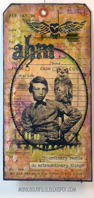
A mixed-media menagerie is what Tim had in mind for this month's tag using a rub resist technique with dimensional coloring and this is what his post inspired me to create.

I lightly tinted a vintage tag (used for tracking sewing alterations) with shades of fall colors and applied Gilded Alpha remnant rubs and a bit of stenciling.

The photo is an image transfer that I framed with tiny dots of black Scribbles (a 3D fabric paint).


I cut and pasted Abraham's initials from a text stamp and the owl stamp was hand-carved by yours truly. The Adornment Arrow was tinted with Butterscotch alcohol ink to match the gold of the remnant rubs and I used some Small Talk stickers that were a perfect match for the photo.

November 15, 2016

12 Tags for Christmas - January

Click to View Larger Version

Once again, I've made Christmas tags inspired by the Tim Holtz monthly tags which I use for decorating gifts.

This year's theme of remixing techniques helped me discover more ways to use my stash--holiday style!

The January tag featured a chalkboard/industrious metal combo with a word band.


This was the first time I've ever embossed metal foil (I didn't have die-cut equipment back in January) and it's an interesting effect. I always prefer a matt finish but since sparkles and shine are must haves at Christmas, this technique was really appropriate.

Without frosted embossing powder for the chalkboard technique, I tried to make do by embossing red vellum (bottom flower layer) with white ink and clear powder but the lines were too faint. Then I tried stamping white ink on red cardstock (top layer) which also faded some so I went over the lines with a Gelly Roll pen. What is it about white inks that make them so fussy?!

I combined the layers for a lush flower look and now I wish I had used green vellum for the bottom layer since Poinsettias have that look naturally. Maybe next time.

The rest, I think, is self-explanatory and here's a list of the products I used: Penny Black (Christmas Star), Stampers Anonymous (Christmas Words), Idea-ology paper (Merriment), cardstock, vellum, heat duct tape (metal foil), Sizzix Thinlet die (Mixed Media #2), Distress inks, acrylic paint, Scribbles, Stickles, Glossy Accents, a white Gelly Roll pen, and one tiny pink gumdrop.

September 07, 2016

Ripper Street


My husband said this Found Relative photo reminds him of the Victorian era detective drama called Ripper Street that he enjoys watching hence the name of my post/tag. One of the main characters wears a Bolo hat so I suspect that's his reason for this connection.

It's my entry for Tim's September tag challenge where he introduced an archival/alcohol ink resist on Yupo. The background text in the close-up above was made using this technique with his Ledger Script stamp.

I've always wanted an easy way to make light text on a dark background and this is a great way to do it--thanks, Tim!


I began by cropping and distressing a Sophisticate cabinet card that I delaminated and pasted to a manila tag. The Found Relative (also delaminated) was cut-out and pasted to the Yupo and then cropped into an oval for mounting on the cabinet card tag.

I used copper and black Scribbles around the oval to create a pseudo-frame along with some Idea-ology ephemera (Thrift Shop) and paper strips (cigar box labels) cut from the Dapper paper stash.


The star was made by altering an Idea-ology Fastener by picking out the original image, painting in the center, applying a Remnant Rub and tinting/distressing the metal edges.


If you're on the fence about adding Yupo to your stash let me say I highly recommend it. It's great for mixed media and I've used it extensively for creating my own stencils because it's thin, easy to cut and very, very durable (see my post here).

In my opinion, the only shortcoming is that since it's actually a plastic you have to use caution with heat guns.

August 12, 2016

Firm Heart

My local library has an on-going used book sale and periodically (no pun intended), I rescue a few "picture books" to use in my collages and also seek text for phrases that might add interest to my work.


The essence of this tag is composed of those very same elements: The background is a hand-drawn map of an old city and there is text. A Found Relative was framed inside a vintage cardboard box (the sides were trimmed down to keep it in proportion with the tag) and the owl is one of my own hand-carved stamps. It was embellished with black Scribbles, a paper heart covered with dimensional medium and some Remnant Rubs.


I'm linking it to Simon's Monday challenge blog. The theme this week is Try to Contain Yourself (so funny) and participants have been asked to use some sort of container. I know, putting a container on a tag is kind of goofy but I just can't help myself--I like making tags!

April 20, 2016

Travel Time


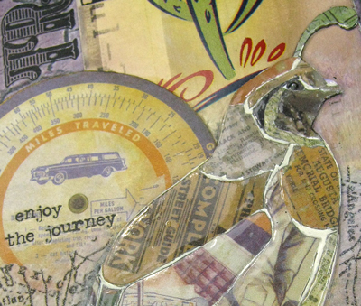
Gambel's Quail are everywhere in my neighborhood and in great numbers, too. They travel in groups, chatter a lot, and almost never fly preferring instead, to scurry along the ground very quickly.

That was my bird of choice for Tim's 12 Tags - April and my mosaic technique was to paste paper bits from the Destinations Paper Stash on a bird illustration/drawing cut from an old book. I filled-in the cracks with white paint and covered the pieces with Glossy Accents.


If you live in metro Phoenix, you might recognize the Express Bus Pass which depicts another unique feature of our landscape, the Saguaro Cactus. The background paper (purple photo of mud cracks) was a yard sale find.

I used some Remnant Rubs, Postale Tissue Wrap and black Scribbles as embellishments along with machine stitching around the edges.


I always have so darn much fun working on Tim's monthly tags--his technique driven prompts have me trying new things that I wouldn't normally think of. This month's tag really emphasizes that point.

December 02, 2015

12 Tags for Christmas - May


Adding texture with burlap and paste, learning how to tint photos with ink, then telling a story with ephemera and text--that's what Tim's tag for May was all about and it was one of my favorites this year.

My holiday version features a Found Relative photo (Occassions), Remnant Rub text, the Schoolhouse stencil and some Idea-ology vellum ephemera. The holly was stamped, cut-out and glitter-fied and I'll tell you about the happy-accident that became the frame.

The photo was thick as it had previously been mounted on heavy cardstock (an abandoned idea) and I didn't like how high it sat on the burlap. To fill in the gap, I applied a black line of 3-D Scribbles around the edge then used a toothpick to poke bumps in it (a lesser-known Distress technique ☺).

After it dried, I dotted red glitter glue over the top leaving spaces for the black to show through. (To see the detail, click the photo to enlarge it.)

I'm linking this tag to Simon's Monday blog challenge where this week's theme is Gentlemen. I can't think of a more "gentle man" than Santa!

December 01, 2015

12 Tags for Christmas - April


The emphasis for Tim's April tag this year was on using a watercolor technique along with a clever way to assemble a word band insert using kraft paper.

My holiday version features a poinsettia stamp by Penny Black and I didn't use a die-cut for the text-- it was stamped and embossed instead (Tim's Christmas Words).

And it just wouldn't be as Christmas-y without some bling so I applied gold Stickles on the border and used black 3-D Scribbles for accent.

I really like this one--it's easy to see why using watercolor with stamps has become so popular and starting with a spritzed background really elevates the technique.

In case you don't know about my 12 Tags for Christmas series, this post will fill you in on the why and what for's.

November 27, 2015

12 Tags for Christmas - January

I used some time-off during the last two weeks of November to make holiday versions of Tim’s monthly tags for 2015 which I'll use to embellish my Christmas gifts this year.

It was a great excuse to break out the glitter, get in the spirit of the season, reminisce over each month’s theme and give some great techniques another try.

While I might have wished for an unlimited craft stash, instead I embraced the process and pleasure of creating and just used what I had on-hand.

To share my experience and some new discoveries, I’ll be posting the rest of them over the next few days and perhaps they'll inspire and motivate your own holiday crafting this year.

And so, I begin with January which featured letters and numbers:


Do you remember the pre-cut grunge board parts and pieces Tim designed before his partnership with Sizzix? Well that’s what I used to make the letters spelling TWENTY. Just painted, they looked kind of blah until I outlined them and added some glitter.

Click to Enlarge
The big number 5 was hand-drawn, cut-out and filled with Crackle Accents.

My favorite technique/design element on this tag is the border.

Made with an outline of black ink, it was dotted over with white Scribbles spacing the dots just far enough apart to give it a checkered appearance.

Well, I hope you’ll return for the rest of my Christmas tag postings in the coming days and if you'd like to see a preview there's a link to them on the sidebar.

September 04, 2015

Remnants

rem·nant
/ˈremnənt/

noun

a small remaining quantity of something.

a piece of cloth or carpeting left when the greater part has been used or sold.

a surviving trace.


I only have remnants of brain matter left this month after working on my entry for Tim's September tag--it was a challenge!


To begin with, I'm alcohol-ink impaired so piles of glossy stamping paper later, I finally arrived at a background that might work.

I don't have transparent gloss texture paste so I used gloss gel medium with Tim's Scribbles stencil instead. I thought it would dry clear but I believe the thicker application prevented this. It's still somewhat transparent though and the pop of alcohol ink colors shine through but it's obviously not the same effect as Tim's.

Rather than highlight the texture with archival ink I used Vintage Photo Distress stain to darken the cracks and provide some contrast.

Click to Enlarge

There's no frosted paper in my studio so I took a laser printer transparency and sanded both sides to mimic this product. I guess it's close-enough but didn't curl as easy as his did.

Finishing touches included a Foliage charm, Remant Rubs (Words), ribbon scraps and Scribbles (3D fabric paint) dotted along the tag edges.

Tim's monthly tags always challenge me and this time, after allowing myself to fail (and learn), I thankfully pushed myself through.

I am grateful for the process and the end result!

June 17, 2015

Lady Huron

Liquitex light modeling paste, Distress clear rock candy crackle paint and shiny black Scribbles were the mediums used to link this tag to Simon's Monday blog challenge where this week's theme is cleverly named don't cut, just paste.

I haven't combined a paste layer with crackle medium before but it worked out well here because it created a uniformly flat surface for pasting on collage elements.

Let me explain.

First, I took a plain manila tag and covered it with several layers of victorian velvet Distress stain to get a rich, dark background.

Then I used a Prima damask stencil and modeling paste which absorbed some of the stain, tinting it to a lighter shade of pink.


Next came the crackle paint which I applied with a palette knife. It settled into the recessed areas of the damask at a perfect thickness for crackling and was enhanced by working in thinned-out white acrylic paint after it dried.

The banner was cut from scrapbook paper and distressed to match the photo. The black, dimensional dots applied to the photo and tag borders were applied using a 3D paint called Scribbles.

Why Lady Huron? She was named in honor of new music I listened to while making this tag. The CD, titled Strange Trails, by a group called Lord Huron was very inspirational and I had to give due credit!

November 13, 2014

Duchess

Click to Enlarge

My post is titled "Duchess" because it is the name of the scrapbook paper (by Kaiser Craft) that I used to make this greeting card. There's no sense providing a link to it as I bought it awhile ago and it is now out of production.

But I can show you what the paper originally looked like:


I cut out one of the design elements and pasted it to metallic bronze card stock after creating a border with a paper punch. Then I went to task embellishing it with colored pencils, Stickles and Scribbles (a 3-D paint). I mounted it to olive green card stock which was folded for use as a greeting card.


I plan to use it as a Christmas card and have linked it to the Monday blog challenge at SSS where the theme is ornaments.  I will admit, I'm getting excited about the upcoming holiday season because there's no better time to use my Stickles and I do love them so!

November 07, 2014

Remember Paris


Inspired by Tim's November tag, I created this one using some of his techniques and also everything but the kitchen sink.

Oh wait! I did use the sink to wash off some ink at one point...

Click to Enlarge
It all started when I hand-cut a flower shape from corrugated cardboard, filled it in with paste medium and after it dried, added an image transfer on top which was then covered with clear crackle paint.

Ink pens, acrylic paint, oil pastels, and colored pencils were used to add color along with some splatters of gold embossing. The letters were hand-cut and then distressed with paint and crackle.

Tim's tag reminded me of inlaid parquetry and I was inspired to experiment!