/* */ Beulah Bee: image transfer
Showing posts with label image transfer. Show all posts

October 31, 2019

Unrequited Love


I've got a lot of pics to share today that illustrate the steps I took to create this journal page made for Simon's Monday challenge this week.

Art journaling can be/should be somewhat spontaneous and you'll see by the process that unfolded for this page, nothing was set in stone and I changed directions a few times.

Being flexible and just "going with the flow" is what makes the experience fun. Not to mention what you might learn along the way!

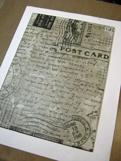
I began with transcribing a document then pasted word strips cut from it onto the page.

I covered the page with gesso and tinted some sections with gray then sanded it a bit.

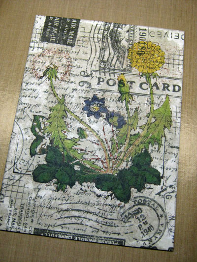
I transcribed the last paragraph of my document over the top using a Fude Ball 1.5 pen.

The ink was taking FOREVER to dry so I sprinkled clear embossing powder on it and heat-set. It was messy but did the trick and I like the emphasis and durability it provided.

I used a vintage stamping set (circa 2008) and applied the flowers with black archival ink.

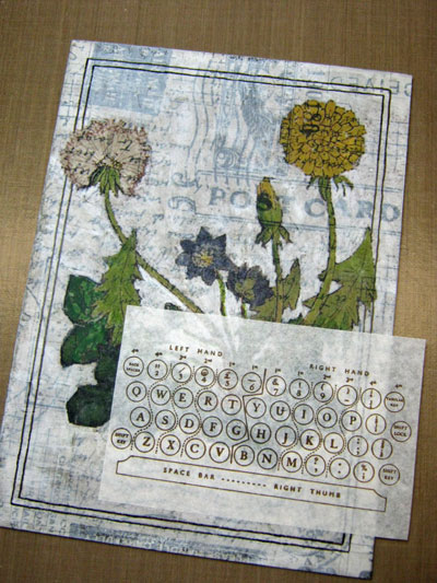
I wanted to create the illusion of flowers growing over and around a brick wall so I printed a photo of some brick, tore out sections and used my image transfer technique.

As you can see, the wall was modified quite a bit later in the process but proved to be a good jumping-off point which was just what I needed.

I used shades of gray to blend in the wall and began to tint the page with craft paints.

I didn't worry too much about "staying inside the lines" but the paint did blur the stamping so I went over the lines with a black pen marker.

Here's the finished product--it's a two-page spread in a Ranger Dylusions journal (8" x 11"):

Some details I didn't photograph but are worth mentioning: I used the Dot Fade stencil and white paint to unify the page and added the butterfly (cut from Tissue Wrap) along with some Collage Paper leaves (Tim Holtz products).

August 19, 2019

Most Noble


I discovered some wonderful paper over the weekend made by Stamperia called Oriental Garden. I found an image of a woman to transfer with gel medium (thanks, British Library), then stamped postal and architectural images onto tissue paper and pasted together a collage tag.

I'm excited to see what other things I can make using this paper!

May 12, 2019

The Way


During an evening walk a few weeks back, I found a rusty, gold painted piece of metal (shaped like a wing?) which someone had tucked into a street sign in my neighborhood.

It was happenstance that I glanced-up at just the right time with just the right light to see it's shiny reflection and to know it was there.


And so I used it for a small plaque made with various papers (vintage book, Tim Holtz collage and butterflies cut from Prima scrapbook paper). The flowers are from the new Idea-ology Botanical Layers and the girl is a Baseboard Doll.

I used a bit of crackle medium around the edges, drew some lines and added shading to create a faux border, and trimmed the plaque edges with gold paint. The text was an image transfer.

I began work on this Monday when I discovered the Simon Monday challenge was "Add Something Metallic." Since this metal piece had been laying around my studio for awhile (with no idea of how or what to use it for), this challenge was just the push I needed.

I didn't think I'd get it done in time to enter but sure enough, I did!

April 12, 2019

Maurice Crooks


My Great Aunt Esther took a photo of a neighbor whose family was homesteading in Newcastle, Wyoming. She wrote his name and the date on the back--Maurice Crooks, August, 1921.

I made a copy of that photo and used gel medium to transfer the image onto a manila tag.


Then I used gesso to white-out some areas, blending the edges of the photo into the background.


Then I went about stamping and tinting and embellishing and came up with what you see here.


I know it's best not to put the focal point of a composition directly in the middle, but in this case, I threw caution to the wind since Maurice seemed to stand so proudly right in the middle of his family's meager garden.

I'm linking to Simon, the Monday challenge is "Down on the Farm."

September 04, 2018

The Beekeeper's Daughter


I've made a Vignette Tray assemblage/collage to share with you today. I chose the smaller tray size and used whiting (a wood stain) and some light sanding to alter the surface. This technique is known as "pickling."

I used this finish on a CHA 2017 project and here's the link if you'd like to see another example.


A Found Relative was cut-out and placed between a sandwich of two Baseboard Frames and vintage book paper of a blue sky was attached to the back.

The background consists of the stained wood of the tray along with vintage book paper text.

The large white script was made using a home-made stencil and white paint on Plain Collage Paper.

By using the collage paper, I have lots more control over where it's placed and after pasting down it becomes almost invisible.


The tiny bee on top is an image transfer on the backside of a vintage button (I filled in the holes with paste medium).

The sunburst is also a transfer and the image came from a Trader Joe's flyer.

The gentlemen were cut from French Industrial paper stash and there's also a vintage postage stamp.


The flowers were cut from the Wallflower paper stash and that's an Idea-ology key dabbed with white paint and dark ink to distress it.

The honeycomb was made with a Tim Holtz Mixed Media thinlet.

This piece was a long-time in the making and there were several versions before I finalized it.

Funny thing, though--I ended up returning to my original idea. I guess I needed to try out all the possibilities before I could fully embrace the design.

June 22, 2018

Lina Cavalieri

Click on photo for larger, lightbox view

Someday I should start saving all my tag experiments gone bad so that you can see how this format is really meant to be my chance to try new things and to learn from my mistakes.

Occasionally, I get it right (in my mind, anyway) and those are the tags I blog about. This one, in particular, is a good example of what I'm talking about.


I wanted to try a variation of this Tim Holtz technique using a new stamp called Beautiful Flowers by Simon Says Stamp. It's a process of embossing, painting in the areas with acrylics, and then wiping the lines clean.

The paint I used was initially transparent so variations in flower color are due to the background (an image transfer over a book page) showing through. I applied another layer of a more opaque color on the flowers near the top to achieve more uniformity.

It was easy to lift paint off the embossed areas even after the paint was dry and I'll definitely try this technique again.


I thought the play of text and page margin under the face would be interesting but it was too severe so I applied a strip of Tim Holtz Tissue Wrap along the edge to soften the contrast.

To balance out the bottom I added text with texture paste and a homemade stencil. The paste was white. I've learned from experience that it's almost impossible to tint the paste black before you apply it because the best you can expect is maybe a dark gray.


So I took a teeny-tiny paintbrush dipped in black ink and painted the texture paste after it had dried. I've never tried tinting the paste with ink instead of paint so maybe I'll give that a go on a future tag. I also wonder if there's a black texture medium that you can buy?

May 24, 2018

My Sweetheart


Inspired by a song (this week's Monday challenge at SSS), here's a tag that celebrates the turn of the last century when everyone was waltzing to a popular tune called "Let Me Call You Sweetheart."

The background reminds me of a vintage tin ceiling tile. It was made using bronze metallic cardstock and the new Sizzix 3D texture fade (Tim Holtz) called Botanical.

The portrait is an image transfer using this photo. Because the original background was dark, I used the tip of an Exacto knife to scratch in lines to lighten it and create better definition.

The frame border was made with dots of 3D fabric paint called Scribbles.


The flowers and perfume label (Tim Holtz) were thinned-out and then fussy-cut to create a more delicate appearance.


I pasted a ribbon along the right hand side using fabric glue (works great and doesn't soak through) and my strip of text is from the Idea-ology Clippings Stickers collection.


And for anyone out there who's not familiar with the song that inspired me here's a link--take a listen!

April 15, 2018

The Phoenix


Just under the wire today, linking up to Simon's Monday Challenge Blog--this week's theme is Mythology.

My idea came from the namesake of my current residence and a little research turned up an interesting story of how the city got it's name, who knew dipsomania played a part in it.

In mythology the Phoenix represents rebirth which is exactly what I did with the wooden support for this piece which was originally an Idea-ology burlap panel (6" x 4").

I removed the burlap, applied an image transfer and then colored it with paint and inks and also stamped some text in the background (Stamper's Anonymous Ledger Script).


The technique was similar to this project which became a favorite of mine and I thought I'd have another go at it. I appreciate how it's possible to take advantage of the brown of the support board and convert the positives shapes into negative ones.

April 11, 2018

Ada Again


I have modified a recent collage (see previous post, Ada 1916) by scraping off the photo of my great Aunt Ada and replacing the image with one I like better.

Because the original photograph was a bit thicker than the other collage papers I used, it was pretty easy to get underneath it and carefully peel/scrape it off.


Then I used this image as a transfer and created a mask of the hands and face. I used the mask to apply off-white paint on the background where the image was placed. Since image transfers are inherently transparent, this technique keeps the background from showing through.


The image transfer's darker undertones made it necessary to adjust values throughout the collage using transparent paint (glazing) and I also colored the collage paper flowers.

And finally, I felt the need to contain the composition by adding a border which was made using dots of Scribbles. I think the addition of the black accents helped to emphasize the other black elements in the collage.

April 08, 2018

Ada 1916


My great Aunt Esther wrote on the back of this photo, "Ada, June 1916." I suspect it is a photograph to commemorate her sister's graduation from high school as I have several copies and the year would be appropriate.

I used a wooden panel (10" x 10"), the new Idea-ology collage paper (Botanical), some Memoranda paper stash and an Idea-ology Collector Layer. All the paper bits were made thinner by rubbing the back side with water and I also used damask patterned tissue paper along with some light pink. The circle scroll design was an image transfer.

(Click on the photos to see a larger, lightbox view.)


The wooden support was gessoed, I pasted on a crinkled sheet of light pink tissue paper, added crackle medium, then rubbed on brown wax to bring out the cracks.


At this stage I was thinking I should have waited to crackle the board AFTER I arranged the collage but in the end it may have been the right approach even though most of the surface was covered up.

Here are some close-ups that show how I layered the collage paper.


Working with the collage paper I learned that, if you don't want the white of the tissue to show, it's important that the glue underneath covers the entire surface. In the photo above, the hand-written name has fewer missed areas of glue underneath than the section of tissue just above it.

My glue of choice for this piece was fluid matt medium. I like that you have a longer working time than a gel medium and that it moistens the paper slightly so it lays down easier. You can get all the bubbles out without using much pressure (which might tear a delicate paper).

January 11, 2018

Raised by Wolves

Photo is by Bernd Heyden

Collage is an interesting art form. Disparate images pieced together that hopefully, speak to the viewer in some way. Sometimes, the hardest part for me is knowing when to quit so I just go with my gut. I guess that's what everyone does.

A lot of my collages are dependent on what I have lying around at the moment that I grab and decide to include. It is a game of sorts and play has a lot to do with it. "I wonder what this will look like if I put it here?" is the ongoing conversation I have with myself.

So today, may I share another journal page/collage that started from a photo by Bernd Heyden that I was compelled to use. Raised by wolves? You may guess what band I was listening to while making it.

I'm linking to Simon's Monday Challenge Blog, this week's theme is "Winter Blues."

October 22, 2017

Shoshin


A journal page to share today made with a technique that I'll definitely try again--a combination of Distress Oxide inks using a Gelli Plate, stencils with white paint and creating negative space with colored pencils.

I embellished my background with an image transfer of a shodo (Japanese calligraphy) for the word shoshin which means "beginner's mind" along with my own handwriting to further explain the concept.

The oxides provide a worthwhile alternative to acrylics when working with the Gelli because of the slow dry time.

Using white paint with stencils while the ink was still wet provided variegations and more subtle shades than just pure white.

I carved out some negative shapes here and there and darkened a few areas with colored pencils for further variety.

October 15, 2017

Kept Her Word


I've been experimenting lately with image transfers over stenciled texture paste using large, solid designs so I thought it was time to try the technique over a more intricate stencil (Tim Holtz Floral).

I used one side of a page from Tim's Memoranda Paper Stash to cover the stencil and another page from the same collection was used for the tag's background.

The little miss is also an image transfer, Remnant Rubs were used to cover the red-bordered labels and a Clippings Sticker became the sentiment.

I consider my experiment a success although it was a little harder and more time-consuming but doable just the same.

And, because this is Not a Card, I'm linking it to Simon's Monday Challenge Blog where the theme this week is to make anything but. Two entries in one week will double my chances of winning and I'm itching to buy some Christmas goodies. Wish me luck!

October 10, 2017

Field Notes


Tinted mostly with water-soluble oil pastels, an image transfer, some stamped images, Tissue Wrap and Quote Chips came together on a support made from an old textbook cover. I've got step-out photos if you'd like to see the particulars.

(Click on the photos for a larger, lightbox view.)


I stripped the cover of a textbook which left me with a sturdy gray board that I covered with Tim Holtz Postale Tissue Wrap using Modge Podge.


I edited an image (coincidently, also a book cover) and then transferred it to the board using Golden Polymer Medium (Gloss). You can read about my technique in this post.


I used dilute gesso to obscure the background details and this also provided a good surface for applying color.


I stamped the keyboard image (Tim Holtz) on tissue paper using archival ink, tore the edges and pasted it on my support. I added a border detail/frame using a dark brown Pitt Artist Pen. They are made with india ink and waterproof with almost all mediums.


The Quote Chips (Tim Holtz Idea-ology) were delaminated because I wanted the text but not the thickness. They were later stained and distressed to blend in with the background.


The snail (Carabelle Studio) was also stamped on paper, which I tinted then cut-out and pasted on.


Most of the coloring was done with water-soluble oil pastels. I like that they are transparent, easily blended with your fingers and can be diluted and spread with a water brush for thinner coverage.


I made this to link-up with Simon's Monday Challenge Blog, this week's theme is to make anything except a card. This may be out of the box for some but if the challenge was just the opposite, I'd expect to struggle a bit as I haven't made a card in quite some time.