/* */ Beulah Bee: watercolor
Showing posts with label watercolor. Show all posts

October 14, 2015

Mums


My entry for Simon's Monday blog challenge this week features a Tim Holtz Flower Garden stamp and watercolors.


I began by stamping the mums on watercolor paper with clear ink then used clear powder to emboss them.

Next I dropped in juicy yellow and orange watercolor, let it dry and then used a damp tissue to wipe it off the embossed lines.

I drew the likes of a basket and handle with my very handy Perfect Pearls pen, embossed with clear powder and filled them in with a brownish mix of watercolor.

Click to Enlarge

I used polka-dot washi tape to fill-in the basket around the flowers by pressing the tape down then cutting around the edges. A sharp blade and gentle pressure does the trick and prevents cutting into the background.

Then I masked the basket, flowers and handles so I could stamp the upper part of the tag with text (Heidi Swapp) using archival ink and tinted it with blue-green and magenta watercolor.

Final embellishments included hand-written text using a Gelly Roll pen, tacking on a bow and distressing the edges of the tag with walnut ink.


This becomes Tag Number 136 which I'll add to my collection at manilaguerilla.blogspot.com. But who's counting?

April 11, 2015

Asteraceae


Here is tag number five in my Flower Garden stamp set series.

The flower is probably in the Asteraceae family, which is huge, and because it starts with the letter A, I can link it to Simon's Monday blog challenge.

Click to Enlarge
I stamped the flower on to some Ranger specialty stamping paper and used distress inks to tint.

Then I cut it out and pasted it to a scrap of watercolor paper along with some stamped tissue paper. Gel pens were used to add lines near the base.

My watercolor paper scraps are from old paintings that didn't pan out.

Since the paper is expensive, I save them because I can always use the backside for testing colors, etc. Who knew one would become the background for a tag?

April 05, 2015

Under Cherries


I was blessed with some really good fortune last month as I won a gift certificate from Ellen Hutson which I used to order Tim's new Flower Garden stamp set (it was love at first site).

My luck improved even more when Tim used this stamp set for the April Tag of 2015 and I'm so happy that I have one to use!

I stamped what I think is a cherry or apple blossom on some watercolor canvas that was cut out and pasted to a background made with Tim's Kraft Resist paper. 

I altered the paper background using paint and stamps.

My hand-lettered text was made with a gel pen and comes from this Haiku poem (translated by Asataro Miyamori):

Under cherry-flowers,
None are utter strangers.


Click to Enlarge
I have to say a word about Ellen Hutson because this was my first experience ordering from their site.

I really like their fast shipping policy. They strive to fill your order and ship it within one business day after you place it.

They use USPS Priority Mail so you get it in three days and it comes in a nice sturdy box so nothing gets smashed.

Thanks Ellen (for the gift) and thanks Tim (for what may be my all-time most favorite stamp set ever).

April 01, 2015

Life is Good


Spring in the desert means the state tree, called a Palo Verde is in full bloom and covered with a blanket of tiny yellow flowers. Yellow is practically the only color you'll see anywhere this time of year and it's pretty but also rather monotonous.

So I guess that's my excuse for creating this tag inspired by the pastel theme at Simon's Monday blog challenge this week.


Using watercolor paper cut in the shape of a tag, I painted the trunk then used a variety of small flower and leaf stamps.

Most were tinted with watercolor paint along with the background. Some I left white.

To create the pastel shades, I mixed white with my colors.

The bunny was hand-drawn on scrap paper and pasted to the tag. This way, if I didn't get the drawing right, I could just start over and not worry about erasing marks on the tag.

To frame the tag, I ran some Black Soot around the edges and bled the color using a wet brush.

Polka dots were made with a gel pen along the deckled edge and a Remant Rub was applied.

There are lots of bunnies here in the desert and they feast on the flowers that fall from the trees but I think life is real good for a bunny under a pastel flowered tree.


Happy Easter!

March 14, 2015

Apidae

Click to Enlarge
This large bee has always been a challenge to work with so I seldom use it. But, on this tag, I've finally produced a result I'm satisfied with.

I stamped and embossed the images on watercolor paper then covered them with masking fluid.

Using a variety of Distress Stains, I tinted the background and spritzed on some watered-down white acrylic paint.

Then I removed the mask and applied watercolor paints over the images.


I did some additional stamping at the base using Archival Ink and made a stab at lettering with fine-tip pens and paint. I felt it needed the heart to help with balance and keep it from looking so serious.

I'm linking to the Monday blog challenge at SSS where this week's theme is the letter B. There's no way I would have missed this one! ☺

On a side note, the geek in me wants to wish everyone a very special Happy Pi Day (a-pi-dae, my blog post title, get it?). This year's celebration is extra special due to the date representing the first five digits of Pi (π), 3-14-15, a confluence that won't happen again for a hundred years. To celebrate I'll be eating pie.

Apidae is the scientific naming classification for many types of bees.

Stamp credit: Violets Floral Fantasy by Stampworkz

January 20, 2015

Winter's Past


I haven't seen (or felt) snow for almost 15 years. But I do remember those bright, cold mornings when everything was quiet and peaceful in a frosty blanket of white.

Prompted by Simon's Monday blog challenge which is winter stamping, I've created this tag from watercolor paper, images stamped with archival inks and tinted with Distress stains and ink.

Click to Enlarge

I used a gel pen to frost the tree tops and a bit of white acrylic paint to blend out the snow drifts in the foreground.

Arches is a well-known brand of watercolor paper and full-size sheets are embossed with the lettering you see in the lower right-hand corner.

Stamp credits: LaBlanche (house), Inkadinkado (trees), Tim Holtz (car)

June 24, 2014

Cat Bird

Click to Enlarge
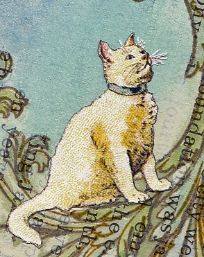
I must credit Julie J. who posted this image from a school reader published in 1896 called Our Little Book for Little Folks. I found the link on Pinterest and it was just what I needed to complete this tag.

It began with this week's theme at Simon's Monday blog challenge where participants were asked to dust-off those craft products that haven't been used in awhile and put them to work.

I was very inspired by Design Team member Andrea Ockey Parr, who used Glossy Accents as a faux resin to create a lovely charm bracelet, and decided to use my bottle of Crackle Accents (provided it hadn't dried up) and one of the first stamps I purchased when I began my journey into paper crafting, a very large flourish from the Stampers Anonymous Tim Holtz collection. It's one of my favorites and, yes, I really should use it more!


I stamped the flourish on to a page from a old book, used watercolor to fill it in, covered it with Crackle Accents (still good!) and after it dried I knocked-back some of the text with acrylic paint then tinted the background with Faded Jeans, Broken China, and Bundled Sage distress inks. After I found the kitty, he was cut-out and pasted along with some tiny stamped butterflies.

The Crackle Accents helped to pop the stamped image and while the cracks are there, they are very fine and didn't show up in my photograph.

This was another great challenge and a good reminder to revisit some old favorites and give them new life.

I'm also linking to a craft challenge called Try It On Tuesday's where the theme is Just a Tag.

June 03, 2014

Waterfall

Click to Enlarge

I can certainly relate to the sentiment on this month's 12 Tags of 2014 by Tim Holtz which is, "out of limitations comes creativity." Perhaps that's another way of saying, "necessity is the mother of invention." All I know is I seldom have the products to make an identical tag so I have to improvise and that often gives birth to a whole new level of creativity.


I did use watercolor paper, his bubble stencil and distress inks for the background and enjoyed this relief printing technique.

The butterflies were made using a handmade stamp on book paper and sewing machine stitching provided the accents.

I know I'll use this technique again with other stencils and I think the key is to use good, smooth, heavy watercolor paper.


April 21, 2014

Apollo

This tag is courtesy of an Inkadinkado 3½" x 5" stamp called World Map and I made it for the Monday Blog Challenge at Simon Says Stamp where the theme this week is Big Stamp.

Apollo was cut from an old history book on the discovery of North America and I also used some Melange tissue paper.

What's unique here is the background and the tag itself.

A while back, I recycled some 300 lb. watercolor paper by covering it with gesso then put it away and forgot about it.

So today, when I began to apply watercolor to it (after I cut it into a tag shape), the watercolor wasn't sinking in because of the gesso. Duh!

So I sanded it down while it was still a bit damp and the edges became nicely distressed. Then I used watercolor which now absorbed into the paper more randomly than if it were a pristine surface. The blue color compelled me to use Apollo and the World Stamp because of the cloud and sea effect and, as they say, this tag is history.

January 07, 2014

Color Blind


Inspired by the Monday blog challenge at Simon Says Stamp where the theme is "blue," I have created a manila tag covered with watercolor canvas, stamped (PaperArtsy) with archival ink, tinted with watercolors and distress inks, and finished with a stencil using a light touch of off-white acrylic paint. Tinting the bottles was inspired by design team member Dan and his monochrome approach to this week's challenge. Thanks Dan!