/* */ Beulah Bee

August 25, 2014

Antoinette


Did you ever wonder why brown paper bag-colored card stock is called "kraft" paper? It's not a clever take on the word "craft" but instead, comes from the "kraft process" a term used in paper making. Others must have wondered about this too because there's a Wikipedia entry for it. And did you know that manila paper was originally manufactured in the Philippines, which is how it got its name.

Click to Enlarge
To celebrate this new found knowledge, may I present a tag made from both manila and kraft paper which I'm linking to the "witch kraft" challenge at SSS.

I pasted the kraft paper onto a manila tag, stamped it with archival ink, transferred an image using polymer medium, tinted it with distress inks, stains and some colored pencils and added strips of printed kraft paper to the border.

The light-colored image plays nicely off the kraft-colored background and this week's challenge was the perfect excuse to finally use it.

August 15, 2014

Madame Butterfly

Before

After

Did you know you can achieve painterly results with gel pens? Just make marks with the ink then wash over them with a brush and water.

Credit for the original image came from one of my most favorite bloggers (thanks again, Aputsaiq).

Half of the pens in the first photo were thrown away after I completed this tag because they had either dried-out or, more typically, the gel and ink had separated from the base of the pen (the survivors had tighter-fitting caps).

Bought several years ago, I haven't used them much but suggest to you that they do have value for adding color to paper and don't need to be saved just for writing.

And because I used a mark-making technique here, I've linked to this week's Monday blog challenge at SSS where the theme is scratched-up.

August 09, 2014

Queen Bee


This is a tongue-in-cheek entry for the Monday blog challenge at SSS. This week's theme is "in the family" and mine happens to be royal.

The tag was made from a scrapbook paper collection by Authentique called Classique Pretty, a bit of Tim's Wallflower paper stash (top), and a frame from Tim's Industrious stickers which I distressed a bit by sanding and painting.

Click to Enlarge
The background in the frame was stamped and embossed (Hero Arts Lace Flower Cluster) then I applied an image transfer of the Queen and her accoutrements. I tinted here and there with distress ink and paint and dirtied up the inside edge of the frame with pencil rubbings. I intentionally offset the frame but, in hind-sight, should probably have centered it instead. It also needs a ribbon topper which I didn't add because then I'd have to photograph it instead of using my flat bed scanner.

I really need to buy a camera and take some photography lessons!

August 06, 2014

Cultivate


I've made a lot of nature-inspired tags lately so why stop now? Prompted by this week's SSS Monday blog challenge "family" theme, I found this excellent photo from my great aunt's collection.

I don't know their names but my relatives lived on a farm in Nebraska and I think it's fun that all the boys are barefoot and wearing bib overalls. In the original photo they were standing on a front porch.

With stalks of corn and advice taken from a gardening manual, this tag was made by creating a background with distress inks, cutting and pasting a copy of the photo, drawing and painting the plants, and hand-lettering the text.

August 03, 2014

Mariquinha

The image of this lovely lady, Mariquinha Junqueira, was found here and was my inspiration for creating a tag to link-up to the Tim Holtz blog.

His monthly tag for August has challenged participants to create something that showcases our own personal muse and reminds us that each of our artistic voices is unique and we must embrace it.

He also shared some great techniques including a personal favorite which is taking advantage of the resist quality of his tissue tape to retain white space.


My technique was similar to his--I used tissue tape, distress stains and Tim's burlap stencil with texture medium. The house (LaBlanche) was stamped on to deli paper which also has a resist quality. A bit of colored pencil was used to create a shadow under Mariquinha's dress to ground her to the page (keeps the image from looking like she's floating).

I love finding images that inspire me and then trying to place them in a composition using stamps and other collage elements. I created this tag for the pure joy of it and give thanks to Tim for a great suggestion and for time well spent.

Jewelweed


A late entry to Simon's Monday blog challenge, this "J" inspired tag pays tribute to another medicinal plant called Jewelweed (Impatiens capensis) whose clear liquid, found in the stems, is a useful tonic for mosquito bites, bee stings and exposure to poison ivy.

There are lots of layers in this tag and it has everything to do with changing my mind (a lot) trying many different effects and essentially just making it up as I went along.

Click to Enlarge
The leaves and bee with shield were gel medium transfers. There's washi tape in both corners on the left side and I also used a Heidi Swapp script stamp.

Distress inks, gesso, gel pens and acrylic paint also played a substantial role in the process along with plenty of sand paper and gel hand-sanitizer which make great erasers! And it all started on a base of text from a book.

I really enjoy working in mixed-media and collage because mistakes are easily remedied and experimentation is such a big part of the fun. Sometimes, I'll create an effect and have no idea how it happened and could never repeat it again, now matter how hard I tried.

I can't help but thank Tim Holtz (and others) for the distress revolution because intentional imperfection is a great fall-back when things don't go just right.

July 30, 2014

Joe-Pye Weed


Eupatorium purpureum, commonly known as Joe-Pye Weed, was named after a native American who used it to treat fevers in the 17th century.

Attracted by the interesting name, it's no coincidence that I created this tag for the Monday blog challenge at SSS. This week's theme is the letter J.

Made with an image transfer of text taken from a vintage botanical guide and a variety of distress inks and acrylic paint, the background was stamped with cursive text (Heidi Swapp) and a fussy-cut image of a Joe-Pye specimen was applied.

This is a very beneficial plant and attracts lots of butterflies. Left to dry in the garden over the winter, it's seed will nourish birds. Its gets tall and will spread (hence the "weed" designation) but what a splendid plant for an old-fashioned garden!

July 28, 2014

Wallflowers

Click to Enlarge
wall·flow·er

[wawl-flou-er], noun

1. a person who, because of shyness, unpopularity, or lack of a partner, remains at the side at a party or dance.

2. any of several related plants of the genera Cheiranthus and Erysimum.

3. paper designed by Tim Holtz

This tag was made from a book page background covered with an image transfer of a "found relative" and greenery cut from the Wallflower paper stash, embellished with flowers from scrapbook paper and tinted with acrylic paints.

July 24, 2014

Sweet Summer Dreams


When you live in the desert as I do, Summer ain't so sweet. Dreaming becomes essential to survival and, prompted by this week's Monday blog challenge at Simon Says Stamp, I've created this tag.

Working on it was good medicine. My disposition improved and I'm sending a shout-out to the design team for the mid-summer dream theme, it was a great suggestion!


I used a variety of ink colors to stamp the leaves, some were outlined with a fine-tip marker, the background tints were made with colored pencils, and the sleeping kitty is from Stampendous.

July 18, 2014

Washi Woman


Awash in the world of absurdity, I have gone too far with this "washi woman."  It's foundation was a contour drawing which by definition lacks precision and accuracy. Then I attempted a mosaic with magazine clippings and later opted for washi tape when it became tedious.

I'm posting it to prove that I embrace my imperfections (it's a self-portrait) and that I have a twisted sense of humor. No, the moon isn't full and I haven't been drinking. If you decide never to return here, I completely understand.

I'm linking to the Monday blog challenge at SSS where the theme is "faces."

July 16, 2014

Esther, Magda and Ada


From left to right, allow me to introduce Esther, Magda and Ada. Esther and Ada are my great aunts and Magda was their friend. The original photo had them standing in front of a train, ready to depart on their next great adventure.

They were all spinsters who worked full-time, saved their money to take nice vacations, and they went everywhere! I have inherited all their photos and postcards of places they visited and know they were very well traveled.

Born at the turn of the last century, they lived far away from me and I only had the chance to meet one briefly (Esther). Whenever I go through my collection, I always wish I had known more about them.

I chose to use this particular photo for the Monday blog challenge at SSS where this week's theme is faces.


It's just a simple cut and paste, with some ink and paint markings to embellish. The background paper was distressed with sand paper and Picket Fence stain.

As I post this I can't help but wonder if they would appreciate me sharing their faces on the internet. I think not.

July 12, 2014

Sancta Fides


We've all seen collages made in mosaic fashion from bits of colored paper and I thought I'd give it a go (granted on a small scale) using a manila tag for the base.

Because pages from inexpensive magazines are printed on very thin paper, I'd decided to use that as my source for the colored papers.

I traced the outline of a bird, then cut my shapes and pasted away. The hardest part was not the cutting but instead, choosing what colors to use and where. I now have a new found respect for collage mosaic artists because of this exercise.


I finished it off by masking, then stamping a strip from a Tim Holtz stamp (Math Border) which was embossed with a copper color. I added some book text and tinted the background with colored pencils.

I'm linking it to the Monday blog challenge at SSS for another chance to with the $50 random draw. This week's theme is "start from scratch."

July 08, 2014

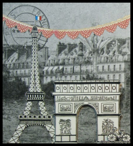
Mon Paris

Click to Enlarge
Artist and designer, Joel Henriques, has devoted himself to making arts and crafts both accessible and meaningful. His website, Made by Joel, encourages everyone, regardless of economic means, skill level or age to participate in the collective, creative process.

When he created Paper City of Paris, I knew I had to make something--I found it irresistible!

And since the Monday blog challenge at Simon Says Stamp is start from scratch, it was just the push I needed.


I started with a 4.5" x 8.25" basswood tray found in the clearance aisle at my local crafts store. I used an online image of an old Paris postcard that I cropped and printed to fit the tray. I cut-out Joel's paper city (the travel-size version) and used craft foam on the back of a few pieces to give it dimension. The garland, bird and border were cut from scrapbook papers.

I encourage you to visit Joel's website (especially if you have young children). If you use this paper city, there's a Facebook page where you can post your creation. Other cities are also available including Sidney and he has future plans for London and Barcelona.

July 04, 2014

Sea Spell


I had so much fun making this tag! Inspired by Tim's tag for July, I can't believe how many products I used to complete it. I dusted off crackle paint, glitter, and embossing powders that haven't been used since Christmas. The background was splattered and spritzed and wiped-off so many times I lost count. I knew getting it right would be a challenge so I coated the tag with gesso beforehand.

It was also the perfect time to use some sea-themed papers that I picked up several year's ago and never used. The sea horse and sand dollars came from a release by Graphic 45 called Botanicabella. The shells and greenery are Calambour decoupage paper bought at a craft fair.

Instead of using a shrink plastic background, I used the Falling Snow stencil by Simon Says Stamp and embossing powder to create a resist. The sandy area is a variety of embossing powders sprinkled onto tissue paper then cut out and pasted to the tag.


There's a bit of clear rock candy Distress glitter over a few shells and leaf edges and I completed the tag with a quote by Jacques Cousteau that was printed and aged with inks.

Tim suggested that if you can't go to the beach then let your creativity take you there. Maybe that's the biggest reason this tag was so appealing to me. I've been land-locked all my life and yet my astrological sign is Cancer the Crab. Every time I've visited the ocean I have had such a connection! Maybe some day I'll make it there again and be part of it's wonder, forever.

July 01, 2014

Miss Henrietta Strong

Click to Enlarge
I always begin a collage by using an image with strong personal appeal and when I stumbled upon the image that inspired this tag, I was awestruck!

I'm not a youngster (I've been around the block a few times, so to speak), but I had no idea that poppy seed heads could, under the right circumstances, dry to reveal such a mesmerizing, skeleton-like structure.

I also liked this image of Miss Henrietta Strong (found here). Her all-white court costume gives her the eerie (and intentional) look of a living porcelain doll.

The butterfly was cut from a magazine and altered by cutting down it's size and adding some white paint. I liked that it's structure resembled that of the poppy seed head.

The background paper is from Idea-ology (Destinations Paper Stash) and the edges were embellished with a 3D paint called Scribbles.


I'll close by sharing a quick tip when working with collage elements that I find quite helpful--it's called encasing.

To protect your paper elements (like Henrietta or the butterfly), it's a good idea to cover the front and back with a clear medium before adding them to your composition. That way, they are protected from later abuse when using image transfers (poppy seed head) or further tinting. It's also much easier to paste down delicate pieces because the medium strengthens them.

My inspiration came from this week's SSS Monday blog challenge where the theme is white and I'm linking it there.

June 27, 2014

Resting Place

I sometimes think my tags are more like journal pages and I certainly seem to approach them that way. This one is a good example of what I mean.

I wondered what would happen if I used black acrylic paint and my tree stencil (Crafter's Workshop) over a piece of very tiny sheet music (Vintage Finds by Theresa Collins). But the contrast of black and white was pretty stark, so I decided it needed leaves.

I put small drops of three shades of green acrylic paint here and there and covered it with a piece of scrap paper that I pressed down and lifted off. There was too much coverage so I used a sheet of hand sanitizer (don't have baby wipes) to take off most of it.

What if I tried to make it look like the sky was peaking through? Out came a few shades of blue paint that I applied with a brush, feathering a bit with my fingers and wipes.

Next? Birds, of course! So I used black archival ink to stamp them and found book text that seemed appropriate. But the overall design was still just a little monotonous. Then I remembered a tool which I should use more often (the prompt this week at the SSS Monday blog challenge).

Click to Enlarge
It's a tracing wheel used in sewing to transfer pattern markings to cloth. You run it through paint and then on your surface and it leaves tiny little dots all in a row. It's a technique that was probably invented by Lynn Whipple and I used it here to complete the tag.

So, whether it's a tag or a journal page, it doesn't really matter.

 It began as an experiment, one step led to another, it was satisfying, I had fun, and I learned something along the way. And that is why I do it! (Stamp credit: Stamping Bella)

I'm linking to Craft Horders Anonymous Challenge #10 Spray It! Ink It! Paint It! Smear It! Emboss It!

June 24, 2014

Cat Bird

Click to Enlarge
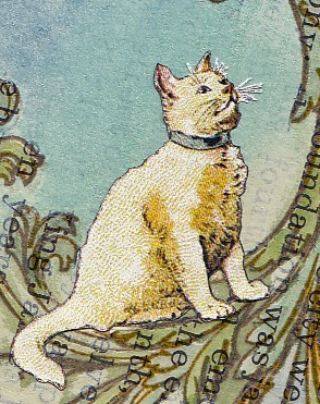
I must credit Julie J. who posted this image from a school reader published in 1896 called Our Little Book for Little Folks. I found the link on Pinterest and it was just what I needed to complete this tag.

It began with this week's theme at Simon's Monday blog challenge where participants were asked to dust-off those craft products that haven't been used in awhile and put them to work.

I was very inspired by Design Team member Andrea Ockey Parr, who used Glossy Accents as a faux resin to create a lovely charm bracelet, and decided to use my bottle of Crackle Accents (provided it hadn't dried up) and one of the first stamps I purchased when I began my journey into paper crafting, a very large flourish from the Stampers Anonymous Tim Holtz collection. It's one of my favorites and, yes, I really should use it more!


I stamped the flourish on to a page from a old book, used watercolor to fill it in, covered it with Crackle Accents (still good!) and after it dried I knocked-back some of the text with acrylic paint then tinted the background with Faded Jeans, Broken China, and Bundled Sage distress inks. After I found the kitty, he was cut-out and pasted along with some tiny stamped butterflies.

The Crackle Accents helped to pop the stamped image and while the cracks are there, they are very fine and didn't show up in my photograph.

This was another great challenge and a good reminder to revisit some old favorites and give them new life.

I'm also linking to a craft challenge called Try It On Tuesday's where the theme is Just a Tag.

June 20, 2014

Faith


This is the fifth tag made in my Civil War series and there are lots of layers here. I fiddled with this one quite a bit but the good thing about collage is--if something doesn't work, you can just cover it up with something else!

Click to Enlarge
The first layer (now almost invisible) is book paper cut in strips with washi tape along some edges.

It wasn't working so I covered everything with plain tissue paper and deli wrap stamped with acrylic paint. To lighten it up and unify the colors, I applied Picket Fence distress stain all over and used Broken China and Vintage Photo distress inks here and there.

I added the mirror, lady, and text, applied Tim's tissue tape on the top and left edge, sanded some edges to expose the first layer of washi tape and used Walnut Stain distress ink along the edges for framing.

I'm linking it to Simon's Monday blog challenge where the theme is anything goes.

June 11, 2014

Soap Box Queen

Today, I'm sharing the result of a tag made for the Monday blog challenge at Simon Says Stamp where this week's theme is paint.

It all began by dripping transparent acrylic paints from one end to the other with the help of a water mister.

Then I wandered through images on the net until I found one that spoke to me and transferred it using polymer medium (see tutorial here).

I drew the platform and crown with fine tip markers and used acrylic paint on her dress and the shadow.

The bubbles (also paint) were made with the Falling Snow stencil by SSS and emphasized by outlining with a marker.

June 09, 2014

Adorata


Number four in my series of southern belles, this tag consists of a digital image of handwriting printed and pasted under some tissue paper stamped with a seed packet image (Stampendous).

The ladies were printed and cut from two photos found here and distress inks and colored pencils were used for tint.

June 04, 2014

Sun Tarot


Design team member Dan has proposed a magic theme for the Monday blog challenge at Simon Says Stamp this week. Dan uses a lot of face stamps in his work so, to honor his theme, I've made a tarot card that was inspired by this image.

The background came from the Idea-ology Destinations paper stash, the borders were cut from French Industrial. The face stamp is by La Blanche. I used a fine-tipped marker, acrylic paint and colored pencils to draw and tint the sun rays.

Possible meanings associated with this fortune-telling card are:

Optimism—Expansion—Being radiant—Positive feelings
Enlightenment—Vitality—Innocence—Non-criticism
Assurance—Energy—Personal power—Happiness
Splendor—Brilliance—Joy—Enthusiasm

And so, since you are here -

My tarot tag has now predicted all of this for you!

June 03, 2014

Waterfall

Click to Enlarge

I can certainly relate to the sentiment on this month's 12 Tags of 2014 by Tim Holtz which is, "out of limitations comes creativity." Perhaps that's another way of saying, "necessity is the mother of invention." All I know is I seldom have the products to make an identical tag so I have to improvise and that often gives birth to a whole new level of creativity.


I did use watercolor paper, his bubble stencil and distress inks for the background and enjoyed this relief printing technique.

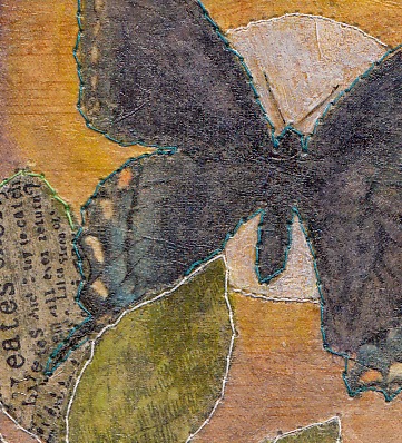
The butterflies were made using a handmade stamp on book paper and sewing machine stitching provided the accents.

I know I'll use this technique again with other stencils and I think the key is to use good, smooth, heavy watercolor paper.


June 02, 2014

Best Souvenir

Somerset Studio had a call for artwork, the theme was "Le Cirque," and this piece was published in their Summer 2014 Gallery issue.

As a child, my strongest memory of the circus were rows and rows of Kewpie dolls lined up for sale as souvenirs. They had pretty costumes with sparkles and feathers and I really wanted one. I haven't been to the circus since then and wonder what the best souvenir is now?

May 28, 2014

Artistamps


From Wikipedia:

The term artistamp (a portmanteau of the words "artist" and "stamp") or artist's stamp refers to a postage stamp-like art form used to depict or commemorate any subject its creator chooses. Artistamps are a form of Cinderella stamps in that they are not valid for postage, but they differ from forgeries or bogus Illegal stamps in that typically the creator has no intent to defraud postal authorities or stamp collectors.

The Monday blog challenge at Simon Says Stamp is The Artsy Stamp and I decided to take a bit of a twist and make a collection of artistamps instead. I used tiny bird stamps, some colored pencils for tint, a black fine tip marker to mimic the perforations, and a vintage envelope for the background (which had an interesting embossed design).


The Wiki article further states:  While the method of production is entirely the choice of the artist, creators who exclusively or primarily use rubber stamps are occasionally held in contempt by members of the artistamp community, some of whom refer to such producers as "bunny-stampers."

Well, I don't care if they call me a bunny-stamper because these are actually birds (duh) and they were really great fun to make. The hard part is getting a realistic looking perforation--I opted to use a less authentic (but easy) method by making tiny black dots along the edges.

May 25, 2014

For Paula

Still working with my "southern belles," this tag was a simple case of cut and paste.

The background is from a sheet of Idea-ology paper stash, the frame was made out of paper called Antique Script by Bazzill, the plantation ruin and my little lady were digital images I printed.

Not much was done in the way of coloring--I only used a little pencil to create a shadow behind the frame. I did, however, knock back the plantation drawing with thin off-white acrylic paint to fade it into the background.

I do wish more papers were made like this one from Bazzill because it is very thin and works so much better in collages than thicker cardstock.

May 24, 2014

Twilight


Linked to the botanical theme at the Simon Says Stamp Monday blog challenge, this tag was an experiment using tissue paper (from a sewing pattern) to unify the composition and impart a vintage color cast.

Click to Enlarge
After pasting down the leaves and butterfly, I completely covered the tag with tissue paper using Mod Podge. On some leaves, I stamped text on tissue paper pieces (Hampton Art/7 Gypsies).

I used transparent acrylic paint (except white) to bring back some of the color softened by the tissue and finished it off with a trip to the sewing machine.

May 21, 2014

Dos Centavos

Click to Enlarge

This week, the Monday blog challenge at Simon Says Stamp is botanical so it prompted me to finally finish a collage I started a while back that includes a bird cut from an out of print Graphic 45 paper collection called Botanicabella.

It's mounted on an old book cover, the paper on the right and at the bottom are vintage, the map on the left side was printed on beige cardstock then antiqued.

A stamp from Anna Griffin was used in the lower left corner, tissue paper from an old pattern, a bit of black mulberry paper and a vintage postage stamp completed the project.

May 19, 2014

Trois Dames


For me, the best part of crafting is the problem solving required when things don't go the way you expected. I believe I used "everything but the kitchen sink" when making this tag and finally stopped tweaking it when I ran out of ideas and the paper just couldn't take anymore.

It may seem a bit odd but, one of my favorite papers is a striped dark brown and off white pattern that can be cut into tiny strips to add accents where needed. An example of that paper runs across the bottom of this tag.

This is tag number two in a series I'm working on that feature some vintage photos I found on Pinterest (see earlier post here).

May 16, 2014

Monopoly


I couldn't let the letter M challenge at SSS go by without one more entry since I've had more time to play this week and found this theme easy to work with.

For Christmas, I received a collection of miniature stamps by Tim Holtz and they remind me of the place markers from a Monopoly game.

So I found a great image of the patent application submitted by Charles Darrow in 1935 and added a few new place markers to his design.

I give much credit to Stampers Anonymous for these tiny stamps as they have an incredible amount of detail. So, how about this for a title?

Modified Miniature Monopoly Markers by an M Maniac

(I think I better take a break...)