/* */ Beulah Bee

September 16, 2015

Carousel

Click to Enlarge

Today I'm sharing a journal page made with vintage images, a stamp (the carousel) and stencils which I'm linking to Simon's Monday blog challenge.

This week's theme is love this technique and in this piece, I primarily used sponging and stenciling which I enjoy because it's a fast way to get results.

And since I live in a very dry climate it's almost impossible to apply acrylic paint without leaving brush marks. So, more often than not, I'll apply paint with a cosmetic sponge because paint daubs seem easier to blend. I also use sponges to apply paint through my stencils.

One of the stencils I used is a tree but it's a positive shape (photo left) so I had to trace it with a pencil then fill in my lines with a paint brush.

I would have preferred the reverse version but ordered the wrong kind by mistake and I have learned to live with it.


The photo above is the full-page, uncropped view and you'll see an image transfer of the moon in the upper-right corner along with some stars made with a stencil. Stamp credit for the carousel goes to Tim Holtz--it's from his Tiny Things stamp set.

And speaking of techniques we love, I'll close by sharing an artist who I thought of while working on this page. Her name is Maggie Taylor and I first discovered her work during the opening credits for a TV Series called Ghost Whisperer. Her dream-like artwork is made digitally and she's a Photoshop expert. Her website is a lot of fun and if you're not familiar with her work, I think you'll enjoy it.

September 13, 2015

Zulu


I've made lots of tags over the past few years but little in the way of postcard/mail art which is funny since, size-wise, they have a lot in common.

So, channeling my inner Nick Bantock, I went way out on a limb with this creation. Yes, it's still a tag but with credit for pasting on a postcard, I think it could be called mail art.


The bird is a hand-carved stamp and the image transfer is from the British Library. I was attracted to the postcard because the handwriting was in red ink and also for the blue circles and text. I used a Tim Holtz Correspondence stamp (247) over the postage mark and there's a bit of Postale tissue paper at the top.

Why I chose this image will remain a mystery, even to me.

September 10, 2015

Escape


A bonus from mucking-out the craft room last month was discovering long-forgotten goodies like the wooden birdcage die-cut (from Kaisercraft) that I used on this tag.

And since this week's theme at Simon's Monday blog challenge is stamp and punch/die-cut what better time to use it?

A background was made with old book paper, paint and stamping then I tinted and stamped the birdcage and used an image transfer for the text. Yes, that's a bit of washi tape for the shadow and I used a black Fudi-ball pen to ink the edges.

Click to Enlarge

I have yet to invest in die-cutting equipment and only have a few, very small paper punches so I was happy to find this birdcage in my stash--otherwise, I'd have to sit this one out!

Stamp credit: Kaisercraft Dictionary Meanings

September 05, 2015

Note to Self

Click to Enlarge

This week's theme at Simon's Monday blog challenge is to create using only three colors and, while this tag may look like I left them out, my trio is off-white, green and sepia.

According to Google, black is not a color; a black object absorbs all the colors of the visible spectrum and reflects none of them to the eyes (in case you were wondering).☺


I used a Found Relative photo which I cut-out and pasted to the edge of a postcard and then attached to a manila tag tinted to match the postage stamp.

The backside of these photos have pretty patterned paper which I peel off (to make cutting easier) and I decided to use it to make the postcard background more interesting.

I just cut away some of the pattern, flipped it over, pasted it down then peeled away parts of it (like on the lady's face).

I added some Remnant Rubs and emphasized the shadow near the lady's feet.

(Note to self--dream big AND dream in color!)

(Another note to self--the postmark on this card is 1915 which means I used a 100-year old post card to make this tag.)

September 04, 2015

Remnants

rem·nant
/ˈremnənt/

noun

a small remaining quantity of something.

a piece of cloth or carpeting left when the greater part has been used or sold.

a surviving trace.


I only have remnants of brain matter left this month after working on my entry for Tim's September tag--it was a challenge!


To begin with, I'm alcohol-ink impaired so piles of glossy stamping paper later, I finally arrived at a background that might work.

I don't have transparent gloss texture paste so I used gloss gel medium with Tim's Scribbles stencil instead. I thought it would dry clear but I believe the thicker application prevented this. It's still somewhat transparent though and the pop of alcohol ink colors shine through but it's obviously not the same effect as Tim's.

Rather than highlight the texture with archival ink I used Vintage Photo Distress stain to darken the cracks and provide some contrast.

Click to Enlarge

There's no frosted paper in my studio so I took a laser printer transparency and sanded both sides to mimic this product. I guess it's close-enough but didn't curl as easy as his did.

Finishing touches included a Foliage charm, Remant Rubs (Words), ribbon scraps and Scribbles (3D fabric paint) dotted along the tag edges.

Tim's monthly tags always challenge me and this time, after allowing myself to fail (and learn), I thankfully pushed myself through.

I am grateful for the process and the end result!

August 31, 2015

No. 214580 - Special Edition

A friend recently asked how I do image transfers so I thought I'd share a simple step-out today in case others are curious too.

(Click on the photos to see a larger version with the lightbox feature.)

I begin with a photocopy or laser printer (toner-based) copy that I crop to the size I need after reversing it (the Photoshop command is Image-Rotate-Flip Horizontal).


Why reverse it? I may not need or want to but it will be essential if there's text otherwise, it will be reversed and unreadable. Pay attention to the direction Mona is facing as I work through this example and you'll see what I mean.

With a paintbrush, I completely cover the front of the image with an even layer of polymer medium making sure to work all the way to the edges. If an area's not covered--it won't transfer.


I flip the image and place the wet side face down on my support (in this case, a Journal Ticket). I gently press and smooth the image down with my fingers to remove any air bubbles. If there's an air bubble--it won't transfer.


I have to work quickly so the medium doesn't dry before I place it on the support. If it doesn't dry--it won't transfer.

Also, I try not to get any medium on the backside of the image but don't worry if I do--it just makes it a little more difficult to remove later.

If a lot of medium oozes out from the edges then I'm pressing too hard or I used too much medium. Blot up what you can.  No worries, my image will still transfer and I'll know better next time.

I let it completely air dry which, in this case, only took about ten minutes due to the small size. In the past, I've rushed drying with a heat tool which can cause the paper to bubble and if there's a bubble... (you know the drill).

Now comes the fun of rubbing the paper away to reveal the image.


I add a small pool of water on my craft sheet then use my finger to spread it over the back of the photo. I let it soak a bit then begin to gently rub the paper away.

I avoid getting water on the ticket border or rubbing it since it's not protected with medium and I could damage it. Using small amounts of water in a controlled fashion is best--I don't want to rush this part.


I just keep adding a little water and rubbing away all the white bits and it doesn't take long before the magic is revealed.


The edges are the most delicate so I use careful, gentle rubbing in those areas. In spite of my caution, it's not uncommon to lose tiny bits and I don't mind because it adds a distressed appearance.


Notice how Mona is facing the opposite direction? Hopefully, you now understand why sometimes a reversed image matters. In this example, it was important to honor the direction Leonardo originally intended.

I hope you enjoyed this step-out and that you'll give it a try. I think image transfers are a terrific technique to use on mixed media projects.

You can check out other projects I've posted here on my blog that were made with image transfers if you need some inspiration!

August 29, 2015

No. 526714


Tickets is this week's theme at the SSS Monday blog challenge. So I made another entry because I wanted to try an image transfer on a Journal Ticket.

Click to Enlarge
The background paper is from the Correspondence Paper Stash and I used my current, most favorite craft stash--Remnant Rubs.

The local big box only carries one kind and they're always out of them so I will order more online which is my reward (which I think I deserve) for cleaning up the craft room. Yeah!

August 26, 2015

No. 214577

Gosh it's good to be back making and creating after a marathon clean-up of my craft room. Even with minor rearrangements, the room feels a bit strange and I hope I remember where I put everything!

Click to Enlarge

I made this tag to link up with Simon's Monday blog challenge. This week's theme is tickets.

Most everyone on the Design Team admitted to having lots of them in their stash and surprisingly, so did I. This tag features an Idea-ology Journal Ticket.


Nothing extraordinary here in the way of technique--just good old Distress Ink, a fussy-cut stamped flower and one of Tim's Photo Booth images along with some Remant Rubs, fabric scrap and buttons.

I love the challenge of making new things look old/vintage and this tag was all about that. I'm not afraid to use sandpaper or water on paper to get the right effect and that's just what I used to grunge up this ticket.

August 15, 2015

Reorganization

My "studio" is a very small spare bedroom and when I began paper-crafting almost eight years ago I had no idea that, eventually, my stash of products would over-run me. So, a week ago, I began to reorganize and declutter to make things more functional.

My biggest problem was my supplies were spread out everywhere. I needed to sort through it all and put my paper together in one spot, move on to tools and then finally ephemera/embellishments. What a chore this has been but I'm beginning to see real progress and expect to have things right again in a few more days.

One accomplishment has been to renovate my Distress Ink storage container to better fit my shelving. And since my original DIY post is so popular I thought you might like to see the changes I made. The original was taller with two vertical rows--the new one is shorter and has four rows.


I just cut the original in half, glued the two shorter sides together and put a new base on it. The material is easy to modify, you can make it whatever size you need and add on to it later, if need be.

I am really looking forward to creating again once my reorganization is complete and vow to use up the materials more efficiently so I'll never have to do this again! (Famous last words?)

August 08, 2015

B Original


Tim's tag for August features a die-cut mixed media background.

I attempted to mimic the effect by using his Subway stamp over a scrap from the Destinations paper stash.

I also used his vellum Ephemera--the square in the upper-right corner and the checkered board behind the photo (which is a Found Relative that I cropped and altered just a bit).

Click to Enlarge

Remnant Rubs provided the black text (except the "B") and the Mirrored Star was distressed with a copper and citris alcohol ink combo.

The oval frame is a thin textured metal scrap that I tacked to the tag with hand-stitching.


A bit of machine stitching, some stamping here and there for texture (tiny black squares and splotches) and black ink to distress the tag edges finished it off.

August 03, 2015

Mariposa


Mexico Moods is the summer challenge at Our Creative Corner and their prompt inspired me to create this tag.

Like my last several blog posts, this one features Souffle Gelly Roll pens. It seems I can't get enough of them and really went overboard this time! They are a bit like paint pens with a fine point and they're very opaque and waterproof.

I began with a black gesso background and stamped/embossed the butterflies and the lettering onto the tag. Next, I traced on a few designs with a pencil and some hand-made stencils.

Then the gelly rolls came out and were used to cover the entire surface with colorful mark making. To modify the values, I did use a glaze of thalo-blue in a few areas (particularly behind the butterflies).

The tag almost has an enameled appearance and makes me think I'd like to try this technique on a copper or gold background to see the result. Since they can be applied on any surface the sky's the limit!

July 31, 2015

Cecil


Cecil's death this month made us more aware of lions on the brink of extinction so perhaps some good will come from this senseless killing.

I've made this tag to honor him and hope you'll visit Lion Aid's facebook page if you'd like more information on what can be done to save them.

I began with a page from a very old cookbook (copyright 1887) pasted to the front of a manila tag.

The paper is so old it crumbles so a layer of acrylic medium was used to stabilize it.

An image transfer of Cecil was applied and features his distinctive black mane (which was his trademark).

I stamped the wing/crown image (Tim Holtz) on a scrap of tissue paper then embellished it with gel pens and colored pencils.

There's a strip of washi tape behind the Industrious sticker frame and a glaze of paint and Graphitint pencils added background color.


I'm linking to Simon's Monday blog challenge where this week's theme is no ordinary paper.

July 25, 2015

Ikat


i·kat  ˈēkät  /  noun

fabric made using an Indonesian decorative technique in which warp or weft threads, or both, are tie-dyed before weaving.


Beginning with a Distress-stained background (Tumbled Glass), I stamped damask-like patterns in Iced Spruce then drew many fine lines using gelly roll pens to imitate ikat fabric.

The girls were added via an image transfer but their faces got lost so I cut-out new ones and pasted them over the transfer.


I distressed the tag edges with a black Fude Ball pen along with some tiny stamped text and added a shadow beneath the girls with a colored pencil.

Credit for my inspiration comes from Simon's Monday blog challenge where this week's theme is the letter i.

July 22, 2015

Pronouns

My take on Simon's Monday blog challenge?

First-person singular pronouns, of course!

The letter i is this week's theme and yes, it made me think of them.

I altered a favorite image (previously used here) which I think may be of triplet sisters.

Their expressions are so serious, their outfits so plain and my, such severe hair-do's!

It was time to lighten the mood.

Myself went crazy with new Souffle Gelly Roll pens and there's a scrap from the Wallflower paper stash along the bottom.

Me thought the word amusement was a good fit.

The bird cage is a stamp from Tim's Tiny Things set.

I also used a strip of Industrious Stickers but they are hard to recognize since me covered them with Gelly inks.

(Scroll down to see the tag in full view.)


July 19, 2015

Renegades


The joy of play and uninhibited creative expression is the reward for keeping an art journal. The pages are not meant to be "works of art." Instead, the freedom to explore (and learn) elevates it to a much higher plane and the confidence gained may carry-over to more serious pieces. So I say, get busy and be a renegade!

Click to Enlarge

A new set of Gelly Roll pens, exposure to a couple of technique videos and a cool new song by X Ambassadors called Renegades fed my inspiration for this journal page spread.

First, the technique videos merit reference in case you want to watch. One is by Piarom (blog link, video link) and the other is by Jeanne Oliver (video link, requires creating a login to view).


Both artists use figures cut from magazine pages which they transform in different ways. Mine didn't go in quite the same direction but their videos did inspire me to try.

I also used some other magazine scraps along with paint pens, colored pencils, stencils, a Tim Holtz scroll stamp and some of his tissue paper.

I'll close by saying that I love, love, love my new Gelly Rolls (called Souffle). They write over anything including fluid mediums and waxy colored pencils and are waterproof. So useful!

I think I'll link this to Simon's Monday blog challenge - this week's theme is anything goes (mine will be entry #521 - whew!).

July 16, 2015

Papillon


I splurged this week and bought a set of Gelly Roll pens and experimented with them on this tag.  They are called "Souffle" because they're pastel-colored and can be applied thickly for a 3D effect. They write on anything, including acrylic mediums, which is a big deal for me.


I began by distressing my tag with inks and paints then applied an image transfer to create the background and also added some stamping of grass near the bottom. I fussy-cut the girls (inking the edges with a Pitt pen) and pasted them on top.

I played around with the gellies to add color directly to the surface and also by diluting with a water brush. They are very opaque and also waterproof when dry. So, where I felt there was too much color, I used an Exacto knife to scrap bits of it away. In some areas, subtle color changes were made with colored pencils.

Click to Enlarge

This isn't the best example for illustrating how the new pens can be used but I'm very happy to have them in my arsenal of supplies and know you'll see lots more of them in future work. Stayed tuned ;)

I'm linking to Simon where this week's theme is anything goes.

July 12, 2015

Merriment


Torn scraps of pasted papers left-over from other projects became the background for this tag along with tints from acrylic paint, colored pencils and walnut ink-stained edges. The lady and flower are image transfers and I used a stencil to break-up the background with just a few tiny squares.

I painted the area just behind the lady's face with off-white paint before transferring the image to keep the background from showing through this transparent layer.

July 09, 2015

Here is Now


An image transfer on an old postcard is the main feature of this collage tag which I embellished with a tiny figure, some Remnant Rubs and stenciled dots.

The bottom border was cut from the back of a Found Relative photo. The tag was tinted with colored pencils and the edges were distressed and dotted with a Gelly Roll pen.

I made it for linking to Simon where this week's theme is coffee or tea.

July 04, 2015

The Fourth


Tim's July tag celebrates Independence Day and what better way to spend the holiday than to play along? I haven't any blue print stamps but except for the postage stamp and typed text, everything else here is Idea-ology.

The boys are from the Occasions photo pack, the red papers are from the Merriment paper stash, the blue is from Correspondence and the snippet of the word "July" came from Lost and Found.


The "Credo" stamp is a US commemorative from 1960 which depicts a quote from Francis Scott Key:

And this be our Motto, in GOD is our TRUST.

"Life, Liberty and the pursuit of Happiness" are words from the Declaration of Independence and our reason for celebrating today. 

Happy 4th of July!

July 03, 2015

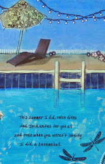
Swimming

Click to Enlarge
The daytime temps here in the desert have been hovering between 105 and 110 degrees for the last three weeks.

So, the only way to get outside and stave-off cabin fever is to find a swimming pool!

You have to park your flip-flops right at the pool edge because the ground gets so hot you can't walk barefoot.

I'm posting this journal page to celebrate a favorite summer pastime which was prompted by this week's theme at Simon Says Stamp.


The ladies are an image transfer and I used a variety of stamps, stencils, acrylic paint, colored pencils and ink pens to make it. My hubby calls my hobby "coloring" and the term really applies here because I did feel the joy of creating like a kid with this one.

I inscribed the words from a song by Loudon Wainwright III called "The Swimming Song" to decorate my pages and thought I'd post the lyrics below since you can't read them too well in the photos.

This summer I went swimming, 
This summer I might have drowned 
But I held my breath and I kicked my feet and I moved my arms around, I moved my arms around. 

This summer I swam in the ocean, 
And I swam in a swimming pool, 
Salt my wounds, chlorine my eyes, 
I'm a self-destructive fool.

This summer I swam in a public place and a reservoir, to boot, at the latter I was informal, at the former I wore my suit, I wore my swimming suit. 


This summer I did the backstroke 
And you know that's not all 
I did the breast stroke and the butterfly 
And the old Australian crawl, the old Australian crawl. 

This summer I did swan dives 
And jackknifes for you all 
And once when you weren't looking 
I did a cannonball, I did a cannonball.