/* */ Beulah Bee: Idea-ology
Showing posts with label Idea-ology. Show all posts

July 03, 2017

Fortune Teller


I'm so delighted to be a Guest Designer this month at the Simon Says Stamp Monday Challenge Blog and if this is your first visit here--hello and welcome!


Our challenge this week is to use red, white and/or blue and features products by Sizzix. I used the Tim Holtz Texture Fade called Roses to create the background for this tag.


After embossing an old book page, I swiped Red Brick Distress Ink on the raised parts. It looked pretty good but I wanted to experiment.

So I spritzed the page with a healthy dose of water (which moved the color into the background) and let it dry. It was still okay but when I turned the page over I got really excited about how the backside looked and that became the background I used for this tag.

To add a little variety of color, I lightly swiped white paint over some of the raised parts.


Next came the oval, cut from a vintage postcard. It needed a border so I hand-stitched around the edge using dark gray embroidery floss then repeated the stitching along the tag edges. I smudged a tiny bit of charcoal pencil around the oval to give it some depth.


The little miss is an Idea-ology Paper Doll dressed up with Lace Trimmings and more stitching (this time using thick white thread). To get the lace to hold it's shape after gathering, I coated it with watered down white glue and let it dry before using Glossy Accents to attach it to the bottom of her skirt.

The original vest was dark gray but I wanted to make it red so I lightly scratched into the surface with an X-Acto Knife which gave me a lighter surface to tint.


The photo above shows how I pre-punched holes with a pin tool to make hand-stitching the scarf a little easier. I didn't have blue thread so I used white and just tinted it to match the skirt.


The scarf inspired me to use a Clippings Stickers text from Idea-ology.
A black star (traced from an image) was placed near her feet.
Tiny stitches were sewn on her vest.
I made a shadow beneath her with charcoal pencil.
Black Soot and Walnut Stain Distress inks were rubbed here and there.

----------------------------------------------------------------------------------

I really hope you'll join us for this week's challenge because I want to see what inspires you!

And when you upload your creation to the Simon Says Stamp Monday Challenge Blog you'll have a chance to win a $50 voucher at the Simon Says Stamp store!


Here's a list of the products I used for this challenge
which can be ordered from Simon:


April 17, 2017

She Meant It


I'm sharing an art journal page with you today, made by transferring an advertisement from a magazine with gel medium then highlighting it with black and white gel pens, a Found Relative, some butterflies (from the Snippets ephemera pack) and text (from Clippings stickers). I also transferred book text to fill in some empty spots.


I was really drawn to the advertisement--a room with wonderful plaster and wood forms, a large framed mirror over such a decorative fireplace and one fabulous chandelier. How clever to furnish it with a modern style sofa and rug.

And so I began this art journal journey celebrating the page and becoming more intimate with all of it's interesting embellishments.


Update: After posting, I went to the ad's website (The Rug Company) and found the original photo so I thought I'd include it for another perspective. BTW, the rug comes in several sizes and prices range from $3,500 to $51,000! It's hand-knotted silk.

January 26, 2017

CHA 2017 (Creativation) Show Samples

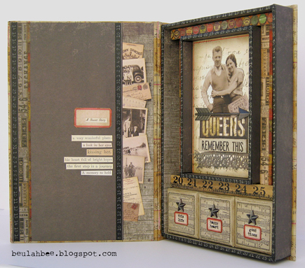
It was a privilege and an honor to create Idea-ology show samples for this year's Craft and Hobby Association Convention.

I was asked to use Configurations boxes and the new Vignette Trays so at least I had some direction but honestly, I was completely overwhelmed. There were just too many possibilities and I didn't know where to begin! It was a challenging experience.

It's so interesting to see the other participants' creative use of the new products and so I'm sharing mine with the hope you'll get an idea or some inspiration for your next project!

Click on the photos below for a link to the details

of how they were made (and close-up views).


 Configurations Box
Configurations Box
 Mini Configuratons Book
Mini Configurations Book
Large Vignette Tray
Small Vignette Tray
Vignette Box

January 23, 2017

Brownie


A photo found here was my inspiration for a tag that combines scrapbook paper and image transfers with a Souffle Gelly Roll pen and the new Tim Holtz Idea-ology Clipping Stickers (a salvaged assortment of adhesive backed phrases, words, and numbers).

I was pleased to receive the stickers when asked to complete some show samples (which I'll post soon)--the phrases available are excellent and really kick-start my imagination!

The dark areas in the top of the photo were sanded a bit to lighten before transferring. To learn more about my image transfer technique you can see a demo here.

November 22, 2016

12 Tags of Christmas - March


Here's tag number three of my Christmas versions of Tim's 12 for 2016. Each month he featured a technique remix and for March it was textures and dimensional die-cuts using cardboard.

I played around with my Mixed Media thinlet to see if I could cut a surface area larger than the original die to cover a section for the inside of a tree.


See the thicker line running up the left of center? That's my attempt to line up the die edge next to a previous cut. It was fun and challenging to use the die in this way and makes it more versatile.

The word bits are from this year's Idea-ology Christmas mini paper stash called Tidings and the packages were made from Christmastime ephemera.

Ranger's Stickles decorate the borders, Liquid Pearls created the texture you see along the cardboard ripples, I applied Glossy Accents to the package ribbons and a Mirrored Star tinted red with alcohol ink was the obvious choice for the tree top.

November 18, 2016

12 Tags for Christmas - February


Monoprinting (a great way to get more mileage out of stencils) and embossed texture paste were the techniques presented in Tim's February tag--here's my Christmas version.

I stayed true to the monoprinting but....

The stencil image (a doily) just didn't develop like I wanted it to so I placed the stencil back over the printing and used paint through the stencil's negative shapes in the traditional fashion.

Without the special texture paste that Tim used, I had to improvise. But I came up with an alternative that yielded a new stencil in the process.

I stamped text on Yupo and cut out the letters to make a stencil then used brown-tinted paste medium covered with glitter.

I've said it before--Yupo makes great stencils (cuts like butter, is durable and easy to clean) and now I have a stencil I can use for future projects.


I love the Santa image from Tim's 2016 Christmastime Ephemera Pack (wish there was more than one) and framed it with tiny dots of Ranger's Liquid Pearls.

Stencil credit: The Crafter's Workshop (Mini Tatting), Stamp credits: Stamper's Anonymous (Christmas Words) and Inkadinkado (Christmas Silhouettes)

September 29, 2016

Wicked Dare.


The older I get, the less enthusiastic I am about celebrating Halloween but I've made an exception this year because of the purchase of a seasonal stamp set I just couldn't resist.

He had me at the house (used here).

I'm referring to the Tim Holtz Mini Halloween Set #5 used on this tag to create the background, skull, bottle label, and typewritten text.


I have to admit making spooky tags is pretty fun--it's a chance to use unusual color combos and the more distressed the better, right?

I like the effect I achieved on the bottles which might be due to the clean, crisp, blue-ish white colors contrasting with the muddy oranges and browns.

Click to Enlarge

If you're curious regarding technique, here's what I did:

A piece of scrapbook paper with various shades of orange, reds and yellows was cut and pasted to a manila tag then covered with stamped Plain Tissue Wrap.

An anchor for the bottles was made with a torn piece of Postale Tissue Wrap.

The bottles were stamped on old book paper, then embossed, cut-out, tinted and pasted to the tag.

There's only one way to use the skull stamp (IMHO)--black ink on white paper. It was also embossed and cut-out.

I used a Vial Label that was stamped with text from the set and cut out parts of the apothecary label stamp (also on Tissue Wrap) and pasted them to the large bottle.

The 45-cent piece Vellum Thift Shop Ephemera was distressed with some sanding and scoring and attached with tiny staples.


You may have noticed the crackle edges. This was done with Distress Clear Rock Candy Crackle Paint and I rubbed in some white creamy eye shadow (yes, it's true) to bring out the crackling.

I accidentally overheated the black embossing on the smaller bottles and they turned a lighter shade of gray so I used it to my advantage and tinted them further with a bit of blue.

To create an illusion of depth, I glazed the top portion of the tag with blue, brought out warmth at the bottom with some Wild Honey Distress and brushed in some inky shadows.

I am linking to Simon's Monday Challenge Blog where this week's theme is Powder Power.

Other Stamp Credits: Big Bottle-Inkadinkado, Small Bottles-PaperArtsy

September 07, 2016

Ripper Street


My husband said this Found Relative photo reminds him of the Victorian era detective drama called Ripper Street that he enjoys watching hence the name of my post/tag. One of the main characters wears a Bolo hat so I suspect that's his reason for this connection.

It's my entry for Tim's September tag challenge where he introduced an archival/alcohol ink resist on Yupo. The background text in the close-up above was made using this technique with his Ledger Script stamp.

I've always wanted an easy way to make light text on a dark background and this is a great way to do it--thanks, Tim!


I began by cropping and distressing a Sophisticate cabinet card that I delaminated and pasted to a manila tag. The Found Relative (also delaminated) was cut-out and pasted to the Yupo and then cropped into an oval for mounting on the cabinet card tag.

I used copper and black Scribbles around the oval to create a pseudo-frame along with some Idea-ology ephemera (Thrift Shop) and paper strips (cigar box labels) cut from the Dapper paper stash.


The star was made by altering an Idea-ology Fastener by picking out the original image, painting in the center, applying a Remnant Rub and tinting/distressing the metal edges.


If you're on the fence about adding Yupo to your stash let me say I highly recommend it. It's great for mixed media and I've used it extensively for creating my own stencils because it's thin, easy to cut and very, very durable (see my post here).

In my opinion, the only shortcoming is that since it's actually a plastic you have to use caution with heat guns.

August 28, 2016

Timeless Flight


When I browse Pinterest, I'll see an image and next thing you know I'm inspired to make something. That's exactly what happened with this tag. Here's the pin that prompted me to research and find the image I used. Nature never ceases to amaze me and Cithaerias pireta (the Blushing Phantom) is no exception!


I had a vintage tag (used for tracking sewing alterations) and covered it with a strip of gold Idea-ology Deco Tape, Tissue Tape and gold metallic mulberry paper along with some Mixed Media thinlits bricks and Remnant Rubs. I added more sparkle with Fruit Punch Stickles.

The antennae were made by pasting on some black hairs from an old paintbrush and Distress inks were used for tinting.

If you'd like to see a previous creation made with these vintage tags, here's the link. I really like working with them and plan to scout around for similar printed tags to add to my stash.

April 25, 2016

Creativity


This is my last week as a guest designer for the Simon Says Stamp Monday Challenge Blog and it has been a wonderful experience.

This is such a great blogging community full of inspiration and information--I'm happy to be a part of it and grateful for the feedback I've received!


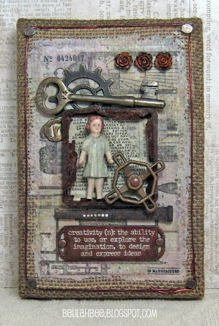
This week's challenge is to use a metallic element so I made an assemblage that would definitely set-off a metal detector!

I used found bits of really rusty metal (the square frame and large nail), a vintage key and lots of Idea-ology including a Quote BandNumber BradGadget Gear, and Faucet Knob.


A border for the Burlap Panel was made using tacks and copper wire (credit to Paula Cheney at oneluckyday.net for this idea).

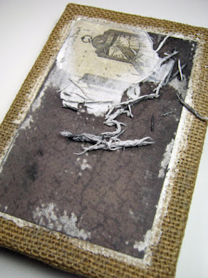
The background technique is rather unconventional. After prepping the burlap with paste medium (to fill in and even out the surface), I transferred an image cut from the Destinations Paper Stash using polymer medium. The overage of paste medium around the edges was tinted to match the paper.


I've done image transfers with lots of Paper Stash and I suspect it would work with other brands as well. Here's a link to a recent tutorial which describes my technique in more detail.


I included a doll and roses because of the Quote Band. The Salvaged Doll is the artist, the faucet knob represents effort, the number stands for time, the key unlocks the idea, the gear stands for the process and the result is beauty represented by the three Heirloom Roses.


It's fun and easy to transform the doll from its original, stark-white appearance. I just covered her with off-white paint, used blue for the dress, brown for the hair and mixed-up a flesh tone for the face, arms and legs. Everything was coated with fine crackle medium and after it dried, I dropped in some Tea Dye Distress Stain to emphasize the cracks. A tiny drop of red ink went on her cheeks and a fine-tip black marker helped define the eyes and mouth (my photo doesn't do her justice).

I wanted to match the roses to the other pieces but didn't have rust-colored alcohol ink. Since mixing colors opposite each other on the color wheel makes mud, I thought to drop an assortment of colors I did have on top of the roses until I got the look I was after. Then I took the shine away with some fluid matt medium.


The Quote Band was also given a rusty look. I filled in the letters with white paint, wiped the background with a rust-colored ink (like StazOn) and used black paint to distress the edges. I used an antique gold metal paint on the Faucet Knob and glued on a few brads with Glossy Accents.

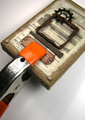
Speaking of glues, if you'd like to try making an assemblage but you're not sure how to anchor the elements I have some advice. Use nails, screws or wires when you can (no problem with the Burlap Panel since the backing is made of wood). When you can't, a good urethane-based glue (like Duncan's Liquid Fusion) and some clamping will secure just about anything. You can see my other assemblages here.


There are other details about this piece that I could mention but if you've already read through what just may be the longest post in the history of craft blogging, then I may have said too much already!

---------------------------------------------------------------------------------


Please join us for this week's challenge and when you upload your creation to the Simon Says Stamp Monday Challenge Blog you'll have a chance to win a $50 voucher at the Simon Says Stamp store!


Here's a list of the products I used for this challenge which can be ordered from Simon: