Showing posts with label washi tape. Show all posts
Showing posts with label washi tape. Show all posts
February 20, 2016
No. 141
What is collage if not upcycle/recycle? Using found bits of ephemera and images from books is common practice for me and so I'm linking this tag to the Monday blog challenge at Simon Says Stamp in honor of this week's theme.
It's another exercise in working through the long, narrow format of a tag and attempting to create a sense of space/depth in the composition. It started with the remainder of a Found Relative photo that I used in another piece.
Book pages, an image transfer, stamping, Tissue Wrap, Remnant Rubs, and a bit of washi tape were used to complete it along with various inks and paint.
All I can say is the best part was placing that tiny airplane in the sky.
Stamp credit: Tim Holtz Components - Flourish
January 13, 2016
Remix
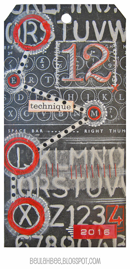
Tim's doing a "Technique Remix" for the 12 Tags of 2016 and this month he features metal embossing and chalkboard stamping. What a combination!
So even though I really tried to use more metal (three tags are in the trash as I write this), the best I could do was pull off the chalkboard look. In spite of my failures it was great fun just to try.
I thought I'd share my discovery for making your own chalkboard paper. Either start with black paper or make your own with paint or black gesso then coat it with what's known as clear gesso.
It's meant to be used mostly for pastel artists who need "tooth" on their surface for the powdery pastels to cling to. It's basically clear acrylic medium with a bit of fine sand mixed in.
First I used Tim's Schoolhouse stencil on a black tag to apply texture paste that was tinted with gray paint. I let it dry, stamped with Tim's Type Keyboard using white pigment ink and clear embossed it.
Then I applied the clear gesso over everything so I could use a white charcoal pencil to give it that chalkboard look.
Remember the grungeboard die-cuts from Tim's early days? That's what I used for the big number 12. Painted with black and clear gesso, they were easy to tint with a red pastel pencil and more white charcoal to keep the chalkboard theme going.
Some circles stamped with red paint, a bit of washi (polka dots), tissue paper and two more design features from Tim's early beginnings--mini staples and Dymo tape (the red 2016) provided the final embellishments.
I may have drifted from this month's remix but embraced what I've learned from following Tim's tag tutorials for such a long time and am excited about this year's new twist. I think it will be great fun to revisit these oldies but goodies.
October 14, 2015
Mums

Next I dropped in juicy yellow and orange watercolor, let it dry and then used a damp tissue to wipe it off the embossed lines.
I drew the likes of a basket and handle with my very handy Perfect Pearls pen, embossed with clear powder and filled them in with a brownish mix of watercolor.
 |
| Click to Enlarge |
I used polka-dot washi tape to fill-in the basket around the flowers by pressing the tape down then cutting around the edges. A sharp blade and gentle pressure does the trick and prevents cutting into the background.
Final embellishments included hand-written text using a Gelly Roll pen, tacking on a bow and distressing the edges of the tag with walnut ink.
This becomes Tag Number 136 which I'll add to my collection at manilaguerilla.blogspot.com. But who's counting?
September 19, 2015
Artvue
 |
| Click to Enlarge |
I thought it was just about using postal ephemera in collages!
So, while I work on my understanding of this art form, I'll share my latest attempt (interpersonal communication) with my blog readers (virtual community). Gee, maybe this is mail art after all?
Beginning with a virgin postcard (never been mailed), I used an image transfer technique to add the newpaper print. I used a distressed Idea-ology frame sticker and stamped a bird on tinted watercolor paper for the center.
The red and green postage stamps are real, the cat stamp is homemade. The address label is from the Tim Holtz Correspondence stamp set. I applied it to paper then used a typewriter to fill in the address before pasting it on. The postmark in the top left corner and the words Par Avion are also from this set.
With a bit more stamping, tinting, dotting and a strip of washi tape (white strip near the center), I considered it complete.
Now all I have to do is mail it!
September 10, 2015
Escape
A bonus from mucking-out the craft room last month was discovering long-forgotten goodies like the wooden birdcage die-cut (from Kaisercraft) that I used on this tag.
And since this week's theme at Simon's Monday blog challenge is stamp and punch/die-cut what better time to use it?
A background was made with old book paper, paint and stamping then I tinted and stamped the birdcage and used an image transfer for the text. Yes, that's a bit of washi tape for the shadow and I used a black Fudi-ball pen to ink the edges.
 |
| Click to Enlarge |
I have yet to invest in die-cutting equipment and only have a few, very small paper punches so I was happy to find this birdcage in my stash--otherwise, I'd have to sit this one out!
Stamp credit: Kaisercraft Dictionary Meanings
July 31, 2015
Cecil
Cecil's death this month made us more aware of lions on the brink of extinction so perhaps some good will come from this senseless killing.
I've made this tag to honor him and hope you'll visit Lion Aid's facebook page if you'd like more information on what can be done to save them.
 I began with a page from a very old cookbook (copyright 1887) pasted to the front of a manila tag.
The paper is so old it crumbles so a layer of acrylic medium was used to stabilize it.
An image transfer of Cecil was applied and features his distinctive black mane (which was his trademark).
I stamped the wing/crown image (Tim Holtz) on a scrap of tissue paper then embellished it with gel pens and colored pencils.
There's a strip of washi tape behind the Industrious sticker frame and a glaze of paint and Graphitint pencils added background color.
I'm linking to Simon's Monday blog challenge where this week's theme is no ordinary paper.
May 08, 2015
Dotty
dot·ty (dŏt′ē)
adj. dot·ti·er, dot·ti·est
Mentally unbalanced; crazy.
Amusingly eccentric or unconventional.
Ridiculous or absurd: a dotty scheme.
Having a feeble or unsteady gait; shaky.
Obsessively infatuated or enamored.
The Monday blog challenge this week at Simon Says Stamp is the color coral and that's where my "dottiness" all began.
I found some paper in my stash that I used for the background and then a vintage photo and butterfly that paired well together. Embracing the pattern of her dress, I embellished the tag with washi tape and black and white gelly roll pens.
Her full name is Dorothea, but everyone calls her Dot.
April 10, 2015
Asian
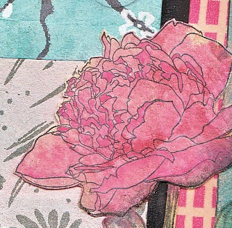
Some flowers have a strong connection with southeast Asia, such as cherry blossoms, chrysanthemums, and peonies. So I opted for an Asian-inspired look when using the peony stamp from Tim's Flower Garden stamp set.
This also worked out nicely for linking to Simon's Monday blog challenge where this week's theme is the letter A.
 Other Asian items used in this tag include the printed mulberry paper background and washi tape. The peonies were stamped on bamboo paper which, because of it's color (bamboo), was lightened with Picket Fence distress stain. Unfortunately, I lost some of the stamp's line detail when I did that. (Note to self: Lighten first, stamp second.)
I wonder if it's fair to count the "Broken China" distress ink which was used on the right side along with a little "Tea Dye"?
This becomes flower number four in my quest to experiment with all six flower types in this stamp set before the week's end. To take a look at the others, just click on the label Flower Garden at the very bottom of this post.
February 15, 2015
The Marker
 |
| Click to Enlarge |
It begins with choosing what elements to use then escalates into a madness deciding where to put them.
I move things around over and over until I get a headache and then say to myself, "this is insane."
I think of artists whose work has a random and spontaneous quality that I greatly admire--they make it look easy but IT IS NOT!
When I come across a great photo like this one, however, I have no choice but to subject myself to such torture. Then I add to my misery trying to decide which of the endless Remnant Rub word combinations to use.
I'm linking it to the Monday blog challenge at SSS for one more chance at the $50 prize. This week's theme is red and pink.
And the craziest part of all?
I enjoy it!
February 09, 2015
Best Day Ever
All the paper bits for this tag came from Tim's Crowded Attic paper stash. His February tag features a collage theme so I cut and distressed the background like he demonstrated.
For embellishments, I used Crackle Accents on the frame edge, an Ephemera Pack label, Remant Rubs, a small Arrow Adornment, a Number Brad, washi tape and some gingham ribbon.
Here's a tip about the Ephemera Pack label: They are made with vellum and are semi-transparent but I painted the backside with white acrylic to alter its appearance.
I also used a touch of gold paint on the arrow and brad and filled in the number with red.
Best day ever? For me it's this Saturday when my husband and I will celebrate our 34th wedding anniversary.
Happy Valentine's Day!
January 10, 2015
Together
"Make New Friends and Keep the Old" is the Monday blog challenge this week at Simon Says Stamp. It's also the name of a song I learned in Girl Scouts which was sung "in-the-round" (like Row Row Row Your Boat). I hadn't given it a thought since I was a Brownie xxx years ago ☺ and now I'm having major flashbacks. For you youngsters out there, here's what our uniforms looked like back in the day:
Imagine girls (of any age) wearing gloves today and why did the Brownies wear a manly bright orange neck tie? Strange, yes, but I liked them. Mom, not so much as they were a pain to iron.
The challenge prompted using something old or new so I grabbed the very first stamp I ever purchased, a vintage sunflower from Inkadinkado. It is based on this original engraving:
 |
| Click to Enlarge |
I applied an image transfer of the girls to a blank tag and before rubbing off the paper, I stamped the background. This way the transfer acts like a mask and saves a step or two. I used distress inks and colored pencils to tint and washi tape for embellishment.
The "new" feature on this tag is the Tim Holtz Remnant Rubs text which I recently acquired and used for the very first time.
If you'd like to know more about the image transfer technique, you can find my tutorial here.
September 07, 2014
If Only...
I don't know what possessed me to purchase a face stamp (this one's by LaBlanche) because I've found them rather limited in use. But seeing Tim's September tag and the others who've posted links, has given me some new ideas.
I also admit that alcohol inks intimidate me so mine have gathered dust but it was good to get them out again for this project. I do love the glossy paper because it takes ink so well, stamped images are super crisp and it may be a "must have" for any success with alcohol inks on paper.
I tried Tim's background technique, to no avail, so I just dripped the colors right from the bottle onto a tag cut from glossy paper. Then I randomly stamped off-white paint through some homemade and store-bought stencils and went over it with distress inks after the paint had dried. Some light stamping with script, borders cut from washi tape and a bit of Dymo tape text finished it off.
June 20, 2014
Faith
This is the fifth tag made in my Civil War series and there are lots of layers here. I fiddled with this one quite a bit but the good thing about collage is--if something doesn't work, you can just cover it up with something else!
 |
| Click to Enlarge |
It wasn't working so I covered everything with plain tissue paper and deli wrap stamped with acrylic paint. To lighten it up and unify the colors, I applied Picket Fence distress stain all over and used Broken China and Vintage Photo distress inks here and there.
I added the mirror, lady, and text, applied Tim's tissue tape on the top and left edge, sanded some edges to expose the first layer of washi tape and used Walnut Stain distress ink along the edges for framing.
I'm linking it to Simon's Monday blog challenge where the theme is anything goes.
April 11, 2014
Washi Paint
Before and After
I linked this tag to the Wednesday blog challenge at Simon Says Stamp where the theme is Easter.
But, I didn't like it that much and it really didn't reflect this week's theme.
So, I peeled off the tape and washed over it with gesso and started over.
And this is the new tag:
After applying gesso, I traced the outline of the cone flowers (originally applied with a stencil) using pen and ink then traced the outline of a bunny photo. I used oil pastels for tint and applied washi tape on a few of the petals.
 |
| Click to enlarge |
So hopefully, I've learned a lesson here.
When I am less than satisfied with something, and it can't be rescued, then I must learn to listen to that voice inside my head and just start over.
February 21, 2014
To Have and to Hold
The best part of a challenge? For me, it's exploring a subject that's not part of my normal repertoire like Weddings or Anniversaries, which is the theme for Wednesday's blog challenge at Simon Says Stamp.
I started by finding a great vintage photo of a bride and groom and thought I'd turn this lovely couple into a wedding cake topper. The cake was decorated with washi tape, acrylic paint and a fine tip marker. Distress inks, acrylic paint and a hand-made stencil were used to create the background.
Since I do a lot of "fussy-cutting" I thought I'd share a tip, especially when using figures from photos: After cutting, take time to ink the edges as this will help to blend them into your collage.
Making this tag was a lot of fun and a great excuse to play around. I never decorated a wedding cake before and I got to know this couple a little better. But why didn't the bride smile and what did the groom need gloves for?
February 12, 2014
Birds of a Feather
 |
| click to enlarge |
I stamped directly onto kraft paper card stock using a rainbow ink pad and the French script stamp from Dark Room Door. I tore strips of washi tape to make a border then blotted on Picket Fence Distress stain. The hearts were cut from deli-wrap that was stamped and trimmed with acrylic paint. The birds were made by stamping (Tim Holtz, Birds on a Wire) on the back side of some glitter paper then cutting out and pasting the front side up. I edged the border with dots and lines using a fine-tip marker.
The inscription on the inside will read:
Birds of a feather stick together!
Happy Valentine's Day
It just so happens that the Wednesday blog challenge at Simon Says Stamp is "Get Krafty" so I'm linking it there and then it's off to the mailbox so Thelma will get it by Friday.
December 14, 2013
Christmas Angel
For color, I used oil pastels after embossing a stamped image onto a tag primed with gesso. A bit of washi tape, some glittered snowflakes and text stamped onto tissue paper, completed the tag.
Thanks Jill, your instructions were terrific and I was glad to try this new method.
December 08, 2013
Santa Baby's Got Bling
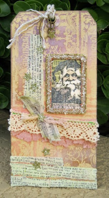
This tag was created for Ellen Hutson's 12 Tags of Christmas with a Feminine Twist challenge and was inspired by Julia Stainton's "shabby chic" tag from Day 6.
I used an emboss resist technique to create the background on a plain manila tag with a Tim Holtz Christmas stamp (placed in multiple areas to cover the entire surface) and some Distress Inks (Dusty Concord, Vintage Photo, Tea Dye and Spun Sugar). To keep it looking shabby, I lightened the colors here and there with Picket Fence Distress Stain.
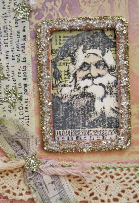
Santa's image (another Christmas stamp by Tim) was tinted with Distress Inks and placed in a glittered frame. I used my sewing machine to attach the lace trimmings then added strips of home-made washi tape and some glittered stars.
Thanks for the inspiration, Julia! I really like shabby chic and my whole house would be in this style but the king of this castle is none too crazy about it. If you like it too, then check out Crooks & Nannies, a favorite spot of mine.
Subscribe to:
Posts (Atom)


