/* */ Beulah Bee: gel pens
Showing posts with label gel pens. Show all posts

June 13, 2018

Precious Things


What to do, what to do...

I can't bring myself to use the papers included in this month's Simon card kit because they are just too pretty! Seriously.

And I couldn't bear to cover up the background of a tag made with a new embossing folder (Tim Holtz 3D Botanical) because it was just too pretty, too!

So I tried to think of a design where I could leave most of it showing and here's what I came up with.


I really played around with distressing the background. I embossed a rather thin piece of pink paper (after slightly damping it first) and then I gave it a coat of Krylon clear matt finish to seal and protect it.

Then I went crazy with gesso, inks, and paints--brushing on, wiping off (and even a little bit of sanding), just to see what worked the best to bring out those glorious embossed details.


Who could blame me for not wanting to cover this beauty up?!

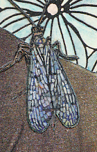
The girls are Paper Dolls (Tim Holtz) and the butterflies came from the Graphics Fairy which I printed in miniature on vellum and then cut out.


Some tiny jewels (tinted with alcohol ink), a scrap of vintage sheet music, a Remnant Rub (text) and a border made with dots of Liquid Pearls were also used.


I tinted the Paper Dolls with transparent acrylic paint and the white of the pearls and lace were made with a Gelly Roll pen. I had a tiny butterfly that was just the right size for sitting atop the little girl's hair bow.

I'm linking this up to Simon's Monday Challenge Blog, this week's theme is Anything But A Card.

Now, what to do about those pretty papers...

March 11, 2018

Cool in the Shade

My favorite teachers? The passing of time, experience, practice, experimentation, mistakes. Case in point this tag (made for Simon's Monday theme "Whatever the Weather"):


  1. Learning how to use Photoshop's recompose tool to crop this photo without losing the photograph's border frame.
  2. Experimenting with Tim Holtz Distress Oxide Ink technique on glossy paper with mixed results (too much water, not enough ink?).
  3. Applying crackle medium to paper, the product I use has to be applied really thick--it was too thin this time to show up.
  4. The benefit of delaminating some Idea-ology paper stash to reduce bulk when collaging (text piece is full thickness, report card area was made thinner). Each time I try this, I get better at it. The trick is to gently rub off the back with a little water after peeling away as much as you can.
  5. The flowers (Idea-ology ephemera) were also delaminated because they are easier to refine with cutting when the paper's not so thick.
  6. Proved again that for me, the best way to tint a photo is still using a dab of ink from a gel pen with a little water (the turquoise in the wallpaper behind the teacher, for example).
  7. Appreciating that without adding a little whimsy to the piece an observer might think it too serious and wonder about my mental state. (Perhaps you should anyway.)
The weather connection is in the Idea-ology text from the Memorandum paper stash. I do believe this teacher is cool in her shades. Also note the Red Precipitate Ointment which is a nice touch--don't you think?


By the way, my favorite human teacher was Mrs. Jennings who had the patience to work with me in the 5th grade when I refused to learn multiplication tables and provided comfort from bullies.

February 13, 2018

Heartfelt Friendship


A Valentine's Day tag? Sure! Why not? I'll be sending this to my dear friend, Thelma, who got me started in paper crafting and always makes her Valentine's Day cards special with a commemorative postmark from Loveland.


I'm linking this to a special Simon Says Stamp blog post, Send a Card to a Friend Day (for a chance to win a $100 gift card--whoo-hoo!).

Supplies used: Authentique Classique "Pretty" paper, tinted paper doilies, washi tape, Scribbles, a white Gelly Roll pen and Idea-ology design tape (Chatter).

January 14, 2018

According to Value


Value is defined as the relative lightness or darkness of a color. It is an important tool for the designer/artist, in the way that it defines form and creates spatial illusions. Contrast of value separates objects in space, while gradation of value suggests mass and contour of a contiguous surface. (Read more, here.)

Of all the things I learned in art classes, the concept of value has been the most significant and perhaps the most challenging to fully understand and implement. I work at it constantly and it can make a big difference when you get it right.

I thought I'd use this tag (my first for 2018), to explain some steps I took to adjust the values which you might find interesting or useful.
  1. The lady's dress was bright orange and this warm, strong color was too dominant. To adjust the value, I tinted it with transparent blue (Tumbled Glass Distress Marker). Blue is the complimentary color to orange and when you mix compliments, they cancel each other out. So the bright orange now has a more muted value and settles better into the background.
  2. The flowers were very neutral. I wanted them to stand-out more and appear closer (plus they needed some detail) so I tinted them with lines of pink, orange and turquoise gel pens (Gelly Roll Soufflé). Warm colors appear closer, cool colors recede.
  3. The lady was grounded by using a dark tint under her feet (otherwise, she would appear to be floating). It's subtle, but you may also notice that the grey background is lighter near her feet than higher up. This is a way to create a sense of depth. Distance (like on the horizon of a landscape) is imitated with lighter, cooler colors.
  4. And finally, most compositions are best when there is a mix of bright, dark and medium values. Here, it's the dark greys and black text combined with the bright white dots (extra-fine DecoColor paint pen). The remaining elements fall into the medium range.
If this information was helpful or interesting and you'd like to see similar posts in the future, let me know by leaving a comment.

December 09, 2017

12 Tags for Christmas 2017 - Noel


I drifted away from the conventional with tag number nine and I kinda like where I ended up.

The ingredients are Tim Holtz Tidings paper stash, a Christmas Collage stamp (on tissue paper), Ephemera, Distress Inks, black Stickles and a white gel pen.

The tree was made from a stencil (Clear Scraps). I traced the outline onto paper and then cut it out by hand. Some might think that's a lot of work but for me, it's relaxing and therapeutic.

December 01, 2017

12 Tags for Christmas 2017 - Joy to the World


♪♫ ♪ "On the first day of Christmas, my true love sent to me ..." ♪♫♫♪

Ten years ago today, Tim Holtz began the tradition of blogging about techniques for creating 12 Tags for Christmas and I've continued to make them every year since then to decorate my presents.

This year, I decided to post them in 12 consecutive days beginning December 1st just like he used to do and my first tag features a simple, understated design with an early American or Georgian vibe.

The background is pearly paper with clear-embossed snowflakes (Kaisercraft Frosted) that was tinted with Faded Jeans Distress Oxide.

I coated the book paper die-cuts (Carta Bella Joy Wreath) with Glossy Accents and created additional contrast by using a blue gel pen and a water brush (which soaked in underneath).

I gave the entire surface a wash of dilute white acrylic paint and took advantage of the resist properties of the Glossy Accents by wiping the paint away from the die-cuts where there was overage.


I used a Remnant Rub to complete the phrase and made a frame border with 1/8" silver metallic ribbon (Offray) tinted with off-white acrylic paint.

To age the appearance a bit more, I rubbed on Frayed Burlap Distress Ink here and there and added some Liquid Pearls along the bottom for a touch of Christmas bling.

May 04, 2017

Happiness


Ah, the merry, merry month of May...

The high temp today in my neck of the woods was 104°F.  A bit warmer than normal, to be sure, but pleasant just the same as May means the crowds are thinning out and the pace is beginning to slow--a precursor of the quiet peace that comes with the heat.

My tag was made to celebrate the great outdoors which is the theme this week for the Monday challenge blog at Simon Says Stamp.

It was an opportunity to use a new Tim Holtz stencil called Floral which I fell in love with after seeing Paula Cheney's Instagram post and was the inspiration for the colors I used.

Rather than use a monoprint technique as she did, I opted to use texture medium over a text background then sanded it down before tinting with Distress inks. The medium helped to resist the ink and retain the stencil pattern.


The moths were cut from a discontinued Tim Holtz paper stash called Kraft Resist which I tinted with Distress markers and a white gel pen. The text is from the new Idea-ology Clippings stickers.

I didn't use machine stitching for the accents because the texture medium just didn't want to feed through smoothly. So, I opted for my backup method which is a good technique for those who don't have a machine.


I use a piece of cardboard placed under the tag and punch holes for my hand stitching with a "pin tool." It's a leftover from my days making pottery but I think it would be easy enough to find a substitute to punch the tiny holes needed. Pre-punching makes the stitching so much easier and it's a curiously pleasant task!

It's also a great method when accuracy is a must as I have more control punching than I do keeping my foot steady on the sewing machine pedal. A simple backstitch is all it takes to complete it.

April 17, 2017

She Meant It


I'm sharing an art journal page with you today, made by transferring an advertisement from a magazine with gel medium then highlighting it with black and white gel pens, a Found Relative, some butterflies (from the Snippets ephemera pack) and text (from Clippings stickers). I also transferred book text to fill in some empty spots.


I was really drawn to the advertisement--a room with wonderful plaster and wood forms, a large framed mirror over such a decorative fireplace and one fabulous chandelier. How clever to furnish it with a modern style sofa and rug.

And so I began this art journal journey celebrating the page and becoming more intimate with all of it's interesting embellishments.


Update: After posting, I went to the ad's website (The Rug Company) and found the original photo so I thought I'd include it for another perspective. BTW, the rug comes in several sizes and prices range from $3,500 to $51,000! It's hand-knotted silk.

January 23, 2017

Brownie


A photo found here was my inspiration for a tag that combines scrapbook paper and image transfers with a Souffle Gelly Roll pen and the new Tim Holtz Idea-ology Clipping Stickers (a salvaged assortment of adhesive backed phrases, words, and numbers).

I was pleased to receive the stickers when asked to complete some show samples (which I'll post soon)--the phrases available are excellent and really kick-start my imagination!

The dark areas in the top of the photo were sanded a bit to lighten before transferring. To learn more about my image transfer technique you can see a demo here.

January 21, 2017

Not Guilty


Yes, I'm guilty of not posting for a very long time but not guilty of wanting to--just so darn busy with all the stuff that gets in the way of having time in my studio to create.

Then, when I did find some time, I spent way to long on a project that never seemed to come together and I should have given up on it but I just wouldn't accept defeat. Thank goodness it finally made it to the trash can.

So it feels really good to get back to basics, take a few images found on the net that had caught my eye and put a tag together. No pressure, no struggles--just plain fun.

I call this one "Not Guilty" because the gent is actually a French criminal and this photo is what you might call a vintage mugshot. Well, he looks like a good guy to me so his crime must not be serious.

The background is a coloring page courtesy of a free download from Alisa Burke and the insect was found on Pinterest.


December 21, 2016

12 Tags for Christmas - November

Click for Larger View

Tim's November tag was a lesson in using Remnant Rubs as a resist and dimensional coloring. As with my original tag and again for this one, my rubs didn't resist in the same way Tim's did. I'm not sure why but think it may have something to do with how absorbent the background paper is.

My background is a little out-of-the-box in that I used a piece of delaminated cardboard (made by soaking it with water then peeling apart the layers). I like how it took the various stains I applied and puddled around the cardboard lines.


I used the white version of Tim's Christmastime Remnant Rubs, filled-in the background with random dots made with a Gelly Roll pen and added some vintage lace and a few seed pearls. The tag borders were hand-stitched with thick white thread after punching the holes on my machine.

I stamped my poinsettia (Penny Black, Christmas Star) on watercolor paper using red archival ink then tinted it and filled in the lines with some glitter paint. To make the flower coordinate more with the rubs I outlined the petal edges in white. The center is a Gumdrop tinted with Butterscotch and Wild Plum alcohol inks.

I have one more tag to go but don't expect to complete it before Christmas Day so with this post, I'm sending you my very best wishes for a safe and peaceful holiday that's full of good cheer!

December 09, 2016

12 Tags for Christmas - August


Gosh, I'm having a hard time sticking to Tim's monthly techniques--it seems unfair to even call this one "August." You may recall that I'm making Christmas versions of his monthly tags and I'm resolved to the fact that I just don't have the stash to pull it off.

Still, it's the inspiration that gets me started and narrows down my choice of materials and I'm always happy for the nudge in a direction I might not have considered before.

This one started with a brayered stain background that didn't work with the stamps I wanted to use so I turned it solid using Seedless Preserves (such a strong color--it will cover up almost anything).

The stamping (Inkadinkado Evergreen Holiday) was done on watercolor paper using Sepia archival ink then tinted with watercolors and Gelly Roll pens.


I cut out the negative spaces so the background would show through then embellished with machine and hand stitching, some Liquid Pearls, Rock Candy Stickles and Lace Trimmings. I felt the lettering needed more contrast so I outlined them with a fine-line marker.

December 06, 2016

12 Tags for Christmas - July


Last year, I was able to stick with the same techniques Tim used for my Christmas versions of his monthly tags. This year, not so much. For many of them, he favored using word die-cuts quite a bit and it's difficult to find an appropriate substitute.

So here's what I did instead for this year's July tag (a remix of watercolor resist and layered words).


A book page, Tissue Tape and an oval cut from tissue paper (which was sealed with acrylic medium) were pasted on a tag. The edges were brushed with white paint then I stained the surface with Distress inks and the previous elements resisted the tint.

My angel is a stamp from Inkadinkado (Christmas Silhouettes) which I cut out and embellished with a white Gelly Roll pen, Liquid Pearls and Stickles. A Christmastime Remnant Rub provided the sentiment.

My little angel still seemed a bit plain (especially for Christmas) so I covered her with lots of Clear Rock Candy Distress Stickles. You just can't beat this old favorite for adding the perfect amount of vintage sparkle!

November 15, 2016

12 Tags for Christmas - January

Click to View Larger Version

Once again, I've made Christmas tags inspired by the Tim Holtz monthly tags which I use for decorating gifts.

This year's theme of remixing techniques helped me discover more ways to use my stash--holiday style!

The January tag featured a chalkboard/industrious metal combo with a word band.


This was the first time I've ever embossed metal foil (I didn't have die-cut equipment back in January) and it's an interesting effect. I always prefer a matt finish but since sparkles and shine are must haves at Christmas, this technique was really appropriate.

Without frosted embossing powder for the chalkboard technique, I tried to make do by embossing red vellum (bottom flower layer) with white ink and clear powder but the lines were too faint. Then I tried stamping white ink on red cardstock (top layer) which also faded some so I went over the lines with a Gelly Roll pen. What is it about white inks that make them so fussy?!

I combined the layers for a lush flower look and now I wish I had used green vellum for the bottom layer since Poinsettias have that look naturally. Maybe next time.

The rest, I think, is self-explanatory and here's a list of the products I used: Penny Black (Christmas Star), Stampers Anonymous (Christmas Words), Idea-ology paper (Merriment), cardstock, vellum, heat duct tape (metal foil), Sizzix Thinlet die (Mixed Media #2), Distress inks, acrylic paint, Scribbles, Stickles, Glossy Accents, a white Gelly Roll pen, and one tiny pink gumdrop.

September 26, 2016

Toxique

Everything about this creation is unconventional and you may not care for it. However, my experimentation here illustrates some unusual techniques that may be of interest so I've decided to share it.


I began by using watercolor on watercolor paper. I stamped on some Plain Tissue Wrap (the hand and face with circle/lines). I cut out some gear images from some Tissue Tape. I used a home-made circle stamp and filled one of them in with some dot-stamped tissue wrap.

I wondered what it would look like to draw white lines with a Gelly Roll pen throughout the background. Then I sharpened the circle edges and added some dots with my black and white pens.

But it wasn't big enough to be a tag so I mounted it on some grey cardstock with stitching.

Now what to do with the empty space on top? I stamped and then embossed some black dots and added the white ones with a gelly roll.

I brought out the whites of the lady's eyes with a Picket Fence Distress Marker.

I think it's interesting that you can't really tell what's tissue wrap or tape when you compare the look with the stamped circles (where the watercolor paper is completely exposed).

For collage work, the tissue wrap is really useful and I have a tip: There is a subtle difference between the front and back surfaces--one side is slightly smoother and stamping on that side seems to give me the best results.

I really don't know what to make of my subject matter except to say that maybe it reminds me to wash my hands to avoid germs? I think I'll link it to Simon's Monday challenge blog (this week's theme is embossing "powder power") just to remind them too :)

September 19, 2016

Common Denominator


Images that caught my eye were printed and pasted, then Tissue Wrap, stamping, stenciling and bits of Dapper paper stash combined with Distress ink/paint and many dots from a Gelly Roll pen became this journal page assembled over the weekend.

For me, the fun of "journaling" is I don't have a plan, I just take what interests me and begin. I never know where it will lead me and along the way I always learn more about what works and what doesn't.

Here are some close-ups (click for the larger, lightbox view):


The papers designed by Tim Holtz are ideal for collages but can be a little too thick for some applications. But no worries, as I have found they are easy to modify into a thinner version perfect for pasting.


I just use my fingernail to separate the front from the back then use a tiny amount of water to soften the paper so I can gently rub more paper bits off the back. In the image above, the paper on the left is the original, thicker version, the right one is how it looks after my delamination process.

I really, really enjoy the challenge of trying to create a sense of depth in my work and with this page, using warm reds at the bottom, cool blues and blacks at the top and the lightest values in the center along with modifying the size of the people helped to accomplish my goal.

And, if anyone is curious, the guys in the white uniforms--they were Coca-Cola salesmen from the 1930's. Perhaps the common denominator here is the love of a good cola?

Stamp credits: Tim Holtz Dots & Florals, Inkadinkado Newsprint
Stencil credit: Crafters Workshop Art Is

September 01, 2016

Encore


You'd think that I've been blogging long enough to know this--wait awhile before you make something final, don't be in such a hurry to share, make sure it's right first.

Earlier this week, I posted Natasha Returns but she should have stayed put and so I revisited her, made some modifications and brought her back for an encore.

I've recently started using die-cuts and thought I'd try an image transfer over the top but this just didn't look right so I modified this tag by pasting the image over the original transfer and now I am satisfied. Why didn't I do this in the first place?!

August 25, 2016

Louella


In the desert, there's no such thing as "a touch of fall in the air" because daytime temps stay in the low 100's until mid-October. So it's not the weather that inspired me to make a tag that looks a bit "Halloween-ish" but it does (I expect it was my color choices).

Perhaps it was just wishful thinking as I've grown tired of the heat and can't wait for winter. Oh how lovely it would be to spend the fall anywhere but here. It's such a lovely time of year.


August 22, 2016

Natasha Returns


Meet Natasha. She has returned for another appearance on my blog (see previous post here). She's an image transfer laid on top of a background made from the bricks Mixed Media Thinlit by Tim Holtz.

There's also a scrap of his Tissue Wrap and the butterflies are a stamp from Prima. A bit of embossed polka dots (Tim's Dots & Florals stamp) and a stitched border that was painted and embellished with black Gelly Roll lines complete the look.


I've recently entered the world of die-cutting and I'm learning as I go. As if I didn't collect enough collage "scraps" already, I've got a feeling this new technique will add to my collection exponentially!

Here's what I know now: Tissue paper over die-cuts can work and look OK but I don't care for the appearance of the image transfer over them and won't do this again in the future.

July 28, 2016

Kimono


I get attached to certain photos, especially when I use them in art. Somehow, working with them connects me to the person more intimately and maybe, after I'm through, you will feel connected to them too.


I switched out the old wall phone with an image transfer of a vintage street scene of Tokyo. The tinting comes from Souffle Gelly Roll pens and just a bit of black colored pencil.


I'm linking this to Simon's Monday challenge blog. This week's theme is texture but instead of using physical texture I've used visual texture. If you're unfamiliar with the concept you can read more about it here.